

Joseph Gannon (@speedyux) is a UX professional with 20 years experience in information architecture, interactive design, and usability research. Joe has crafted desktop and mobile solutions for Fortune 500, global accounts and mid-size companies. Projects have spanned across numerous industries from transportation services to e-commerce, government and non-profits. His interests include evangelizing web performance within the UX community, blogging and data visualization.
Speed Index is one of the key web performance metrics that is useful to both developers and designers alike. Given it’s popularity, I’ve come up with some suggestions to extend Speed Index visually as well as better understand how it works.
Calculating the Speed Index
When I first delved into web performance, I wanted to get a better insight into how the Speed Index is calculated. I figured this would give me a better understanding of what that number really represents. However, what really threw me is that scary looking formula at: https://sites.google.com/a/webpagetest.org/docs/using-webpagetest/metrics/speed-index
So, I decided to unpack it and after some trial and error I came up with an easy way for me to understand how it’s calculated.
First, I created a test page then ran it on Webpagetest. See test results
Based on the formula, I set up an Excel spreadsheet with 4 columns: listed below.
- Time – The current time in the filmstrip, starting with 0, and ending when the page is 100% complete.
- % Visual Progress – For the corresponding time, what is the % completeness of the visual progress?
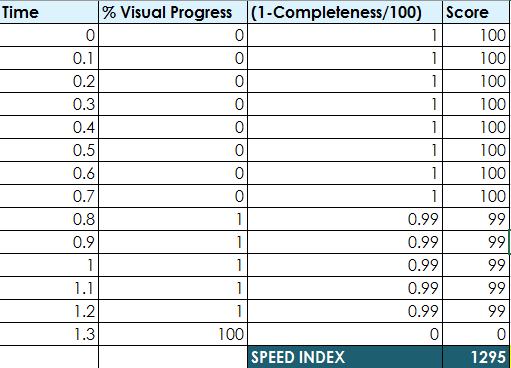
- 1-Completeness – Takes 1 minus the sum of the % visual completeness divided by 100. For example, at the .80 second mark, take =SUM(1 -(B10/100)), which yields a score of 99.
- Score – Multiply the completeness score by 100. For example, =SUM(1 -(B10/100)), which results in a score of 99.
Then, I set the filmstrip Thumbnail interval to .1 sec.
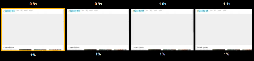
From the filmstrip, I began to fill in the blanks into the spreadsheet. Once complete, add the numbers in the Score column, to yield a Speed Index of 1295.
Based on this formula, we can make a few observations:
- A lower score is achieved when the visual progress is achieved as quickly as possible. Making visual progress early on is better than later.
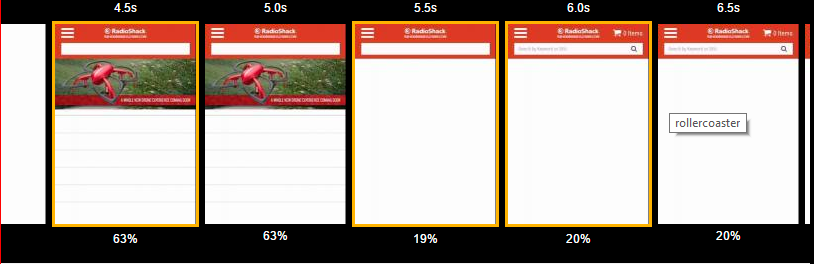
- Rollercoaster variations can affect the index. In the example below, the progress decreased from 63% to 20% and held at that level for roughly 4 seconds. This yielded a speed index of approximately 8841. If the progress held at 63%, the index would be lowered to roughly 7032. So, by tweaking the numbers in the spreadsheet, you can see how the progress affects the score and whether it’s worth the development effort to fix it in order to gain a lower Speed Index number.
Speed Index Progress
The Webpagetest film strip is useful when you’d like to get a frame by frame view of progress. However, there are times when I’d like see the big picture. One solution is to use a line chart like the Webpagetest Visually Complete Progress chart which plots page completeness over time. While there is such a chart on the compare page, there doesn’t seem a way to be able to export the chart in a Webpagetest run. However, after some research and forum postings, I was able to find some useful info in the XML data which can be used to create such a chart.
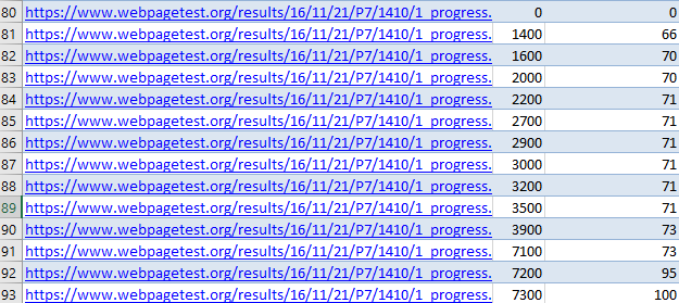
You can get the XML data as follows:
Enter the URL for a test run in the following format – http://www.webpagetest.org/xmlResult/[testID]/
To get the test ID, go to the test history page, then hover over the URL. This will show the test ID such as https://www.webpagetest.org/result/161121_P7_1410/ Then take the URL path to the right of the result, and paste it into the test ID. This gives the URL such as:
https://www.webpagetest.org/xmlResult/161121_P7_1410/
Once you enter the URL, you can then save the XML file to your computer. To find the progress data, locate the Time and VisuallyComplete columns, then scroll down to around line 80.
I then plugged the data into Excel and created a scatter chart with straight lines and markers. The result shows the visual progress over time.
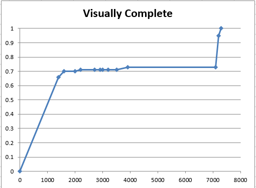
This is a good start, but the chart doesn’t tell at what point in the page load process did the key elements load. From a user experience standpoint, it would be helpful to give us a snapshot of at what point did these critical elements were visible. There are several ways to measure this.
- Look at the test results film strip, then determine when key page elements such as the nav bar and hero were visually complete.
- Add a user timing mark – see Steve Souders excellent post on this at: User Timing and Custom Metrics
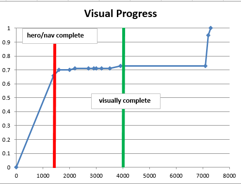
I chose the first option since I didn’t have the user timing metrics. I added 2 timing markers in the chart to denote:
- Hero/nav complete – in this test both the hero and nav rendered at the same time set at .1 seonds intervals. However, in many cases the navigation or other elements may render first, and you may wish to then add another element indicator.
- Visually complete – At the 4000 ms mark, the page looks to me like it is complete, even at 73%.
Usage
These elements bring added value to the chart since it helps you better understand the relationship between visual progress and the key page elements required by the user. The approach is particularly valuable to designers and UX who need to get a better understanding of the page load user experience. Granted, the filmstrip is most commonly used. However, what I like about this approach is that is quickly encapsulates the experience at a glance. To be successful with this approach, developers should get UX on board and help to identify the key page elements so they can be measured.
Speed Index Plot
Have you ever wanted to quickly get a graphical representation of the speed index for all runs in a given test? Well you can using the Plot Full Results. To access this page, click the link located beneath the Performance Results section at the top of the page. Here you will find test result data plots for various measures including Speed Index.

There are 2 different medians you can select to compare against.
- Median of plotted metric – The median of all runs for the corresponding test. In the above example, the Speed Index of 3,841 represents the midpoint of 9 runs.
- Run with median loadTime – This uses the Speed Index median based on the performance results run. It uses the median run which uses the Document Complete load time.
Of the 2 measures, I prefer to use the median, since it represents the actual median speed of all runs. There also is useful statistical info including the mean and median. More detailed statistical measures include:
- p25 – 25% is below 3,780
- p75 – 75% is below 4110
- p75-p25 – probability range
- StdDev CV – Represents the coefficient of variation. According to Wikipedia, “it shows the extent of variability in relation to the mean of the population.” In the above example, a CV of 3.657% shows the speed index ranges here has more variability. Due to such variability, ongoing monitoring is important to ensure that stakeholders get the big picture among a larger data set.
Industry Speed Index
While working for e-commerce retailer, our team wanted to get better insight into how well other retailers were doing with web performance. This metric is particularly important since the web is fluid, and users can easily switch from site to site. At first, I began to run tests of various competitors, but soon this became time-consuming. At the same time, I didn’t need something that was statistically accurate since the team was looking for some general guidance that we could bring to senior management. My plan was to bring these numbers to management in hopes of creating more awareness into web performance. A quick solution I devised used the Http Archive data dump on Big Query. For more information on how to get this set up, check out Ilya Grigorik’s article and video – HTTP Archive + BigQuery = Web Performance Answers
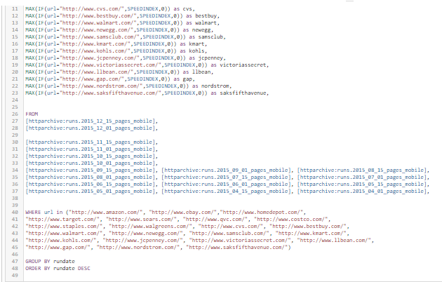
In this query, I took a sample data set of 23 e-commerce web sites, getting the data from the May-Dec of 2015 mobile dataset. The caveat to using this approach is that the sample run size is small, so the results may not show the big picture. Still, I wanted a general idea so this dataset was fine. Below is a sample of the query set using Big Query.
After running the query, I exported the data as a .CVS file, then created a box plot to show the results for each retailer. I then ran a query to get the median Speed Index of 9515 and added a horizontal red line on the chart to denote the median.
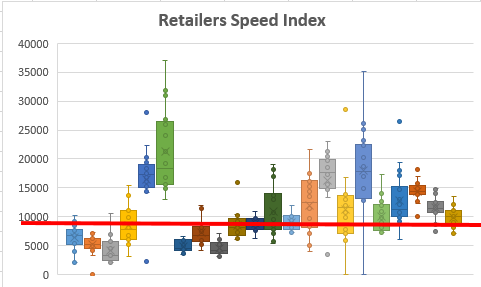
This chart shows at a glance that roughly 5 retailers are consistently below the median, while 4 have an average Speed Index above 15,000. This insight is useful since it is more focused on a particular industry, rather than the web as a whole.