
Neil Gunther, M.Sc., Ph.D. (@DrQz), is a researcher and teacher at Performance Dynamics where, amongst other things, he developed the both the Universal Scalability Law (USL) scalability model and the PDQ: Pretty Damn Quick open-source performance analyzer, and wrote some books based on them. Prior to that, Dr. Gunther was the Performance Manager at Pyramid Technology and also spent a decade at the Xerox Palo Alto Research Center. Dr. Gunther received the A.A. Michelson Award in 2008 and is a Senior member of ACM and IEEE. He sporadically blogs at The Pith of Performance but much prefers tweeting as @DrQz.
One can easily find any number of blog posts that describe how to improve web and cloud application scalability. Almost to a tee, however, the information provided tends to constitute qualitative actions rather than quantitative analysis. In order to decide which recipes lead to the best results in practice, some kind of cost-benefit analysis is desirable. But any cost-benefit analysis demands numbers, not just words, and the best numbers come from measurements.
From another standpoint, even presentations that do provide quantitative information, generally render it in the form of time-series plots. Although quantitative, time series are generally not optimal for assessing scalability. Time series are a bad impedance match for the human visual and cognitive systems. Visuals are good, but the right kind of visuals are better. In fact, that’s a general truth for displaying performance data.
Universal Visual Cues
The core notion behind any form of scalability is this. When a stimulus is applied and increased (e.g., user load on a web application) the system will respond in direct proportion (e.g., the web application will do more work with more users). Direct proportion implies that the system will have a linear response. In general, that turns out to be an ideal situation.
The Universal Scalability Law (USL) is a formal which I developed to capture the salient characteristics that determine the scalability of both hardware and software. In the following, I’ll be discussing application software scalability. The USL comprises three key components that represent non-pathological scalability costs:
- Concurrency: Later, we’ll denote the amount of this cost by the letter A.
- Contention: We’ll denote this cost by B.
- Coherency: Denoted later by C.
Time is the zeroth order performance metric. So, these costs refer to an increase in the time spent to get the work done and the concomitant loss of performance.
Let’s examine how those costs can be visualized.
(A) Concurrency costs
In the USL context, concurrency refers to the number of processes or threads that are actively involved in servicing requests (usually on behalf of a user). However, some computational cycles need to be devoted to scheduling and otherwise orchestrating how and when those threads actually get executed on a CPU core. That OS scheduling time ends up being a cost for achieving the goal of maximal concurrent processing. Other concurrency costs include network and storage IO latencies.
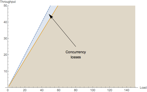
If there was no cost associated with concurrency, application scalability would be perfectly linear. In reality, concurrency overhead shows up visually as the throughput diverging below linearity. That’s why perfect parallelism is hard to achieve in real applications.
(B) Contention costs
In real computer systems, otherwise independent concurrent processes may need to access resources that are shared, e.g., data on the same disk or data in the same database table.
That contention for a shared resource means that only a single process can be serviced at a time. Others must wait. This temporary waiting usually takes place in a buffer or a queue.
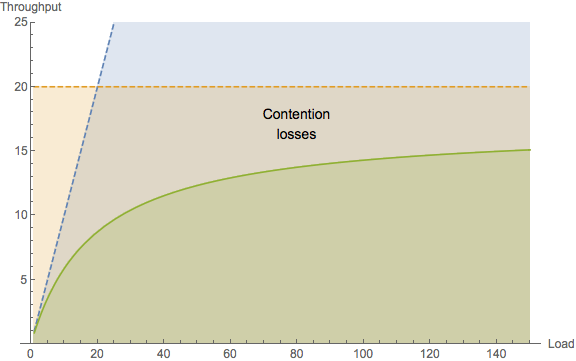
Visually, this kind of loss in time (due to waiting) shows up not just as a linear deviation from perfect parallelism (concurrency cost), but as a nonlinear fall away from linearity. Worse yet, contention costs place a ceiling on possible throughput scaling. This fundamental limit is shown by the dashed horizontal line in the above plot. There is no way the system throughput can exceed this bound. Any attempt to do so will simply result in the queues growing longer and thus, the associated processing time becoming longer.
With this visual cue in mind, scalability performance cannot be made more linear or more parallel until contention costs are reduced. Therefore, when attempting to improve the performance of application code where the scalability looks like the above plot, you need to be looking for requests that are spending most of their time waiting to be serviced, e.g., sitting in message queues.
(C) Coherency costs
Coherency refers to the consistency of multiple copies of data that can reside in different locations in a distributed system. If one of those copies gets updated by a concurrent process, then all the other copies immediately become outdated or stale. Any process that now tries to update its copy of that data, will first need to retrieve the most recent copy in order to avoid corrupting the data repository.
The only way to do that is for the source (the process with the most recent copy) to exchange its copy with any requesting process (a process with the stale copy). There are various protocols for doing this safely and they’re all complicated. Consequently, many distributed architectures try to avoid data consistency situations, when possible. But, in the event that consistency needs to be reached, the point-to-point exchange can constitute a heavy cost on scalability. Being quadratic in the number of requesting pairs, coherency costs can cause the throughput to become retrograde.
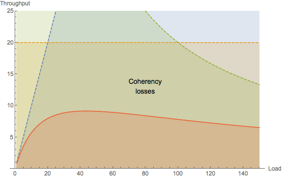
When this retrograde characteristic reveals itself visually, it means there is some kind of point-to-point exchange going on somewhere. No matter how shocking that may be, that’s what you need to be looking for in the application code; as opposed to searching for queueing effects that belong to contention costs.
Another way to think about the coherency costs is Brooks’ law which, put colloquially states: when the meal is late, adding more cooks in the kitchen increases the cooking time.
The formal concepts behind the USL are presented in my book Guerrilla Capacity Planning but, you don’t need to understand a lot of those details in order to apply the USL. Let’s look at some examples.
Know Your ABCs as Numbers
Not only does the USL provide the above visual cues, but it also quantifies them by calculating numerical values for the costs A, B, and C. which have numerical values that lie between 0 and 1, and therefore, you can think of them as percentages.
Varnish
The main author of the Varnish HTTP accelerator has not been shy about touting its performance. But is this just typical hype or is there really something to it? What’s more, how can you tell? The only sane way to decide is to do a cost-benefit analysis and that can start with the USL. Here is some scalability data (dots) obtained from performance engineering tests.
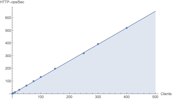
Superimposed on those data is the corresponding USL curve—-which looks like a straight line with a slope. This curve is obtained by applying nonlinear statistical regression analysis to the data. It would take us too far afield to go into those details here. The magic is that the statistical regression gives the numerical values of A, B and C belonging to the USL model that best fits those data. For these Varnish data, the scalability costs are:
A = 1.3029
B = 0.000015
C = 0
What do these numbers tell us? The fitted value of A just corresponds to the throughput due to a single load-test generator or test client. The measured value is, in fact, 1.4 HTTP-ops/second. The value of B is an extremely small percentage which, as the Varnish author claims, implies that it must scale very close to linear. Finally, we see very clearly that there are no data coherency costs in Varnish because the C component of the USL fit is zero. Although we can expect mileages to vary in actual applications (rather than controlled tests), the author of Varnish certainly seems to be vindicated by the USL numbers.
But the USL is even better than that! We don’t have to stop with the currently available measurements. Since we now have the A, B, C values in hand, we can project the expected scalability beyond the current data. An example is shown in the next plot.
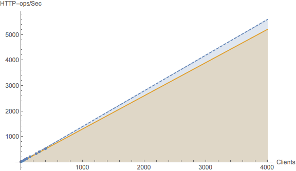
With a projected load of around 4000 clients, we can now see the divergence from linear scaling. The USL told us it was there numerically, but now we can visualize what the effect looks like at a the projected scale. The original measurements now reside on the lower left portion of the plot.
Recall that the value of the B cost also tells us that there must be a ceiling which the throughput cannot exceed. Not even with Varnish! So, where is it for Varnish? That question is now very easy to answer. All we need to do is take the value A and divide it by the value of B, i.e., A / B = 1.3029 / 0.000015 = 86,860 HTTP-ops/second. In most every case, that’s likely to be more than sufficient throughput capacity. Even the USL tells us its ok to call it linear.
Memcached
The next example comes from controlled performance measurements of memcached. In the course of performance testing, it emerged that release 1.2.8 did not scale beyond about half a dozen threads.
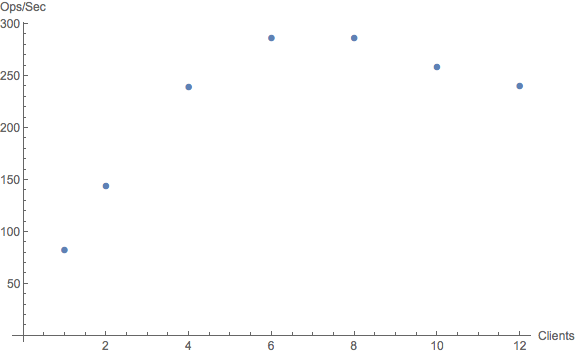
This result is visually apparent from the data alone, even without applying the USL regression model. The throughput reaches a maximum and then becomes retrograde, i.e., the throughput decreases with increasing load!
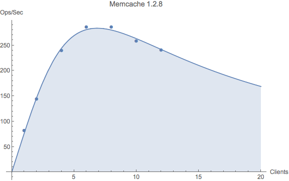
To see how this looks numerically, we obtain the ABC values from the USL regression analysis.
A = 76.73
B = 0
C = 0.021284
Here, we see the converse result when compared with Varnish scalability: no contention cost but a non-zero coherency cost. Clearly, this value of the C parameter points to some kind of exchange between requestors and responders—- most likely data, since it’s key-value pairs. Keep in mind that these ABC values characterize an average flow of exchanges in the system, not any particular instantaneous exchange.

A remedy for the release 1.2.8 problem was found for version 1.3.2 that involved modifying certain hash table structures. Although the peak in the scalability curve was not eliminated completely, it was moved out to about 40 or 50 client threads. That’s an order of magnitude improvement! Definitely a benefit of analyzing costs, quantitatively. More details can be found in our Velocity presentation
Tomcat
Both of the preceding examples were based on analyzing controlled performance measurements of the type obtained from a testing rig. What about determining scalability in a production environment? Good news! If throughput and response time data can be captured, the USL can be applied. That indeed turns out to be the case for Apache Tomcat, which is a Java-based application and therefore provides a JMX interface. Once we have the sampled throughputs and response times, we can employ Little’s law to determine the number of concurrent threads, if those measurements happened not to be captured.
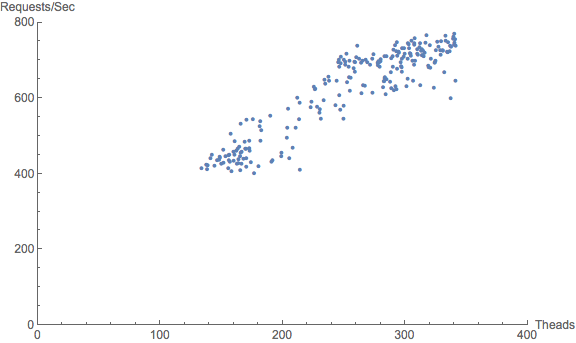
The first plot shows the raw data as a function of the number of active threads, where each web user is assigned to a thread. Squinting slightly, one can imagine that this data cloud might represent a portion of an as-yet undefined throughput curve. Notice that there is no data at low load (near the origin), as was the case for the Varnish and Memcache examples. This can happen with web services in particular where, during a 24-hour business cycle, a finite number of users are active in some time zone. The number of users never gets anywhere near one or none. In this case, there are never fewer than about 100 active threads. Moreover, the plot contains almost 300 thread-throughput data pairs, and statistical regression loves more data.
The next plot shows the result of performing the USL regression analysis. Indeed, it is now quite apparent that the data cloud does is a portion of a throughput profile for which the USL represents the statistical mean.
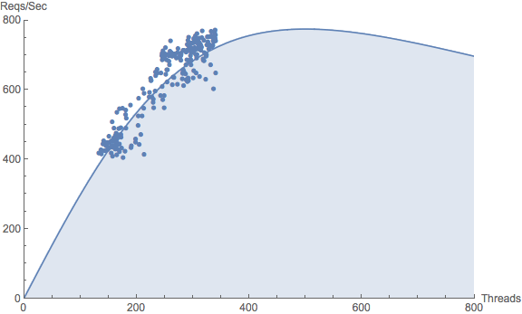
The ABC values for these Tomcat data are:
A = 3.0966
B = 0
C = 0.000004
Interestingly, there’s a lot of similarity with the Memcached data in that there are no scalability losses due to contention costs (i.e., B = 0). Since the architectures are totally unrelated, this is probably nothing more than pure coincidence. Moreover, the coherency cost (C) is many orders of magnitude smaller than it is for Memcached. So, although there appears to be some coherency cost it is very tiny and may not be worth the investment in an engineering effort to improve it. Assessing engineering costs are yet another advantage of doing quantitative analysis. This USL analysis shows that Tomcat scalability is ultimately expected to peak at around 500 threads.
Summary
The above examples just give a flavor of what you can achieve by applying the USL to quantify application scalability. Other distributed systems that I have analyzed include Hadoop and Zookeeper. Links to the R scripts that I used for the above examples, as well as other performance and capacity management resources, are available from my github repo.
