I recently redesigned my personal site and the first version was very lean. As I started adding content to pages and writing new blog posts, it made sense to implement image lazy-loading to improve performance.
There are many JS-based solutions for image lazy-loading but I did not want to invest time in finding the best one. So, I quickly decided to go for native lazy-loading.
Browser support for native lazy-loading is currently limited but support in Opera and Chrome is good enough for me.
Implementing native lazy-loading is easy: simply add loading="lazy" to img elements. Awesome!
I commited the change, deployed my Eleventy-powered site to Netlify and then tested how images load in Chrome. I was disappointed.
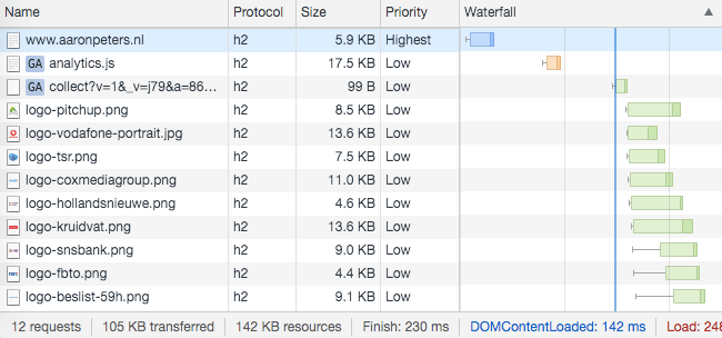
Chrome fetches all the images on my homepage on page load, while none of the images are above the fold on mobile and only some on desktop.

What is Chrome’s native image lazy-loading logic?
When does Chrome decide to fetch a below-the-fold loading="lazy" image?
Being disappointed with what I saw on my own site, I set out to find the answer to this question, like so:
- find a very long blog post that has
loading="lazy"images at the bottom: An In-Depth Tutorial of Webmentions + Eleventy - load the page in Chrome, then clear the Network panel
- scroll down, a few hundred pixels at a time until those lazy-loaded images are fetched
- in console, get the value of
window.pageYOffset - scroll down until the top of the lazy-loaded images become visible
I see the lazy-loaded images being fetched at ~ window.pageYOffset = 8500 on desktop and they become visible at ~ window.pageYOffset = 11500. So, the image lazy-load logic of Chrome seems to be: if the image is 3000 or less pixels below the viewport, load it.
3000 pixels… that is a lot!
Load-in distance threshold
It’s always good to compare test results against the spec or official documentation.
I read the native lazy-loading explainer article on web.dev. The section Load-in distance threshold states:
All images and iframes that are above the fold�”that is, immediately viewable without scrolling�”load normally. Those that are far below the device viewport are only fetched when the user scrolls near them.
That section in the article also mentions the “distance threshold is not fixed and varies depending on several factors”. These factors include the type of resource being fetched (image or iframe), whether Lite mode is enabled on Chrome for Android and the effective connection type.
Thankfully, there is also a link to the relevant code in Chromium source: Lazy image loading distance-from-viewport thresholds for different effective connection types.
The code is easy to read and confirms my findings: if the effective connection type is 4g, Chrome will fetch images with loading="lazy" when they are within 3000 pixels of the current scroll position.
A Better Lazy-Loading Logic
On my 13 inch macbook, with Dock positioned on the left, the viewport height in Chrome is 786 pixels so images with loading="lazy" that are more than 4x the viewport down the page are eagerly fetched by Chrome on page load.
In my opinion, that is waaaaay too eager. Why not use a lower threshold value like 1000 pixels? Or even better: base the threshold value on the actual viewport height.
I will file a bug with Chromium soon and see where that leads.
If I would need to implement image lazy-loading on a high-traffic e-commerce site today, I’d very likely go for a JS-based solution. Partly because the native solution only works in Chrome, but also because Chrome’s implementation is too eager and therefore not so effective.
