
Matt Hobbs (@TheRealNooshu) is Head of Frontend Development at the Government Digital Service (GDS), a unit of the Government of the United Kingdom's Cabinet Office tasked with transforming the provision of online public services.
An experienced frontend developer, he is passionate about using his skills to build accessible and performant user interfaces. He makes a point of keeping on top of the latest technology and tools, and is interested in all aspects of interface development, and is a keen advocate for best practices.
There’s one tool that you immediately refer to if you want to capture data about your website’s performance. At first glance it looks quite unremarkable, but underneath the mid-2000’s GUI lies a literal treasure trove of data at your finger tips. I am of course, talking about WebPageTest. Originally developed by Patrick Meenan at AOL, it was open sourced in 2008 and is still developed by him today. On the surface, it may not look like much has changed with WebPageTest in the past few years, but under the hood there has been some exciting developments. And this is what this article is all about. I’m going to focus on one of the most recognisable, and arguably the most valuable parts, of WebPageTest for many users: the waterfall chart.
Many performance problems can be identified using waterfall charts. Do you have a bit of JavaScript which is holding up your website? Do you have large images that are using up all the bandwidth? Are your assets being properly cached when navigating between pages? Or maybe you’re interested in what difference one of the resource hints has on your page performance? These are all problems you can identify using a waterfall chart. Read on to find out more.
But first, how do you get to the waterfall chart? Here’s a quick tutorial for those who have never used WebPageTest before. If you have, feel free to skip ahead!
The homepage
Don’t let the homepage fool you. There’s a lot to discover beyond the old fashioned user interface.

It’s all fairly obvious, but it’s worth explaining a few settings before you start the test:
Test location
You can select a run agent from a number of locations across the globe. When doing this it is important to consider where the majority of your users are browsing from, then select the location that is closest. Latency and Round Trip Time (RTT) make a huge difference on web performance and is something you should always aim to minimise. Make sure you are simulating tests as close to what your users actually experience as possible, that way you can make informed decisions about the relative performance of the site.
It’s also worth remembering that not all users are on the latest top of the range hardware. The test location dropdown gives you the opportunity to measure your sites performance on a low spec device. To do this select “Moto G (gen 4)” from the test location before you run your test. This is a real device (not an emulation) that is sitting in Pat Meenan’s basement in Dulles, VA. The results from this device will allow you to identify performance bottlenecks in low spec devices, and in doing so improve performance for all devices.
Browser
Here you get to choose the browser you wish to test with, as not all browsers are created equal. Again it is important to look at any data you have about what browser your users are using. For example if 60% of your users are on Chrome, you’re going to want to be testing that!
Connection
It’s always a good idea to throttle the connection for tests, to give you a more accurate, real-world example of the performance your users are experiencing. There are a number of options from a 2G connection all the way up to native connection speed (i.e. no traffic shaping).
Number of tests to run
This setting is the number of times a test will run on the page in question. Each run is independent of each other (no shared cache), so you get to see a larger data set of how a user experiences the page when they first visit. Once finished WebPageTest will identify the median run for you, which will give you a good baseline to work from. The general rule is the more runs the better, but this will of course have an impact on the time taken for the tests to complete.
Repeat view
The repeat view has 2 options: “First View and Repeat View” and “First View Only”. This is a great way to test the page performance under cold cache conditions (First View Only), and warm cache conditions (First View and Repeat View). By selecting “First View and Repeat View” you get to test how well your caching strategy is working between page navigations.
Capture video
If enabled, WebPageTest will capture a video of the page loading on the agent which can then be analysed frame-by-frame if you so desire. This is a great way to identify issues like Flash of Invisible Text (FOIT) and Flash of Unstyled Text (FOUT), among many other page load performance issues.
Label
An optional input to add a note to yourself about what is being tested. Don’t worry, this can be edited later if you forget or make a mistake.
The waterfall chart user interface
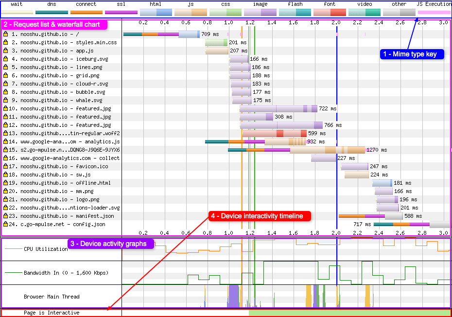
Here’s an example of the WebPageTest waterfall in all its glory. I’ve labelled a number of areas so I can go into more detail later in the article.
MIME colouring
First lets look at number 1, the MIME type key.

You will see set of colours (or colors for those from the US) listed horizontally. The first 4 colours represent an action that the browser is currently making:
- Wait : This signifies the point at which the browser has discovered an asset on the page (but not yet requested it). Two reasons browsers sometimes wait is because of the connection limit under HTTP/1.1 (6 connections) or slow network conditions under HTTP/2.
- DNS : The browser is making a DNS request to discover the servers IP address.
- Connect : The browser is negotiating a TCP connection to the server.
- SSL : Connection to the server established, now a secure connection (SSL) is negotiated between the browser and the server.
It’s worth noting that all the above actions must happen for each separate domain before a file request can be made.
Moving onto the thicker coloured bars, these represent different file types that are being requested by the browser. They are all fairly self explanatory:
- HTML : HTML request and response.
- JS : JavaScript has been requested.
- CSS : Cascading Style Sheet requested.
- Image : Image file requested (e.g. JPEG, GIF, PNG, BMP).
- Flash : Flash file requested (e.g. SWF).
- Font : Font file requested (e.g. WOFF, WOFF2, EOT, TTF, OTF).
- Video : Video file requested (e.g. MP4, FLV, MOV, AVI, WMV).
- Other : Any other file type requested (e.g. JSON, XML, webmanifest).
You may ask why each bar associated with downloading files has two colour tones, one light, the other dark. This is to signify when the browser has made the request (light tone) and when the browser is actually receiving file data (dark tone). Note: one of the more recent changes to WPT is it shows the actual chunks of data being downloaded so the darker tone may be split into several parts. This is called download chunking (more on this later).
Note: WebPageTest examines the MIME type of the response rather than the actual content of the file to classify what type of file it is. Only with fonts will it also examine the file extension to help with classification.
And finally, the last coloured bar:
- JS Execution : Display when the browser thread is executing the JavaScript.
I’ll write about this in more detail later in the article.
This functionality hasn’t always been available in WebPageTest. If you compare the current waterfall to the “classic” version (more on how to do this later), you will see a distinct difference:
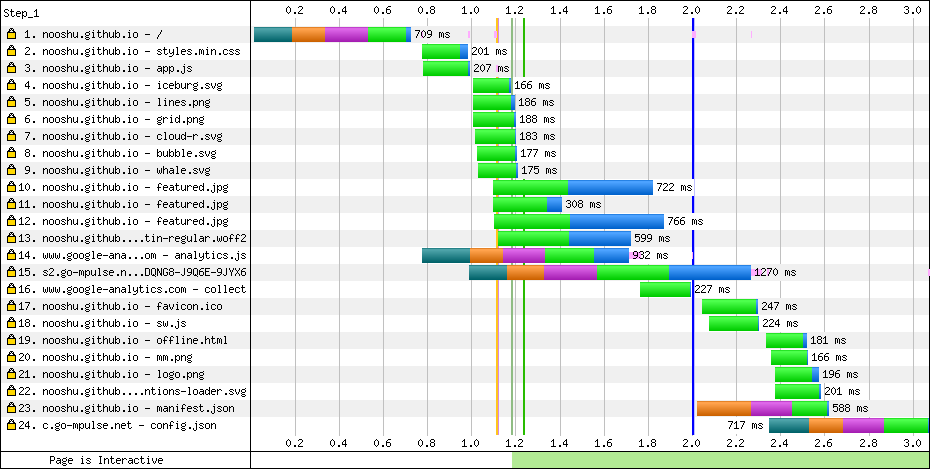
In the classic version there’s no colour distinction for each of the requests, and no MIME type key along the top of the chart. Just a simple set of 5 colours:
- DNS : The browser is making a DNS request to discover correct server IP address.
- Connect : The browser is negotiating a TCP connection to the server.
- SSL : Connection to the server established, now a secure connection (SSL) is negotiated between the browser and the server.
- Requested : A request for the file has been made by the server.
- Receiving : The browser is receiving data from the server for the file in question.
As you can most likely see, it’s much easier to quickly understand what is happening in the waterfall chart with the modern colour scheme.
It’s also worth noting that there are a few other visualisations that weren’t available in the “classic” version:
- Download chunks – See “Download chunks” section for more details.
- CPU Utilisation graph – Is the CPU busy or idle at a particular point in time.
- Bandwidth In graph – Rough estimation of when the page is doing useful work vs wasted time.
- Browser main thread – See “Script execution” section for more details.
Vertical lines
While we’re on the subject of colours on the graph, it’s also worth mentioning what the vertical lines mean, as they give you some real insight into how the page is performing. Again referring to our simple waterfall example:
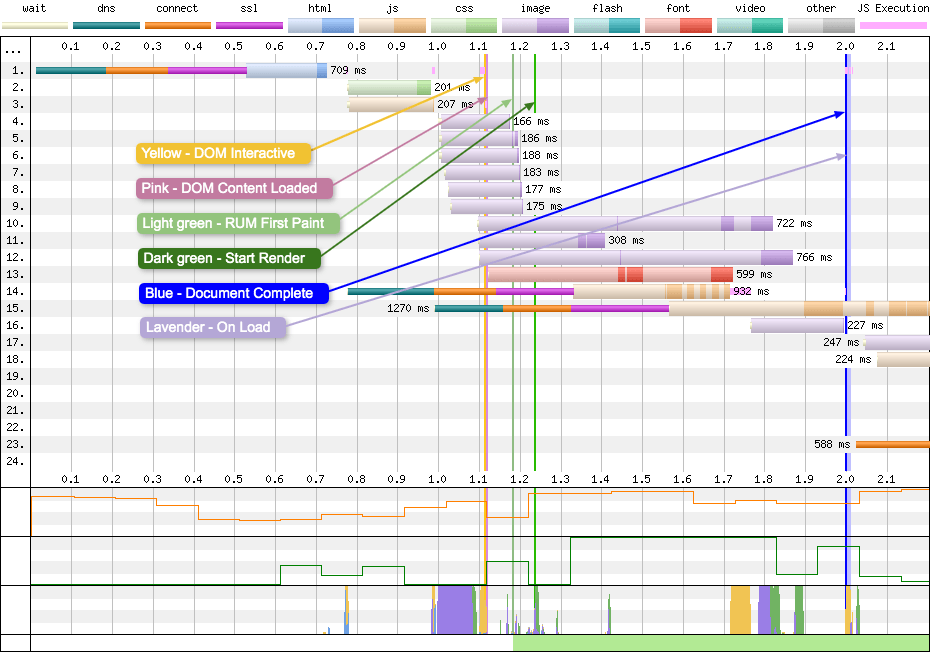
NOTE: For simplicity I have restricted the time the graph covers and hidden the label. See the “Customising the waterfall” section for more details on how to do this.
So what do each of the lines mean:
- DOM Interactive : The browser has parsed the HTML, DOM is complete. Not a reliable metric.
- DOM Content Loaded : HTML loaded and parsed, and the browser is at the end of the document. Blocking scripts have run and the DOM is fully defined.
- RUM First Paint : Point where browser renders anything to the screen, it is reported via the Paint Timing API.
- Start Render : Video is analysed to look for any pixels rendered to the screen. This is the point at which a user will see anything.
- Document Complete : Onload event has fired, image content has loaded but content changes triggered by JavaScript may not be included, for example
async/deferscripts may still need to run. - On Load : Window load event fires. All objects are in the DOM and all images and scripts have finished loading. On many websites JavaScript may continue to execute and change content after this point.
Notice how these vertical lines travel down the length of the page and cross the lower CPU, Bandwidth, and Browser main thread graphs. If you look closely you will see changes in these graphs happen at approximately the same time as these vertical lines, which gives you some insight into what effect the events behind each of these lines has on a device.
Wide DOM Content Loaded issues
As you can see from the waterfall charts above, the vertical lines are often very thin, maybe 1-3 pixels in width. This signifies that they took place over a very short time period. But in some cases the DOM Content Loaded (DCL) line expands to many times it’s expected size:
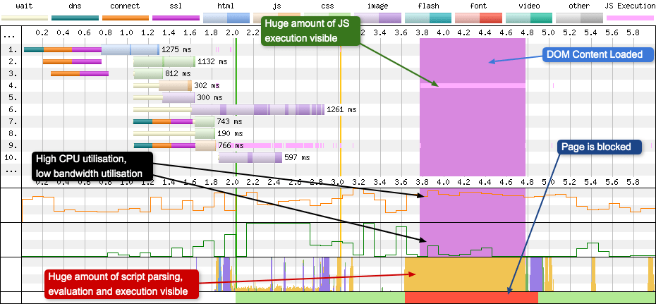
Looking at the width of the DCL line in the example above, it’s taking approximately 1 second to complete. In this time you can see the light pink line in request 4 which is a large amount of JavaScript executing over this period. This script execution is also reflected in the CPU utilisation graph, the browser main thread, and the Page is interactive visualisation (it is blocked, more on this later). Curiously, not much is happening in the bandwidth graph, so very little is actually downloading, the browser is choking on downloaded assets.
So what is actually happening? Well, there’s some very expensive JavaScript running in the file at request 4. Often this is caused by JavaScript attached to the jQuery $(document).ready() method (or some equivalent). So if you ever see a DCL line eating your waterfall chart, you now know where to look.
Download chunks
Staying on the subject of colours, but diving a little deeper into the requests, we come onto the subject of download chunks. If you look closely at some of the requests, you will see many thin slices of solid colour, almost like a barcode. These are download chunks.

In the waterfall chart, requests 10, 14, and 15 are where you see the most chunking occurring in this specific test. What’s happening here is the server is sending data in small distinct chunks from many files in parallel. This is particularly helpful for HTTP/2 connections where prioritisation can mean a resource is downloaded in fits and starts. The browser gathers the small chunks together and combines them into a single large file at the end of the response.
I have also highlighted the device bandwidth graph at the point where the connection is saturated, as this is where we are seeing lots of chunking. This isn’t a coincidence, they are directly related. By sending many different files at the same time, the server is maxing out the connection. The fact there’s no wasted time on the bandwidth chart is a good thing, but chunking resources can be good or bad depending on the resources being downloaded. Some resources (e.g. progressive JPEGs), can be used while partially downloaded, so downloading several JPEGs at the same time is a good thing. Other resources, like CSS and JS are only useful once the whole file has been downloaded, so it would be better if these resources were given the full bandwidth rather than it being shared between others.
If you have a spare 2 hours and 42 minutes I recommend watching Pat Meenan’s talk from Velocity 2019 about HTTP/2 Prioritisation to learn a lot more about download chunks and many other interesting HTTP/2 topics.
Script execution
I mentioned script execution earlier in the “MIME colouring” section. JS Execution can be seen in pink right after a JavaScript file has fully download, has been parsed, and is being executed by the browser. I’ve chosen a different waterfall chart to illustrate the point better, one that has a heavy reliance on JavaScript:
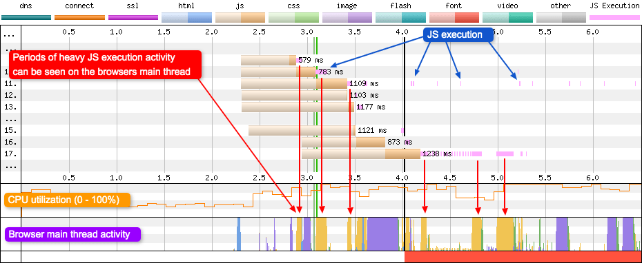
As you can see from the waterfall charts there’s a fair amount of JavaScript being executed on this page. Each pink line signifies that the script is executing at that point in time. This can either be intermittently as seen in request 11, or in a heavy block as can be seen in request 17.
Notice how for periods of heavy JavaScript execution, it is reflected in the browser thread activity graph. At these points in time the browser is completely focused on executing the script. If you look closely as well at the CPU utilisation graph you will see it reflected there too. Periods of heavy JavaScript execution activity usually trigger high CPU usage. If you are wondering what all the colours mean in the browser thread activity graph, there’s a useful key below:
- HTML parsing : The browser is taking the HTML and extracting the relevant information to build the page.
- Layout : Calculate the exact position and size of an element within the viewport.
- Painting : Renders pixels to the screen.
- Script parsing, evaluation and execution : JavaScript is read and turned into something that’s meaningful to the device, then run.
Blocked time vs Interactive periods
At the very bottom of the WebPageTest waterfall chart you will see the “Page is Interactive” visualisation. I’ve selected a different waterfall with multiple blocking periods to illustrate what is happening.

In the chart above you can see both interactive and blocked periods. So what does “blocked” actually mean? The red blocked periods are any point where the main thread is blocked (including from input) for 100ms. These blocking periods can be made up of one very long event, or lots of separate 100ms events that merge to look like a single long event. In this blocking period page scrolling should be fine, as this is handled off the main thread for most browsers. Clicking could be delayed, but not necessarily for the full duration of the red block.
Notice how blocking periods seem to correspond with script activity on the browser main thread. In the purple highlighted area you can see lots of script activity and high CPU usage, but very little bandwidth utilisation. This shows that whatever is being executed has already downloaded, maybe earlier in the waterfall or cached by a previous page navigation. If you look very closely you can see some small spikes of green after the script activity completes. This tells us that whatever this script is doing, it is causing a page paint.
Example issues
So here are just a couple of examples of what you can identify using the WebPageTest waterfall chart:
OCSP validation
Online Certificate Status Protocol (OCSP) is an internet protocol used for obtaining the revocation status of a digital certificate. In some situations a browser will send a request to a OCSP responder to see if a sites certificate has been revoked. This can be seen in the sites waterfall chart:
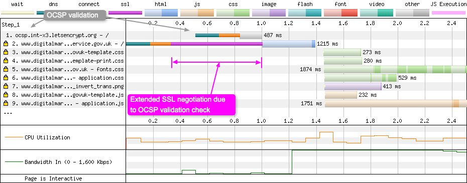
In the example above, you can see Firefox making a request to the OCSP responder (request 1) while the connection to the origin server is being established. The SSL negotiation cannot complete until the browser receives a response from the OCSP responder, and this is why it takes almost 700ms to complete on a 3G Fast connection (used in the example).
The second example below shows Chrome (on 3G Fast) using OCSP to validate an Extended Validation (EV) certificate. This is something it only does for EV certs. As you can see this requirement has a large impact on the SSL negotiation time, 883ms in this example:

Note that the use of OCSP stapling will not save you from the performance impact in this situation, as it is a check that Chrome chooses to do with EV certificates even with stapling enabled. But this may be switched off in Chrome soon as they’ve pretty much given up on EV certificates.
Customising the waterfall
Now we come to customising the waterfall. All the images in the above article have used this powerful, yet fairly hidden, feature of WebPageTest. Some webpage waterfall charts are just ridiculously long which makes them quite unwieldy. Wouldn’t it be great if you could remove the noise and only focus on the parts of your test that illustrate your point? Thankfully you can by using the “customize waterfall” link that sits below the waterfall UI:

With this feature we can customise the image from the huge waterfall chart above and make it into something a little more usable:
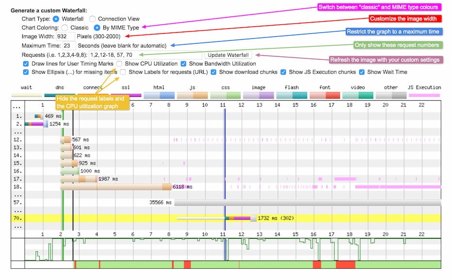
Here we’ve taken a waterfall chart with 528 requests and cherry-picked the request numbers we’re interested in. We’ve also restricted the maximum time period the graph covers to 23 seconds, and set a custom image width. With the checkboxes we’ve disabled the request labels, giving the actual waterfall visualisation more room, and also hidden the CPU information graph.
Some of the article topics discussed above can be seen in the customisation panel. You can select between the “classic” colours and the MIME type colours as mentioned in the “MIME colouring” section. Or you can choose to hide the download chunks, or the JS Execution chunks, both of which were discussed earlier. At this time the “Page is Interactive” visualisation can’t be hidden. Once you’ve completed customising the waterfall chart simply save the image as you would any other image.
Looking closely at the top of the waterfall customisation settings you can see “Chart Type: Connection view”. We haven’t mentioned this separate waterfall chart yet, so I’ll give you a very quick overview now.
Connection view
On the surface, the connection view looks similar to a standard waterfall chart. However there’s one major difference. With the Waterfall chart, the numbers along the left hand side represent individual assets being downloaded, but in the connection view they represent individual TCP connections:

In the example above there are 4 TCP connections. One is an OCSP check so it can be ignored. The other three are opened and used by the browser to download page assets. As you can see as time progresses from left to right, each connection is being used at some point in time to download different assets. This is an excellent browser optimisation as opening TCP connections is expensive, so being able to reuse ones that are already established, saves a lot of time and resources. So by looking at the connection view you can quickly see how many connections the page is opening and look to optimise this if required.
Now we understand a little more about the connection view, what other web performance considerations can be identified by using it?
HTTP/2 connection coalescing
Under HTTP/1.1 a browser would typically open 6 TCP connections to a single domain to allow multiple assets to be downloaded in parallel. To allow more downloads at the same time, domain sharding was introduced. You could have 6 connections to one domain, then another 6 to a sub-domain. It worked well in the HTTP/1.1 world.
HTTP/2 changed all this by introducing streams and multiplexing over a single TCP connection. Suddenly having domain sharding becomes an issue because multiple TCP connections need to be established, and since they are independent connections, the browser can’t prioritise correctly between them. This is where HTTP/2 connection coalescing comes in. There’s a great article all about connection coalescing here if you are interested, but a simplified TL;DR is: if the domain and sub-domain share similar properties, the browser does not need to open a second connection – it may reuse the first. All content from coalesced domains can be transferred over the single shared connection. However browser support is flakey and error prone.
Looking at the connection view you can identify when coalescing is happening:

It’s slightly hard to see due to the ellipsis in the middle of the labels, but on row number 1 the domains en.wikipedia.org, login.wikimedia.org are being coalesced. When setup correctly, this allows you to have the best of both worlds. For HTTP/1.1 you can continue to use domain sharding. For HTTP/2 you get the correct prioritisation over a single shared TCP connection.
Cross-origin webfont downloads
Where would the web be without webfonts? Well, it would be a lot more performant but nowhere near as pretty. When it comes to downloading webfonts the origin they sit on has a significant impact on web performance. This is because:
The font-face specification requires that fonts are loaded in “anonymous mode”.
When you preload your fonts or preconnect to the domain, always remember to include the crossorigin attribute. You must do this even if the fonts are on the same origin as the page. If you don’t do this the fonts will be fetched twice: once by the preload, then again by the browser when it has opened the “anonymous mode” connection it needs.
The crossorigin attribute will force the browser to open an anonymous TCP connection that is then used for all assets that require “anonymous mode”. An example of this in action can be seen below:

WebPageTest doesn’t specifically use the word “anonymous” in the request details modal (opened by clicking on a request in the waterfall). But under the “request” tab you will see sec-fetch-mode: cors which indicates that the request is being downloaded via a CORS-enabled fetch method. To setup this “anonymous” connection a preconnect header was used that looks like this:
link: <https://fonts.gstatic.com>; rel=preconnect; crossorigin
So, remember to look at the connections view graph when optimising your website performance, as it will give you a more complete picture of what the browser is doing under the hood.
If you are interested in learning more about the ‘Connection View’, I’ve written a blog post all about it here: ‘How to read a WebPageTest Connection View chart’.
Anything else you should know?
WebPageTest isn’t the only place you can find waterfall charts, every modern browser has them (usually under the network tab in their developer tools). But I find WebPageTest’s clearer and easier to understand, with a whole host of more information available. WebPageTest’s also comes with the added advantage of being sharable, which is a very useful feature when debugging issues. If you want to keep your test private you can host your own instance and integrate it into your build pipeline. Interested in your pages Lighthouse score? It can run that at the same time if required. If you want a history of your sites’ performance over time, you can run tools like SpeedCurve which will run tests automatically for you every day. It has many different settings available that you can configure to get the most out of your WebPageTest data.
Looking to find out more about WebPageTest? Check out “Using WebPageTest” by Rick Viscomi, Andy Davies, and Marcel Duran. Andy also has a number of blog posts dedicated to some of the more advanced features of WebPageTest. Or if you are looking for a similar article to this, but with a few more WebPageTest waterfall scenarios, I’ve blogged about them here.
Summary
At first glance, the waterfall chart and connection view can look quite complex and intimidating. But once you understand the basics they become less scary and incredibly useful. Hopefully this article has helped explain some of the intricacies of both, and made it a little more digestible. Thanks for reading.
