

Peter Hedenskog (@soulislove) works in the Wikimedia Quality and Test Engineering Team at the Wikimedia Foundation. Peter is one of the creators of the Open Source sitespeed.io web performance tools.
Many years ago my former colleague Gilles Dubuc wanted to know if Wikipedia users’ performance gets faster over time so he added a new metric: The CPU Benchmark. Essentially it’s a JavaScript loop that runs for a small number of our users. By collecting how long time the loop takes we have a metric that measures the speed of our user’s device. Understanding device speed helps us ensure Wikipedia is accessible and performs well for everyone, no matter their device. The actual number is interesting when we compare it to other users or specific devices.
The idea from the beginning was that maybe, if we just let Wikipedia alone, the user experience would be faster over time because of people adopting new (faster) devices. Or at least we wanted to measure if that could be the case.
Over time we tuned what we do with the data and today we use it to compare the CPU speed for users all around the world. That is important because of the Wikimedia’s vision:
By better understanding if people have different device speeds, we can adjust our content so that all people have the same access and experience to knowledge. It’s also important to know about the speed so when we test for performance regressions, we want to match our tests to match the users with the low end devices. That way we know that if it works good for those users, it also works fine for users with faster devices.
To better understand the CPU benchmark metric we have also measured the metric on a couple different mobile devices, to get a better feeling of what we need to use to get the same experience as our users. In our graphs you will see the metric for iPhone 6s, a Moto G5 and a Samsung A51.
So what do you think the device speed looks like for our users? Today I want to look at the data we have for three countries: the United States, India and South Africa. I chose these three countries because I know there are some differences between them. Let’s start by looking at the speed of users from the USA on our mobile version of Wikipedia.
But first: In the graphs you can see the CPU speed of the 50, 75 and 95 percentile of our users. The 50th percentile is like the midpoint. Half of our users have a speed that’s faster than this, and half are slower. The 75 percentile means that 75% of the users have a faster speed than that metric. And 95 … yes I think you get it.
CPU benchmark for USA users
Lets checkout a graph of the data.
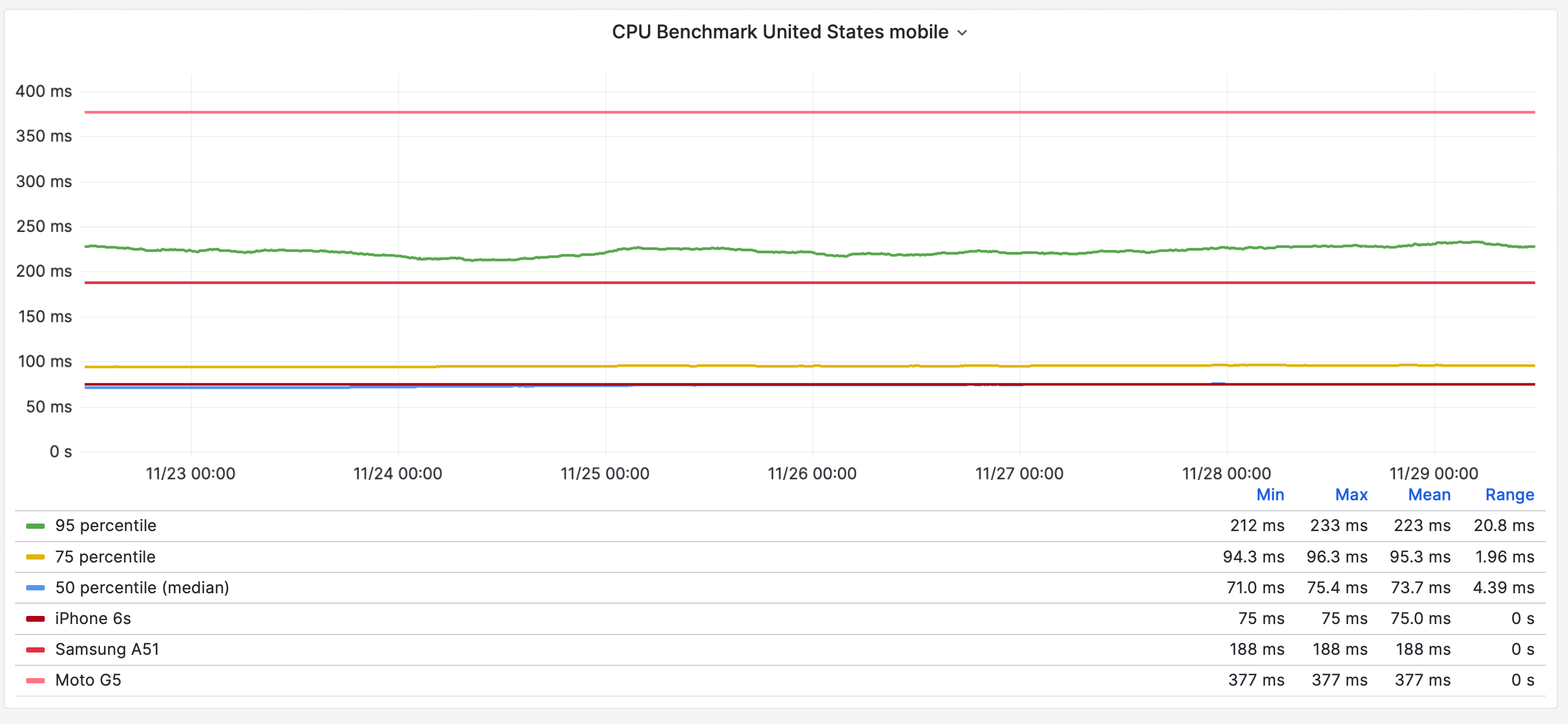
We plot the 50, 75 and 95 percentile and then the different phones. We can see that 50% of the US users have a CPU speed faster than an iPhone 6s. We can also say that almost 95 % of the users have a faster speed than a Samsung A51. There’s not so much more to say about the data in the US, let’s look at users in India and compare.
CPU benchmark India users
Let’s just dive into the graph.
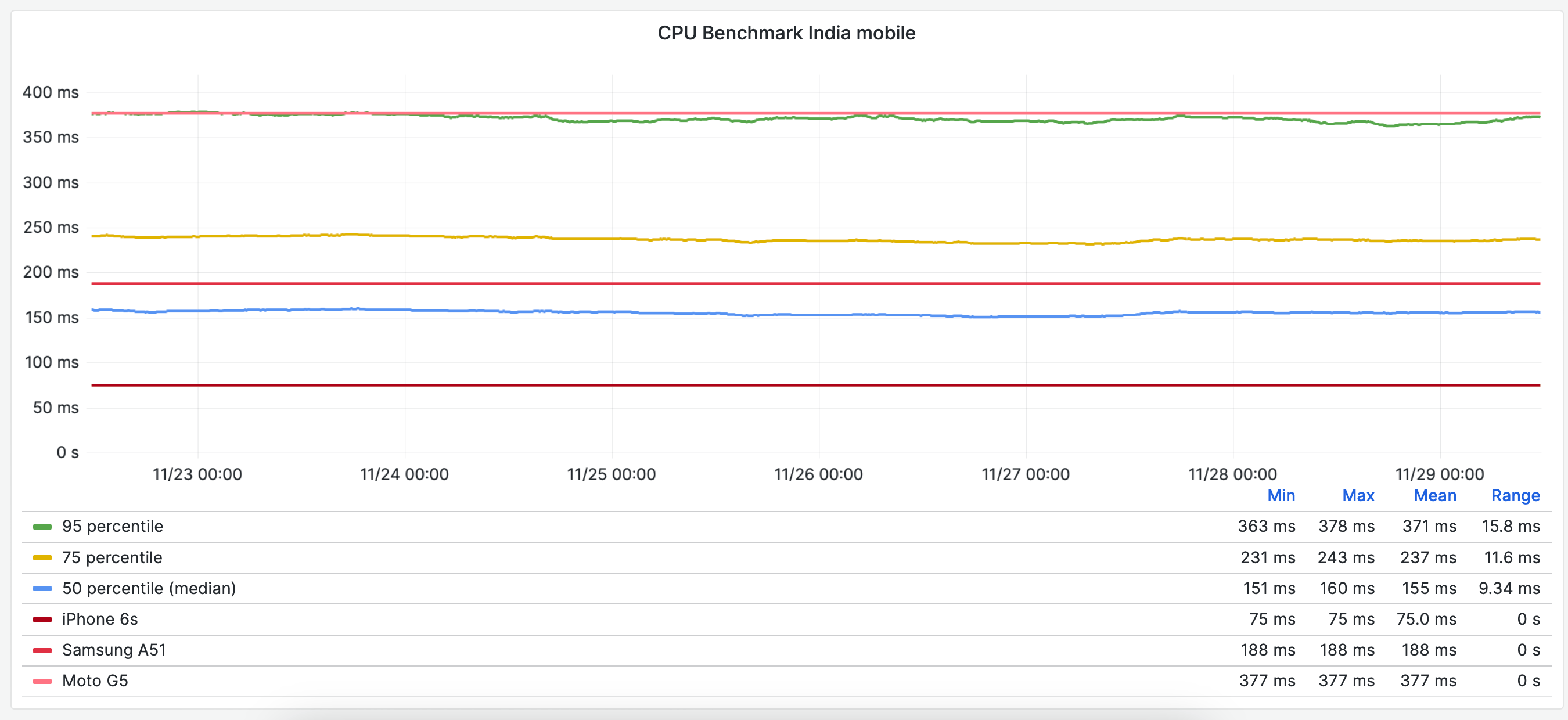
Here we can see something different than for the US users. The 95 percentile hit the Moto G5 metric meaning 5% of the users have slower CPU speed than the Moto G5. That means that if we as developers want to test the experience for the users with the slowest devices, we need to test on something slower than a Moto G5. And we can also use the metric that if we run tests on a Moto G5 and we do not get any performance regressions we know that for at least 95% of our users in India, we will not change the user experience.
We can also see that the median and 75 percentile is higher than in the USA. Users in India have slower devices than users in the USA.
CPU benchmark South Africa users
The last country I want to look at is the users in South Africa.
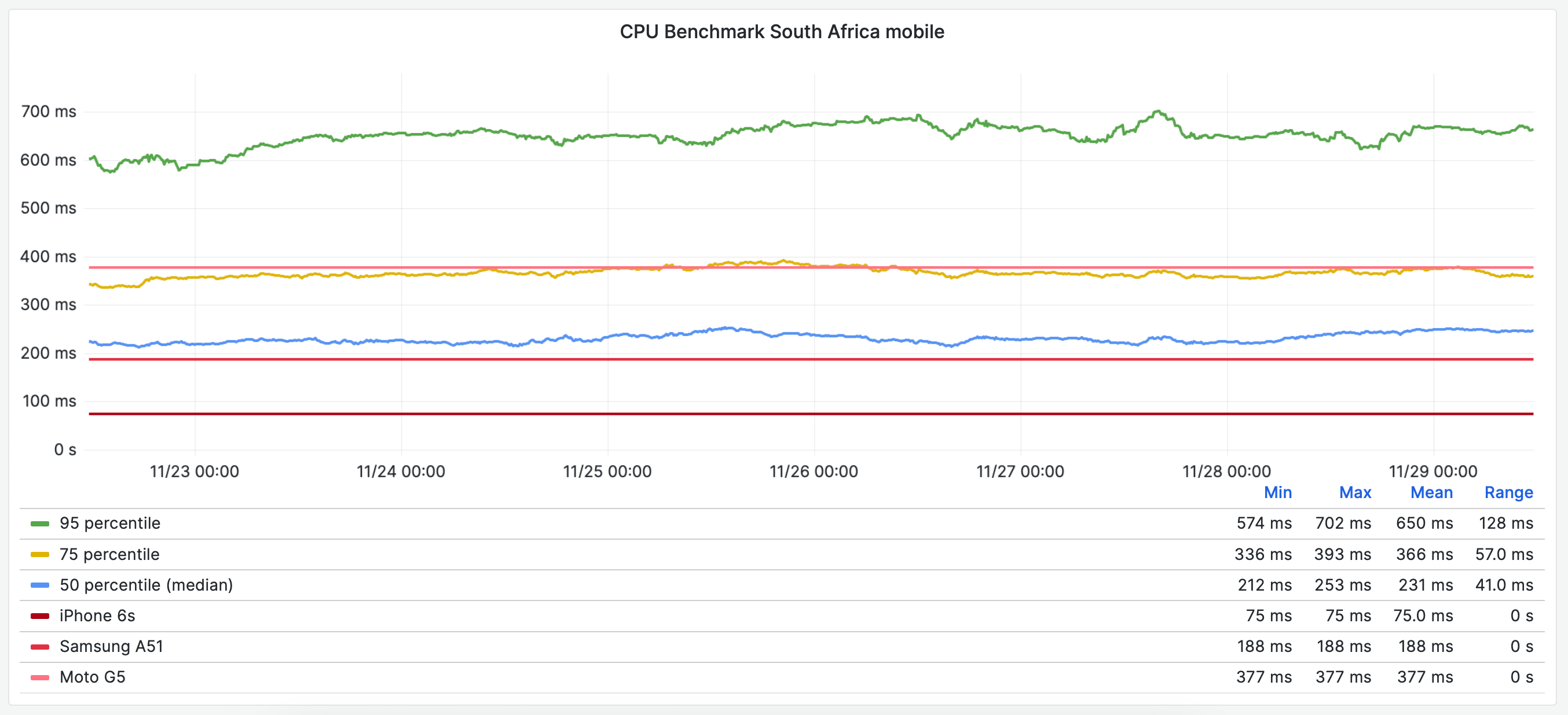
First thing that stands out for me is that the 95 percentile here is much higher than for the other two countries and they do not match any of the test phones we use. That is interesting because to test for performance regressions for those users we need to have a strategy/phones that matches the benchmark.
We can also see that the 75 percentile matches the Moto G5, meaning that 25% of the users in South Africa have worse CPU speed than a Moto G5. To make sure these users have the same experience as our other users we need to be sure to test on slower devices.
Summary
I would say there’s a big difference between the CPU speed for our users depending on where you are in the world. Users from the USA have overall faster devices than users in India and South Africa. Looking at all the graphs you can say that something like 95% of our users in the USA have a faster speed than 25% of the users in India and 50% of the users in South Africa.
From a perspective of giving users the same access to free knowledge there is probably room for improvements to make sure all users are independent of the speed of the device. Maybe we should look at solutions where we ship different content to different users.
There’s also a gap in our performance testing, to test as our users with the slowest CPU speed we use too fast devices. At least if we want to feel the same performance as the 5% of our users in South Africa with the worst CPU speed. Here I have some work to do as a performance tester 🙂
Do you want to dive into the metrics yourselves? Our data is open, you can checkout our CPU benchmark graphs at https://grafana.wikimedia.org/d/cFMjrb7nz/cpu-benchmark and use the dropdown at the top of the page to switch between countries.