Stoyan (@stoyan.org) is currently consulting for Etsy, Previously of Webpagetest.org, Facebook and Yahoo, writer ("JavaScript Patterns", "React: Up and Running"), speaker (dotJS, JSNation, Performance.now()), toolmaker (Smush.it, YSlow 2.0) and a guitar hero wannabe.
Let’s talk about font fallbacks and how we can craft these to to perfection in order to reduce layout shifts and our users’ headaches. Who among us has not experienced the horrors of clicking the wrong thing because stuff moves? Arghhhh! I’ll start with a brief intro and then focus on lessons learned (the hard way) and a new tool.
In the olden times…
Gone are the days when this was considered a proper fallback for web fonts:
body {
  font-family: CrazyFont, system-ui, Helvetica Neue, Helvetica, Segoe UI, Arial, sans-serif;
}
Well, “gone” is maybe an exaggeration vis-a-vis the days, but gone they should be. Why? Layout shifts.
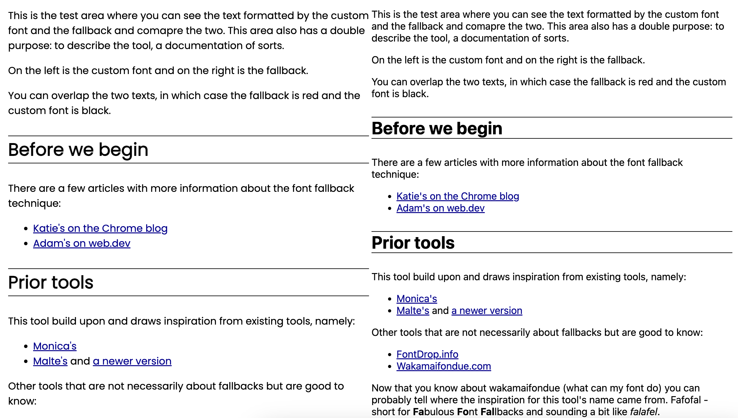
Consider this example of text rendered with Poppins on the left and Arial on the right.

The fallback text takes very different “rectangle” on the page and, when replaced with the webfont, a layout shift occurs, hurting your CLS metric and, worse, hurting your users by making them click the wrong thing.
Today
We have a better way to do fallbacks today, thanks to 4 CSS font descriptors: namely:
ascent-overridedescent-overrideline-gap-overridesize-adjust
Unlike in the olden times where our fallbacks target DOM nodes (e.g. body) now we target @font-face declarations and the fallbacks apply to any and all DOM nodes, weight, styles, line-heights and so on. An example:
@font-face {
  font-family: fallback;
  src: local("Arial");
  ascent-override: 89.7%;
  descent-override: 35%;
  line-gap-override: 10%;
  size-adjust: 111.66%;
}

body {
  font-family: CrazyFont, fallback, sans-serif;
}
The trick is using local() to point to a font the user already has installed locally (which comes with the operating system) and tweak it from there to match the webfont.
There are various tools that can help you figure out the actual % values, some more manual and some automatic (my Malte Ubl) and a even a build-time one by Nuxt.js.
(Honorable mention is due to Monica Dinculescu’s tool but it’s in a different category as it still targets DOM rather than @font-face)
For a comprehensive write up on this technique, see Katie Hempenius’ article.
Future
With this piece of background out the way, for the rest of the article let’s focus on:
- How we can do even better
local()troubles- Safari’s partial support
- A new tool, largely based on Malte’s, but also borrowing ideas from Katie and Monica
How we can do even better, or “That’s enough Arial!”
One problem I see when people implement this technique is just using Arial for any and all sans-serif fonts. The assumption is that Arial is everywhere. This, as it turns out, is not true. For example Arial is missing from some Android distributions. Arial is a commercial font and some device manufactures reduce the price of their devices by saving money on Arial licenses.
One improvement I’d like to humbly suggest is that we can use other fonts that more closely match the custom webfont out of the box. For example Avenir, Calibri and so on. And additionally why stop at one font? Use as many as we can reasonably expect to be installed on each OS. Because while users do have local fonts, the fonts are not the same on each OS.
For example if your webfont is of the “Geometric Humanist” type, use one Avenir @font-face fallback for Mac OS, a Corbel one for Windows, and so on. So you end up with something that looks like:
@font-face {
  font-family: FallbackMac;
  src: local("Avenir");
  ascent-override: 98.7%;
  /* ... */
}
@font-face {
  font-family: FallbackWindows;
  src: local("Corbel");
  ascent-override: 87.6%;
  /* ... */
}

/* more OSes here, e.g. Linux and Android */

body {
  font-family: CrazyFont, FallbackMac, FallbackWindows, /*...*/ sans-serif;
}
“Geometric Humanist” I hear? What’s that? To find out, head out to modernfontstacks.com for an invaluable insight into different font face types and their OS support. Pick a category your webfont falls into and see which fallback is supported on which OS. Amazing!
If you can’t tell the type of your webfont (Humanist? Grotesque?) there are tools by font libraries (example) that let you upload an image and they try to match the image to a font from their collection. Look at the provided options and you’ll probably get a hint. The other approach is trial and error and staring at characters until you like the result. Fair warning: once you start on this path, there’s no way back. You’ll be inspecting the roundness of os and the shapes of as and fs for the rest of your life.
So. That sounds great. Pick your 3-5 fallbacks (maybe add Arial for good measure), tweak them using one of the tools and take the afternoon off with the warm feeling that you’ve reduced layout shifts (and users’ suffering!).
Sigh… I wish it was that easy.
local() woes
The src: local() is a strange beast. It’s browser- and OS-dependent. Some frustrations:
- Using
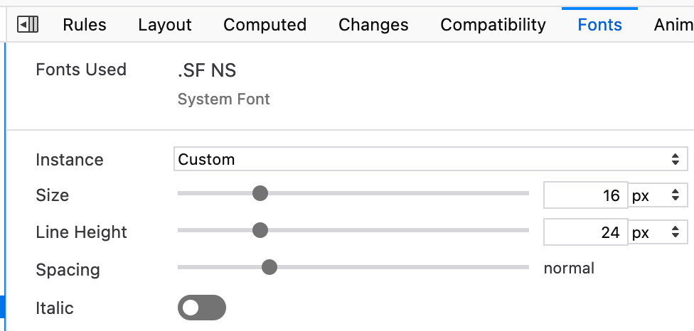
font-family: system-uion a Mac gets you an elusive font, awkwardly named.SF NS, slightly confusing with another Apple font called “San Francisco” but which should probably be referred to as “System Font”. All that aside, you cannot use it withlocal(). Please prove me wrong, but I’ve tried all kinds of combinationslocal('.SF NS'),local('System Font')and so on to no avail. Hopefully a future OS update will fix this.


- Similarly
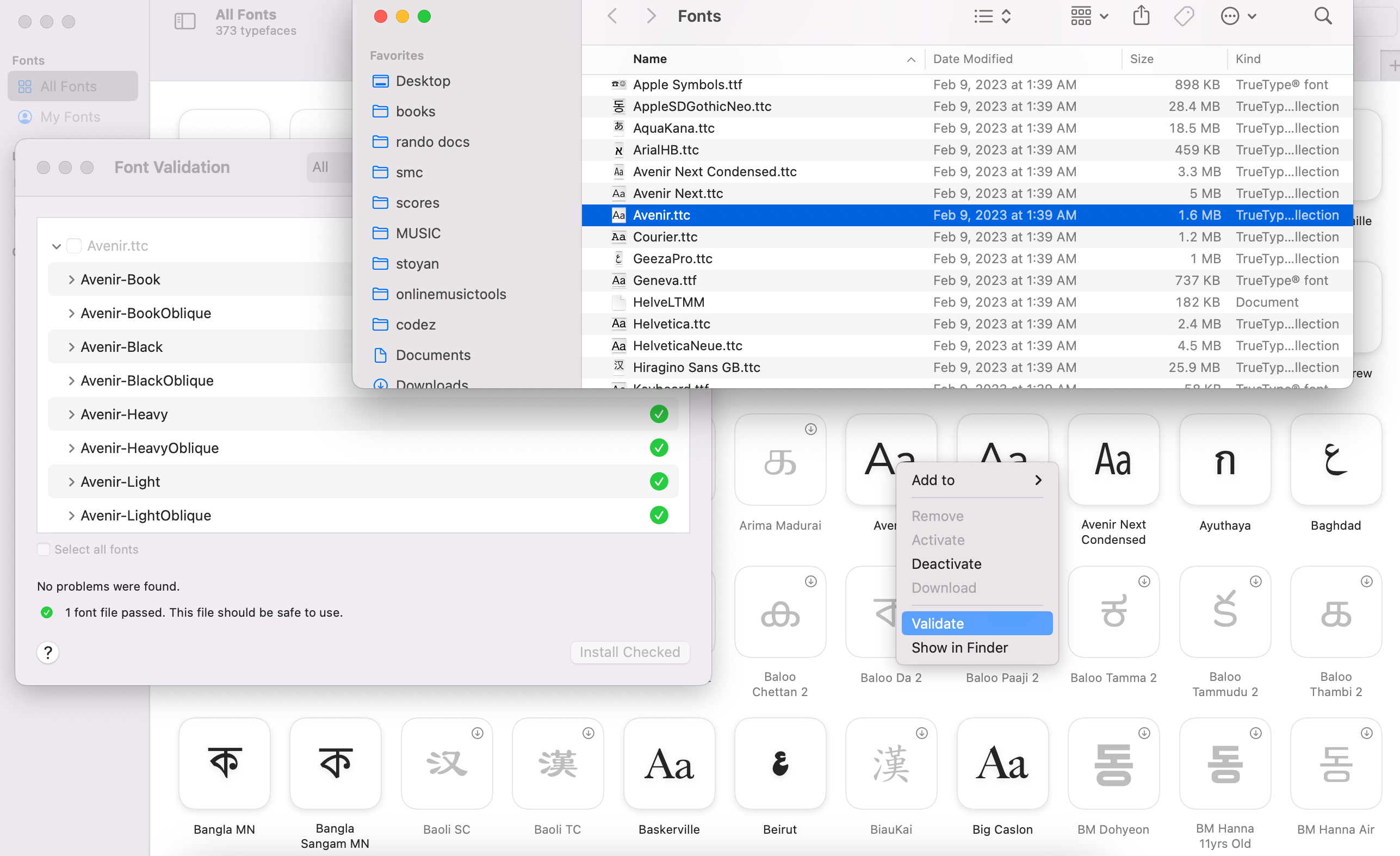
font-family: Avenirworks butlocal('Avenir')does not (in Chrome, it does work in Firefox). My best guess is that this is due to the difference between a font family and a font collection. You can pop your FontBook app (on a Mac), right-click a font and choose “Validate” to see what’s in a collection. Also in Finder you can note the.ttc(collection) file name vs.ttf(family).

I guess local(Avenir) works in Firefox because Avenir Book is the first in the collection and it gets picked up, where Chrome is more strict and expects an exact font family name. Even without local but rather font-family, you can see how Avenir Book is the actual font being used. Avenir is not a font, but a collection of fonts.

So how do you pick a local font? Trial and error, my friends, trial and bloody error. I wish I could help more but the most I can do is warn you about the dragons that be there.
Safari, or “Just one more thing…”
Some background: look at the descriptors: ascent-override, descent-override, line-gap-override, size-adjust… One of them is not like the others. The first three can correct the font height, while size-adjust is the only one that can tweak width. But size-adjust also does height as it’s an aspect ratio and if you want to make the font wider, you also make it taller. Since size-adjust is the only width tweaker, you must use it. But then you need to corect the height using one (or all) of the other three. More on this in a bit.
The problem with Safari is that it only supports size-adjust. Adjusting the size without correcting the height will more often lead to worse results than not doing any adjusting. So Safari needs to be excluded from these tweaks.
You’d think that’s easy these days thanks to @supports. But no. Font descriptors (as opposed to CSS properties) are not supported by @supports (but there’s hope). There are (at least) three solutions, all of them imperfect, so choose your poison:
- Browser sniffing on the server. Eww, browser sniffing stinks.
- JavaScript
if ('ascentOverride' in new FontFace(1,1)). Gah, JavaScript in the critical moment of providing a fallback during initial loading. - Indirect CSS
@supportsby choosing a property supported in FF and Chrome but not Safari. Not ideal but certainly simplest, e.g.
@supports (overflow-anchor: auto) {
  @font-face {
    /* works in Chrome, Edge, FF, but not in Safari*/
  }
}
Hello Fafofal tool
Say hello to Fafofal (Fabulous Font Fallbacks), a new tool to help you with your @font-face locals.
It’s largely inspired by Malte’s tool with some visualization ideas from Katie’s article and Monica’s OG.
Malte’s tool brute forces the discovery of size-adjust (to determine ideal width) and then does the same for ascent-override to correct the height. Katie’s article suggests that this approach is less than ideal and we should use the font meta data (which contains info about ascent, descent and line gap) instead. That would be ideal, but not completely practical because of the aspect-ratio-changing size-adjust.
In my tool I start with meta data, then calculate size-adjust and then correct the height. Finally, you can tweak the ascent-override manually to make the baseline of the characters match and the descent-override is updated in the opposite direction to keep the same height.
Here are some of the improvements over Malte’s tool that I thought useful:
- Use font metadata for initial overrides
- Take
line-gap-overrideinto account - Take any font, not only Google fonts
- Simpler
size-adjustcalculation (it’s a ratio, so no need to brute-force) - Better text used to measure the width that represents the average character distribution in English rather than Lorem Ipsum.
- Improved results eyeballing: flash layout shifts like Monica’s tool and overlay fallback on top of custom font
The code is on Github if you’d like to tweak and/or reuse and/or improve. For example, I think the baseline tweaking can be automated by using the Canvas API.
Is it perfect?
Is it an ideal solution? No, it really depends on the actual text being rendered. Not all texts on your page match the average distribution of letters in English, so the width may not be perfect. Wider containers will have a better chance of not moving a word to the next line.
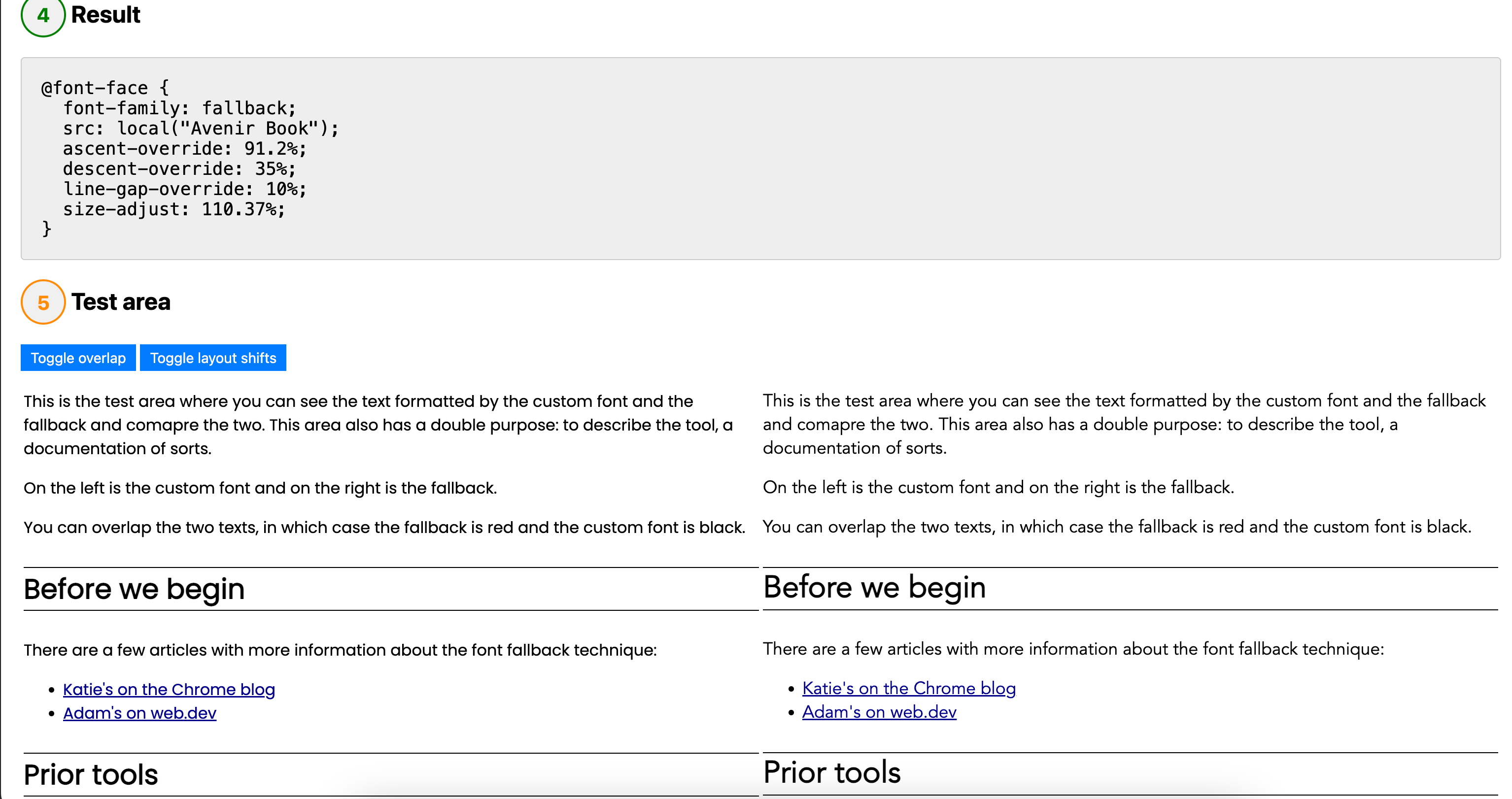
But if you chose your local() carefully, you can be very very close. Here’s an example of Poppins on the left and Avenir (Book!) to the right with the appropriate overrides and size-adjust-ing.

On the shoulders of…
Many thanks to folks tirelessly sharing articles, time, and tools:

[…] 详情参考 […]