Fabian Krumbholz (@fabkru.bsky.social) is a Web Performance Consultant at Speed Kit and a recognized Google Developer Expert. He helps businesses deliver instant experiences.
As a web performance consultant, I frequently rely on visual data to prioritize optimizations and troubleshoot regressions. Over the past year, two types of graphs have stood out for their effectiveness in simplifying complex data and speeding up decision-making.
The Prioritization Graph: Where to Start?
When optimizing web performance, the first step is identifying the areas that will have the biggest impact. To do this, I need answers to three key questions:
- Do we have a web performance problem?
- Which page types are affected?
- How many users are impacted?
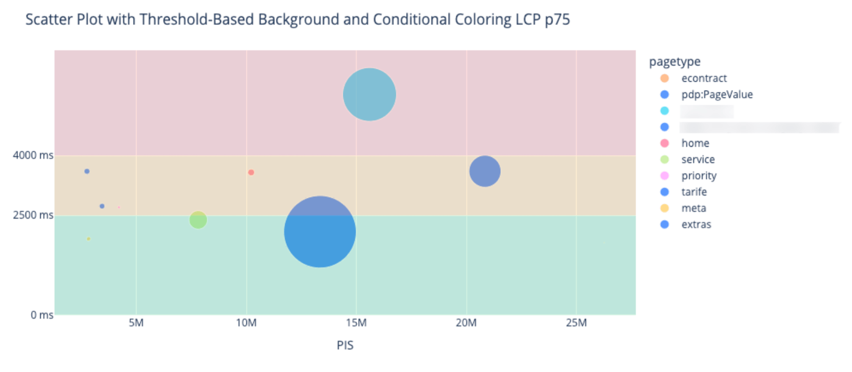
The prioritization graph is my go-to tool for answering all of these questions at a glance. Here’s an example:

How to Read This Graph:
- Circle size: Represents the number of pages of the same type. Larger circles mean a single fix can benefit many pages at once.
- Y-axis (LCP p75): Shows the performance metric for the 75th percentile. The background colors highlight thresholds, with green indicating “good,” yellow as “needs improvement,” and red as “poor.” The lower the circle, the better the performance.
- X-axis (Page Impressions): Reflects the number of page visits. Circles farther to the right affect more users.
Actionable insight: The biggest circles in the upper-right corner are your top priorities—they represent pages with poor performance that affect the most users.
In this example, the focus is on LCP (Largest Contentful Paint), but similar graphs can be created for other Core Web Vitals like INP (Interaction to Next Paint) and CLS (Cumulative Layout Shift). Ideally, all these graphs should appear side-by-side in your RUM (Real User Monitoring) dashboard.
Special thanks to Rick Viscomi for introducing me to this visualization—it has become an essential part of my workflow.
Timeseries Graphs: Understanding Regressions
Timeseries graphs are great to learn what changed when a regression occurred. This information is key to quickly find the root cause.
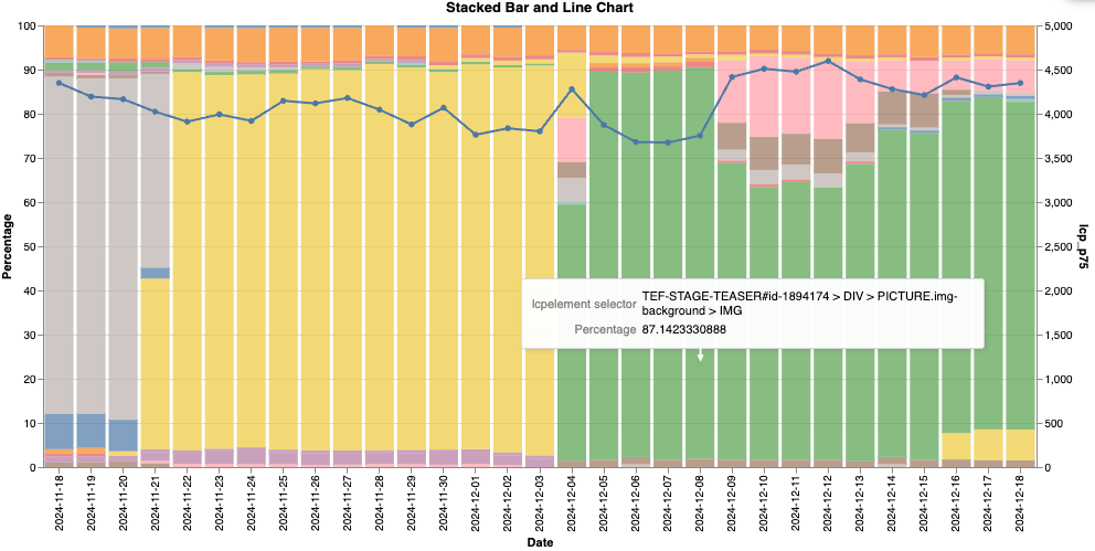
Here’s an example of a timeseries graph that I recently used during an LCP regression analysis:

How to Read This Graph:
- X-axis: Tracks time (daily).
- Stacked bar segments: Represent the percentage of visits where a specific LCP element was responsible. Each color corresponds to a different element (e.g., images, cookie layers).
- Line chart (overlaid): Displays how the p75 LCP value changes over time.
To improve the graph even more, you can add vertical lines with deployments and content changes.
In a real user monitoring (RUM) tool, it would be great to see multiple graphs for everything that can impact the LCP, like navigation types, connection speed, location, etc.
Case Study: Solving an LCP Regression
Here’s how this graph helped me identify and fix an issue:
- Initial observation: LCP degraded but TTFB and FCP remained stable. This ruled out server-side issues and shifted focus to the LCP element itself.
- Element analysis: Using the graph, I identified that after a regression, the cookie layer was twice as likely to be the LCP element. It had a significantly worse LCP value than other elements.
- Root cause: A new third-party service prompted returning users to re-consent to cookies, increasing the prominence of the cookie layer.
- Solution: We modified the cookie layer to ensure it could not become the LCP element, preventing similar issues in the future.
Wrapping Up
Visualizations like the prioritization graph and timeseries graph are invaluable for diagnosing and prioritizing web performance optimizations. They transform complex data into actionable insights, saving time and effort while driving better results.
Have you used similar graphs in your web performance journey? I’d love to hear your thoughts or see examples of visualizations that have worked for you!
