
Alex Hamer is software engineer at Tesco, with a passion for building high performance, accessible web applications for the many.
As software engineers and technologists its common to have access to some powerful devices and super fast bandwidths. It’s highly likely that you will be developing/testing on a high end Mac (or similar) or pulling out an expensive mobile device such as an iPhone from your pocket.
But we need to be careful that this doesn’t lull us into a false sense of reality. We need to take care that we don’t end up sitting in ivory towers thinking performance of our applications is rosy, when in the wild our users are facing a different reality.
I’m going to utilise Rum Archive’s fantastic dataset to hopefully paint a picture of why this is important. The following measurements were narrowed to beacons collected from the United Kingdom. Important to highlight that the Rum Archive data is sampled.
I will lean on Core Web Vitals a little, but because of the comparison I want to highlight I will also use metrics that are collected from Safari users.
Throughout we’ll look at the 75th percentile of users for each metric and we’ll zero in on mobile devices.
First Contentful Paint (FCP)
Let’s start at the beginning of a users experience. The point at which the user can see a change on screen. “Is it happening”*.
Contrasting the FCP seen from iOS and Android users.
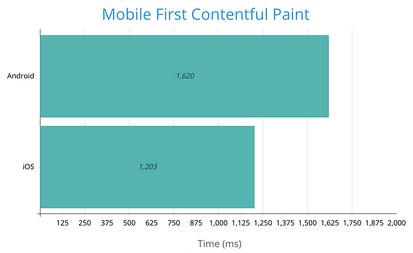
FCP comparison between Android and iOS devices
The 75th percentile for Android users is 400ms slower than that of iOS users, a significant 34% slower.
Time To Interactive (TTI)
Next to look at is Time To Interactive. mPulse describes this as
“The time when the page looks ready to use and is responsive to user input.”
I’ve chosen to consider this metric as INP is unavailable for Safari users and I’m seeking a comparative measure of the time it takes for a page to become interactive, i.e. the point at which a page could reliably respond to user interaction such as a click.
This metric could provide a good understanding of how our split of users are handling the resources that are delivered as part of the page, i.e. the JavaScript!
We see a significant performance gap contrasting iOS and Android users.
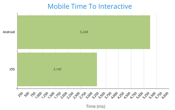
TTI comparison between iOS and Android devices
The 75th percentile for Android users is 66% percent slower than the iOS equivalent, more than 2 seconds slower!
Alex Russell’s Performance equality gap highlights that the Android user base typically will be on lower powered devices compared to those with an iPhone. Devices with less hardware capability, more prone to being overwhelmed by heavy JavaScript execution.
Interaction to Next Paint
So what does the impact of low end devices look like on user interaction?
At this point it would be really great if Safari could support Core Web Vitals and in particular INP, but it’s not quite Christmas yet! Instead lets take a closer look at INP measurements for Android users by device model, to see how device capability can impact INP.
To give a sense of device capability I’m going to utilise GeekBench’s scores for each device model. GeekBench focuses on the devices CPU performance, so we’ll use this as a measurement for the devices capability.
We’ll use GeekBench’s single core score as this is relevant for running applications that are lightly threaded such as web applications.
We then plot this data to visualise if there is any correlation between INP times and the devices CPU performance. I’ve taken the top 100(ish) Android devices by beacon count during the period.
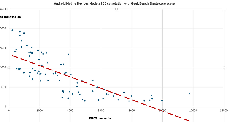
Correlation of Geekbench score with INP measurement
Probably not a huge surprise to this audience, we see a correlation.
As CPU performance decreases we see an increase in INP times. What is interesting to see is the size of the gap between the high powered and lower end devices, as well as some of the startling measurements!
The user experience ranges significantly.
How might an iPhone compare?
How might an iPhone compare to this? Although we haven’t got access to a useful set of INP scores we can contrast the scores collected by GeekBench for CPU performance.
The highest score for a Samsung Android device is for the Galaxy S24 Ultra, scoring 2135.
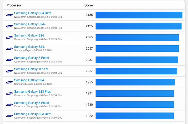
Samsung mobile device Geekbench scores
In contrast the highest scoring iOS device currently is the iPhone 16 Pro, clocking up an impressive score of 3423. Thats a 60% increase on CPU performance score compared to the S24 Ultra!
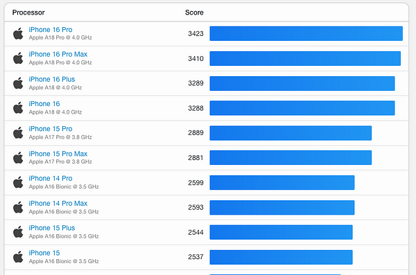
iPhone Geekbench score
In fact, your looking at the iPhone 12 until you find a previous version of the iPhone that scores less than todays fastest Samsung Android device. To add a little more perspective, this device was first sold over 4 years ago!
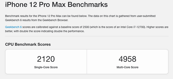
iPhone 12 Geekbench score
Using the correlation from above, we can make an extremely strong assumption that INP performance experienced on our latest iPhone is going to be faster than even the latest, greatest Android device on the market. In fact in many cases even our old iPhone stuck in a drawer somewhere would give the best Android devices a run for their money!
So why should we care about this?
Well, because Android users make up a huge slice of the mobile web audience. In the UK, its the greatest slice, with 52% of the market share according to statcounter. If your working in online retail thats a lot of potential customers.
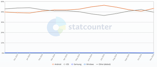
Android/iOS marketshare (Android is red line)
From the sample of data I looked at, only 43.6% of Android page loads came from device models that score 1000 or above on GeekBench (remember an iPhone purchased within the last 4 years is scoring > 2000).
So thats ~29% of overall web users that could at best (and most likely worse) have a mobile device 3x times less powerful than the latest high powered iPhone. How does the experience look to them?
Are we considering these users whilst developing and testing the applications we’re responsible for?
What can we do?
First thing we can do is understand the conditions that our users are accessing our web applications from.
Have you got Real User Monitoring implemented?
Do you have granular insight into your users conditions?
- Visibility of attributes such as device type, OS and device model. Something like Akamai’s Device Characteristic header is super useful for this.
- Usage of the Navigator API to provide insight into things such as device memory (where supported) and hardware concurrency
- Network conditions. Through the Network Information API we can gain insight into areas such as the connection type (4g, 3g etc), the connections round trip time (RTT) and user downlink speeds. Again where supported.
What is the CrUX data showing for your application? If you haven’t got RUM running this might be a good place to start.
Are you proactively monitoring and utilising this data to understand real user experience and typical user conditions? Are you going beyond measuring a high level p75 and looking at the detail beneath?
Using this data you can get an insightful picture of the profiles of your users and have visibility of which of these profiles are common and important.
With this knowledge we can ensure our development and testing cycles cover real user conditions. We need to dog food our work in these conditions. Sometimes we need to feel the pain to enact positive change. If an engineer is frustrated at the responsiveness of an ‘Add to cart’ button click during development, then they’re probably more likely to investigate why and resolve it.
Chrome allows us to easily throttle CPU and network capability via its Performance tab in developer tools.
Low powered devices that match your user profiles can be purchased (cheaply!) or services such as BrowserStack used to test the experience on real devices.
Other approaches exist, the important thing is there are ways to achieve this.
Wrapping up
Through the data, we’ve seen the gap in user experience between high powered and low end mobile devices.
The population of mobile users on these low spec devices is significant and they should not be ignored. They stand as a group we could be (and probably currently are) alienating and lead to missed opportunities if we continue to provide a poor user experience.
As online teams we should proactively be understanding the profiles of our users and what conditions they operate within. Looking beyond what sits on our desk and the comfort of expensive tech. Not everyone is lucky enough to own an iPhone.
We need to experience our users reality and build this into our software development processes. This way we can build inclusive web applications, improve for the many and open up missed opportunities.

[…] Source: Web Performance Calendar » Not every user owns an iPhone […]
[…] Article URL: https://calendar.perfplanet.com/2024/not-every-user-owns-an-iphone/ […]
This comment is here just to remind that the were excellent, full-featured, highly-performant websites right in 2010.
In the past 15 years we got zero progress.
[…] 网站: calendar.perfplanet.com HN评论: […]
You have a couple of instances in your article in which you are using “your” incorrect. They should be “you’re”.
It’s not “your looking” or “your using.” It’s “you’re looking” and “you’re seeing.”
[…] Not every user owns an iPhone – “I’m going to utilise Rum Archive’s fantastic dataset to hopefully paint a picture of why this is important.” […]
This excellent idea is necessary just by the way
Certainly. So happens.
I consider that you are mistaken. I can defend the position.
Excuse for that I interfere … At me a similar situation. Lets discuss. Write here or in PM.