

Jordy Scholing (@jordyscholing.bsky) works with a lot of clients at RUMvision helping them improve their website speed. With his direct and pragmatic approach (Dutch...) they get a lot done and make the web a faster place.
Why optimizing on p75 is a starting point. Optimizing for p90 should be our common goal.
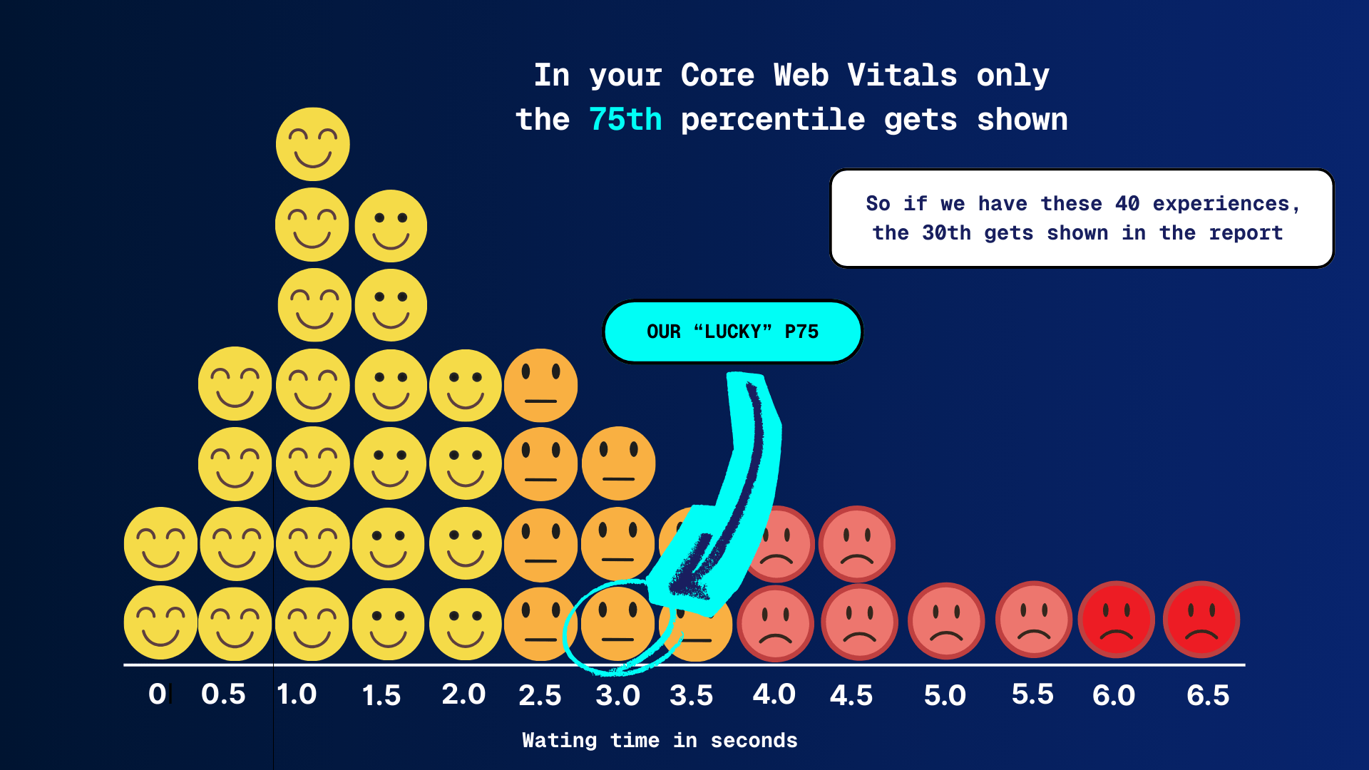
What is a percentile? The 75th percentile (p75) means 75% of users had an experience that was equal to or better than that value, and 25% were worse.
If you work with Core Web Vitals, you live in the 75th percentile. Google chose it, the industry adopted it, and honestly, it’s a solid global standard. Hit p75 and you “pass” CWV. Green checkmarks, happy dashboards, on to the next ticket.
But passing doesn’t mean everyone is having a good experience. It means that 75% of your users are within the thresholds. The remaining 25%? They might still be dealing with friction, delays, or just enough slowness to be annoying.
And depending on your market, your industry, or your audience, that 25% can be way too big. I mean if you test browser compatibility down to single digit % adoption, then surely you should do the same for performance?
More and more performance experts are starting to ask a simple question:
“Why do we stop at p75 if that’s not where the sweet spot actually is?“
I think it’s every performance expert’s dream to pass at the 90th percentile, but most merchants are happy with just passing the Core Web Vitals.
What p75 really tells you
The 75th percentile means that 75% of page loads are faster than or equal to a given value. For LCP, that’s the number Google uses to decide whether your page is “good” or not.
The reason Google picked p75 makes sense:
- It’s stable
- It works globally
- It avoids being dominated by extreme outliers
But p75 is mainly a compliance metric, not an experience metric. It answers the question:
“Is the majority okay?”
It does not answer:
“Are almost all users happy?”
And that gap matters.
SEO and CRO/UX play different games
For SEO, p75 is usually enough. Google wants a baseline level of quality, not a speed arms race. If you pass Core Web Vitals, you’re in a good place from a ranking perspective.
CRO and UX are a different story.
Conversions and engagement aren’t driven by “the majority.” They’re driven by:
- high-intent users
- returning visitors
- mobile traffic
- users with high expectations
And those users often live above p75.
Why the 90th percentile makes sense
Optimizing for the 90th percentile means saying this:
90% of my users should have an experience within my quality threshold.
That leaves 10% outside. Not zero, that’s unrealistic, but small enough to manage.
What p90 tends to surface:
- unstable TTFB
- third-party scripts that are “usually fine”
- JavaScript spikes on slower devices
- cache misses and consent-related delays
In other words: the real UX issues, not just the averages.
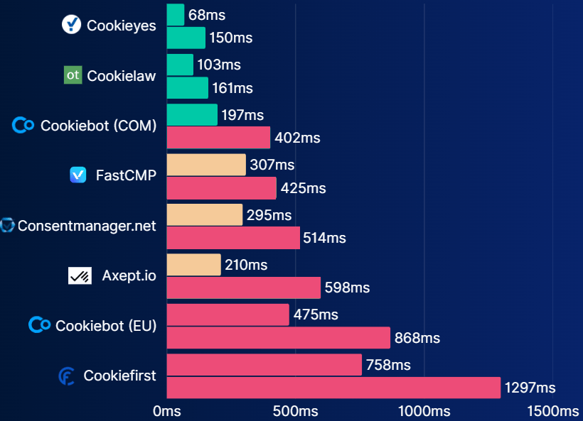
Chart of third party CMP tools making an impact on the INP metric. The first line per CMP is p75. The line below that is p90 JS execution time of that same third party. Sometimes you have to make compromises.
p75 feels good. p90 feels fair
p75 can create a false sense of success. Everything looks green, but:
- support tickets keep coming in
- mobile users still complain
- conversion rates don’t improve despite “good scores”
p90 is less comfortable. Dashboards get less green. But they get more useful.
You stop asking whether something is fast “on average” and start seeing who is actually suffering.
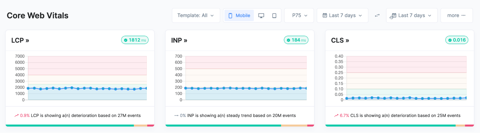
p75 core web vitals, pretty solid scores and all green.
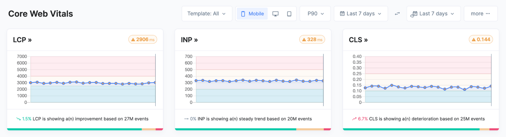
p90 core web vitals, not so good anymore. This motivates me to keep going as it doesn’t look impossible to achieve all green on p90.
Audiences where p75 simply isn’t enough
Take me as an example.
iPhone 16 Pro, Gen Z, mobile-first, used to instant feedback (spoiled brat…). If your site barely hits the LCP threshold at p75, it doesn’t feel fast. It feels slow.
And I’m not an edge case anymore.
Other segments where p90 often makes more sense:
- high-end mobile traffic
- ecommerce with short attention spans
- fintech and SaaS, where trust equals speed
- countries with fast networks and high expectations
For these audiences, p75 isn’t the sweet spot. It’s the minimum.
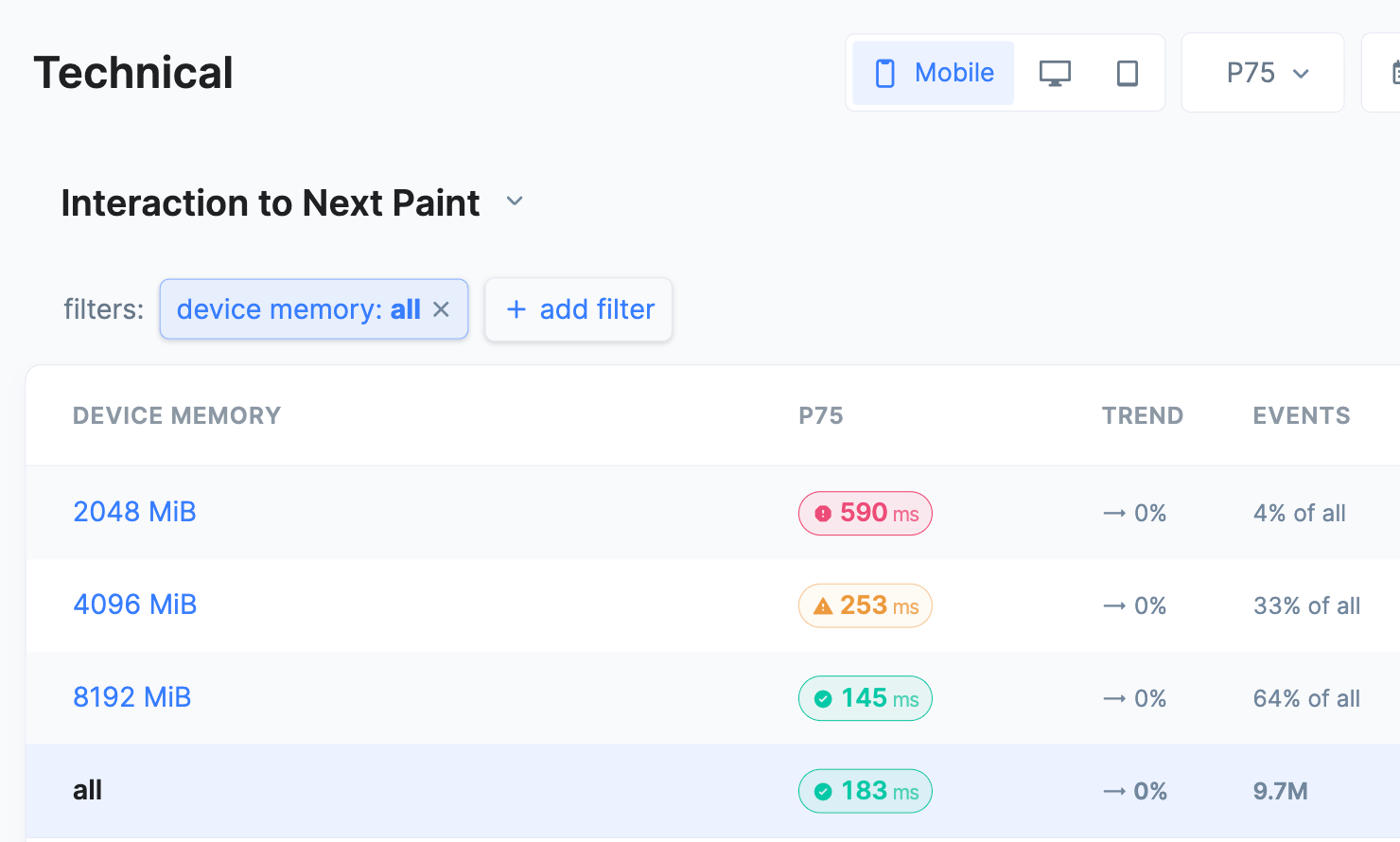
In this screenshot of RUMvision you can see the p75 INP value per device memory bucket. Making it clear that users on slower smartphones suffer higher INP scores. The overall p75 score of this website is 183ms, so when just looking at that, you’re creating a blind spot.
The bar is going up
It’s not a coincidence that tools like Speed Kit are introducing stricter LCP thresholds. That’s not punishment, it’s a signal.
We can do better. And users expect better.
Within the performance community, the conversation is shifting:
- “CWV passed” is no longer the finish line
- stability matters more than peak scores
- reducing variance often beats pushing averages
Optimizing for higher percentiles fits perfectly into that shift, in our opinion.
This only works with RUM
Let’s be honest: optimizing p90 in Lighthouse is not possible (AFAIK). Percentiles only become meaningful with Real User Monitoring:
- real devices
- real networks
- real frustration
With RUM, you can:
- compare p75, p90, and p95 side by side
- segment by device, country, or page type
- understand why the tail is slow
Most importantly, you can prioritize based on impact, not vanity scores.
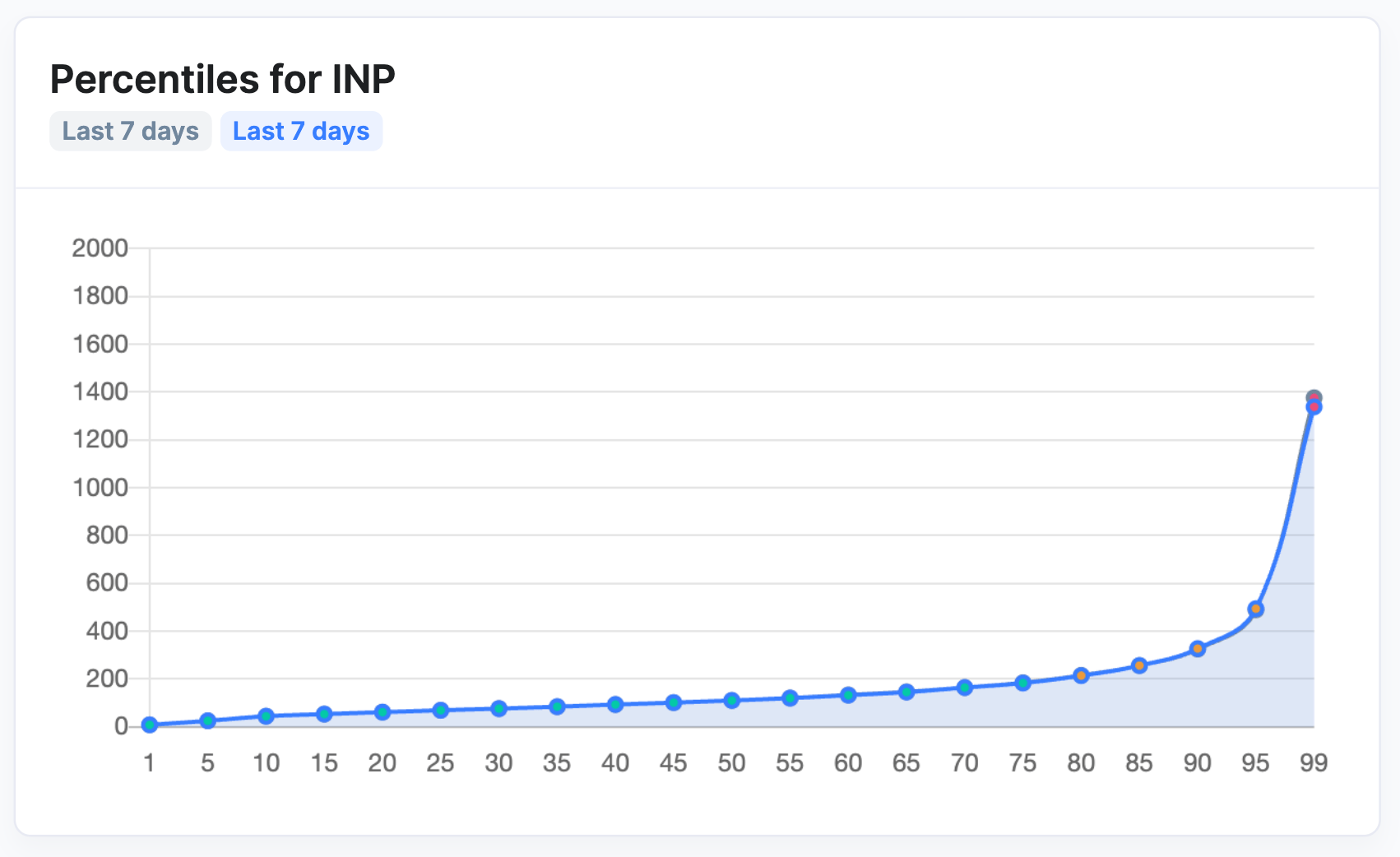
Percentile chart showing different INP experiences per percentile
How do we look at this as a RUM (RUMvision)
This year, we’re increasingly focusing on the 90th percentile with our customers. Don’t forget that a large amount of your traffic is “new” (paid) traffic; a good first experience is essential, not only for those with a good internet connection and a flagship phone. Prioritize your insights and optimizations, not everywhere at once, but:
- on critical pages
- for valuable user segments
- in flows where speed directly impacts revenue or trust
We also want to reflect this in the UI. If you consistently hit your current percentile, you should be able to raise it. Not as a rule, but as a natural next step in performance maturity. This motivates people to keep going.
Let’s start by defining a performance KPI everyone understands
Performance only creates value when it’s understood beyond engineering. If it lives solely in percentiles, acronyms, and dashboards, it stays a technical metric instead of a business driver. A strong performance KPI answers a simple question: how many of our users actually have a good experience?
That’s why percentile-based KPIs work so well. They shift the conversation from “are we fast on average?” to “for how much of our audience does this feel fast enough?”. Whether that target is p75 or p90, it makes performance tangible for product, marketing, CRO, and leadership. It aligns teams around user impact, not vanity scores and turns performance optimization into a lever for growth, not just compliance.
So, should everyone optimize for p90?
No. Definitely not.
But everyone should ask themselves one question:
Is p75 really the sweet spot for my audience?
If the answer is yes, great.
If the answer is “I’m not sure,” look at p90. Or work with correlation charts.
If the answer is no, then you already know what to do.
p75 is fine.
p90 is where it gets interesting.