

Edwin Molina Hernández (in/edwinmolinahernandez, @webperfreport.bsky, @WebPerfReport) is a Software Engineer, founder of WebPerformance Report, and Head of IT at an ecommerce company in Germany. Mantra: Code, Data & Performance.
A high-level view of performance reporting
In the performance community, we spend a lot of time talking about tools, metrics, budgets, thresholds, regressions, and dashboards. But at the end of the day, the real challenge is not collecting data, it is making sense of it.
- A great report does not overwhelm.
- A great report tells a story.
WebPerformance Report was designed around that principle. Although its underlying data comes from automated performance tests, the report itself is intentionally high-level. It is structured to help anyone, developers, designers, marketers, and executives, understand what happened, why it matters, and where the opportunities lie.
This article walks through the anatomy of a Web Performance Report, explaining each section, why it exists, and what decisions it enables.
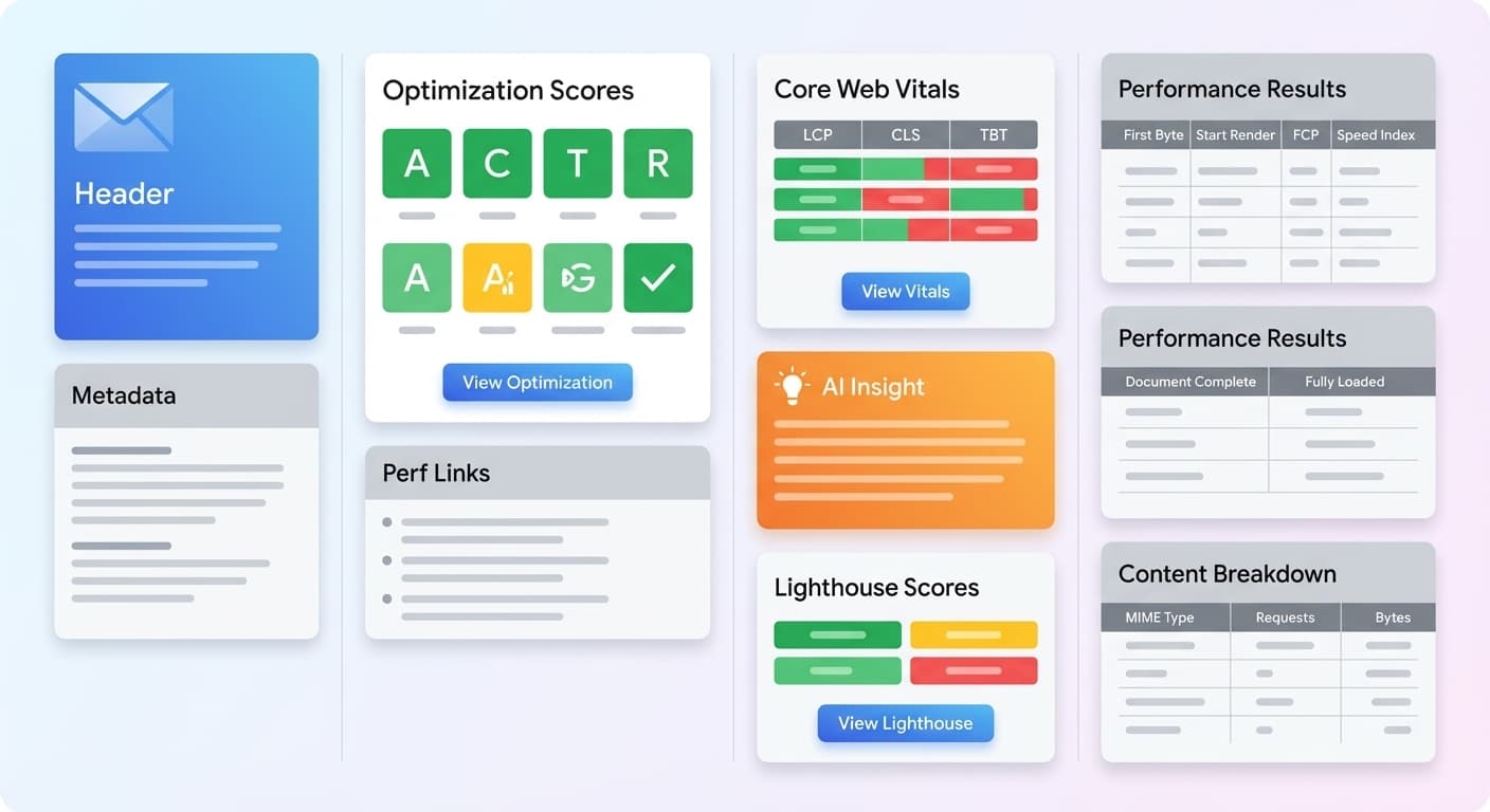
1. Test Context: The Frame of the Story
Every performance story starts with context.
A URL. A location. A device. A timestamp.
These elements define the environment of the test, the frame within which all metrics should be interpreted. A 400 ms TTFB in California may look entirely different from the same value in Europe. A mobile run under a throttled connection cannot be compared with a desktop run on fast Wi-Fi.
The context section anchors the reader:
“This is the test we ran, from here, in this way, at this moment.”
Without this framing, no metric has meaning.
2. Optimization Scores: The Executive Snapshot
Before diving into timing data or Core Web Vitals, the report opens with a set of optimization scores, a compact summary of critical performance optimizations:
- Compression
- Caching
- CDN usage
- Security headers
- Lighthouse performance grade
- Other structural improvements
Most large wins come from a small set of well-understood optimizations.
This section tells the reader immediately:
- Are best practices being followed?
- Are there low-hanging fruits?
- Is something fundamentally misconfigured?
Think of this block as the health triage of your site. It reduces complexity before the report expands into deeper analysis.
3. Perf Links: The Learning Layer
Performance work is not only about debugging. It is also about learning.
The report includes a curated set of links to articles, case studies, and community insights. This section reinforces a culture of continuous learning inside organizations.
It answers a question often ignored in technical reports:
“What should I read to understand this better?”
While small, this block reflects a larger philosophy. Accessible reporting leads to shared understanding, and shared understanding leads to better decisions.
4. Core Web Vitals Lab Data
This section presents LCP, CLS, and TBT measured in a controlled environment. Lab data is useful because it reveals regressions instantly, without depending on real user sample sizes.
Each Vital answers a different question:
- LCP: How fast does the main content load?
- CLS: Is the page visually stable while loading?
- TBT: Are long tasks blocking interactivity?
This block acts as an early warning system. If LCP suddenly doubles or TBT spikes, the report highlights it before the issue affects users in the field.
Lab data does not replace field data. It provides fast signal detection.
5. Core Web Vitals CrUX Field Data
While lab data shows a controlled environment, field data shows reality.
This section displays CrUX metrics, reflecting real performance across millions of user sessions. Field data captures network diversity, device differences, geographic variation, and caching effects. In other words, it represents the true experience of the user population.
It answers key questions:
- Are real users experiencing a fast site?
- Are trends improving or declining?
- Do mobile users struggle more than desktop users?
- Is interactivity becoming a problem?
Lab and field data complement each other.
One detects regressions.
The other measures impact.
6. AI Insight: The Executive Summary
This is one of the defining features of the report.
The AI Insight block takes all preceding data, vitals, trends, regressions, anomalies, and produces a human readable summary:
- what improved
- what regressed
- why it matters
- what should be done
This is the closest thing to a performance brief that can be shared directly with leadership. It translates numbers into meaning.
Instead of requiring every stakeholder to interpret timing charts or graphs, the AI Insight answers the question that matters most:
“What should we do now?”
7. Lighthouse Scores: A Holistic View
While the report focuses on performance, Lighthouse adds complementary dimensions:
- Accessibility
- Best Practices
- SEO
This section is not meant to replace a full Lighthouse audit. Instead, it highlights cross-cutting issues that often correlate with performance problems, such as oversized images, non accessible markup, security weaknesses, and inefficient script usage.
This reinforces an important truth:
Performance is part of the larger quality picture.
8. Performance Results: The Timeline of Loading
This block maps the important loading milestones in a simple, readable form:
- Time to First Byte
- Start Render
- First Contentful Paint
- Speed Index
Each describes a different aspect of loading:
- TTFB reflects backend and network responsiveness.
- Start Render shows when the page first becomes visually alive.
- FCP marks when meaningful content appears.
- Speed Index estimates how quickly the visible experience completes.
The report also lists:
- Document Complete
- Fully Loaded
These values help identify at which stage delays accumulate. They represent the structural backbone of how the page loads.
9. Content Breakdown: Understanding Resource Weight
This section shows how bytes are distributed across resource types:
- JavaScript
- CSS
- Images
- Fonts
- HTML
- Others
Weight distribution often reveals the root of performance issues:
- Too much JavaScript often indicates main thread pressure.
- Too many images often indicate visual payload problems.
- Heavy fonts often affect rendering stability.
- Oversized HTML often indicates template or server side issues.
Almost every performance problem leaves a footprint in resource weight.
10. Full Test Link: Depth on Demand
Although the report is high-level, some users need deeper inspection. The full test link allows access to waterfalls, logs, and detailed timing data when needed.
This link is a bridge between clarity and detail.
The report stays accessible, but never restrictive.
Conclusion: Reports, Decisions, Results
A performance report is more than a list of numbers. It is a story.
By structuring information into meaningful layers, context, optimization, vitals, insights, timelines, and weights, the Web Performance Report transforms raw metrics into understanding that can guide action.
Clarity leads to better decisions.
Performance succeeds not when it is measured, but when it is understood.
Reports. Decisions. Results.