A lot of different factors can affect a web page’s performance. For this reason, truly effective Web Performance Optimization starts with identifying the most significant perf bottlenecks of your site. This is usually done with tools like DevTools, WebPagetest, PageSpeed Insights, etc.
Once you’ve identified a possible lead, and taken the time to refactor and optimize it, it’s important to follow-up by properly validating and understanding the impact of your change. Getting this right will help you learn whether that’s something you should race to implement across your site, or a best-practice that in your particular case amounts to a micro-optimization.
This type of analysis is not trivial because web performance data is typically noisy. You can reduce noise by running your optimizations as A/B experiments side-by-side with the existing implementation, and by visualizing your data with a suitable graph such has a histogram.
This post explores these techniques in-depth.
Running experiments side-by-side
Let’s suppose you’ve decided on a specific type of perf optimization you want to try (e.g. inlining css, or using async scripts).
One way to go about it is to simply modify your code accordingly so that it works in the new manner. In this case, you could evaluate the impact of the change by gathering some web perf samples before you deploy your change, and compare them to samples gathered immediately afterwards. This approach does not isolate the optimization from other factors which might have also changed and affect the speed of your page, such as the amount of traffic you’re experiencing. This reduces the amount of confidence you should have in your data, which limits your ability to learn from it.

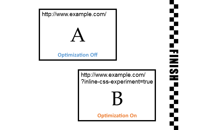
Another option is to introduce the optimization as a separate configurable option in your code that sits side-by-side with the previous implementation. This will let you gather samples from both versions at the same time. If you’re using Synthetic monitoring, expose a way to choose which version to use on a request-by-request basis (perhaps using a querystring parameter) and trigger tests simultaneously. You could also gather data with Real User Monitoring by serving some users the old version and some the new version.
You can probably roll out this his type of ability yourself but if you find you’re starting to use it a lot, consider adding a proper way to create these “feature-toggles,” perhaps with an A/B testing framework.
At any rate be sure to delete the irrelevant implementation when your experiment is done.
Always visualize the data
Why calculating the average isn’t enough
Once you’ve gathered a set of samples for each version of your experiment, the easiest way to get a sense for the impact of the optimization is to calculate the mean (average) of each set. But you shouldn’t rely on this value alone. Web perf data is likely to include outliers- a subset of the samples with unusually low\high values. These values skew the average.
For example, your set of values from the existing implementation could include a sample taken when the server had a momentary hiccup that caused it to reply very slowly. As a result the average of the entire set will be greater.
By always visualizing the data in a graph you can spot outliers immediately, and get a truer sense for the impact of your change.
Statistician F.J. Anscombe wanted to illustrate this point about the value of visualizing the data, so he created “Anscombe’s quartet,” four datasets with the same mean and standard deviation. When you visualize them with a graph however, you can clearly see that are significantly different.

Choosing the right graph
There’s no shortage of graph types we can use to visualize our data. But some graphs are more appropriate for this type of data than others.
For example, here is a line graph showing the results of a web perf experiment where the y-axis shows the SpeedIndex score and the x-axis shows the timestamp. It’s easy to spot some outliers but it’s not clear whether the optimization made the page faster and to what degree.

Do you really need a time dimension?
The samples in the graph above are presented in chronological order, and that’s partly why it’s difficult to get a sense of the clear winner. The series lines cross each other as time progresses which is confusing. The takeaway here is that for these short-living experiments, we don’t really need to care about the point in time of when each sample was taken.
Do you really need absolute values?
Another thing that’s making the graph above difficult to digest is the fact that the y-axis values are not rounded in any way. Just because your graphing software lets you plot down-to-the-millisecond values, doesn’t mean you should do it.
If you’re dealing with typical web perf milestone metrics (TTFB, Start Render, Page Load) your values are most likely in the 1,000-10,000 milliseconds range. So by rounding to the nearest 100ms or 250ms you’re making your data easier to consume without altering it significantly.
Now that we’ve identified what doesn’t work about the graph above, let’s take it all into account when choosing a better-suited graph, a histogram graph.
The Histogram
A histogram is a graph composed of bars where:
- The x-axis represents the range of your data values.
- Each bar represents a “bucket” or “bin” of samples aggregated together by their rounded value.
- The y-axis represents how many samples are in each bucket.
Like before, since we’re comparing both versions of the experiment, we’ll have two different series shown on the same graph.
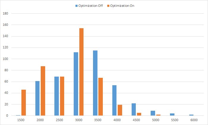
This histogram is of the same data as the line graph above. Samples were grouped together into buckets of 500ms.

What we can learn from this histogram
Our data seems to be normally distributed, which is typical of web perf measurements, so for each series the bucket with the most samples (highest bar) is in the middle. As you go left\right of it there are less samples in each bucket.
Each bucket to the left of the highest bar contains more samples from the ‘Optimization On’ set than the ‘Optimization Off’ set, because the optimized version reached those lower values (was faster) more times than the non-optimized version. Similarly, each bucket to the right of the highest bar contains more samples from the ‘Optimization Off’ set.
This is a good signal that the optimized version provides a better experience in a consistent manner.
The far left bucket (1,500ms) has 46 samples from the optimized version (10% of all the samples in this set), while the non-optimized version managed to be that fast only once. This is another indication that the experiment is a success, and there’s real value in applying it to more pages.
