
Stoyan (@stoyanstefanov) is a frontend engineer, writer ("JavaScript Patterns", "Object-Oriented JavaScript"), speaker (JSConf, Velocity, Fronteers), toolmaker (Smush.it, YSlow 2.0) and a guitar hero wannabe.
Often performance improvements come with their drawbacks, sometimes improving performance causes pains in other parts of the development process or strips stuff from the final product. Sometimes there’s even a conflict where you have to pick: slow, unusable and beautiful or fast and looking like hacked with a blunt axe. But it doesn’t have to be this way.
This post outlines some approaches to achieving common UI elements using CSS tricks in as many browsers as possible while using as fewer images as possible. Some of the tricks are brand new, some are very, very old, IE5.5. old. They all have in common the “fewer or no images” mantra. Using fewer images comes with some pronounced benefits:
- less time spent in Photoshop
- lighter page, less HTTP requests, less image payload
- fewer elements in the sprite to maintain (and sometimes fewer sprites) which means longer lived sprites with fewer updates and cache invalidation
- generally easier maintenance – it’s much easier to change a color value than to update and push a new image version
Sometimes some browsers may not be fully supported but that’s ok – as long as there’s progressive enhancement and the basic page is usable, people rarely notice 1px glows and other ornaments.
So let’s get started. BTW, a test page with the stuff discussed in the post is here.
Rounded corners
Yep, let’s tackle the biggie.
Forget rounded corners in browser that don’t support border-radius. Period. It may be hard to argue this case, but definitely try. Doing rounded corners any other way than border-radius is a pain – it adds markup bloat, it makes you create more images or sprite elements. It’s tougher to update. Just forget it. Forget rounded corners in IE < 9 (as rumor has it border-radius is coming to IE9). People may argue that IE is important for your audience. No doubt that’s true, but rounded corners are not so important for the audience. Show your designer Yahoo Search results page – the sidebar on the left-hand side. Not very rounded in IE. Do you think this was an easy battle – losing rounded corners in IE for such a high-profile site? Ask the man who won the battle 😉
So starting with a normal module – head, body and border:

The markup – nice and clean:
  <div class="module">
    <div class="hd"><h3>This is the header</h3></div>
    <div class="bd">
      <p>Here comes the content</p>
      <p>Here comes some more</p>
      <p>You can never have too much content, because
         content is king, right?
      </p>

    </div>
  </div>
Some fairly simple border radius to support Firefox, Webkit (Safari, Chrome, iPhone…) and, since a few days ago, Opera 10.5 alpha:
.module {
  -moz-border-radius: 9px;
  -webkit-border-radius: 9px;
  border-radius: 9px;
}
Result:
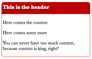
This is it! Easy-peasy, lemon squeezy.
Now, it’s a little annoying to write three declarations for the same thing, but, hey – beats images and extra markup hands down. Also annoying are the differences when setting individual corners (-moz-border-radius-topleft is -webkit-border-top-left-radius). In this case we need to also round the header (class .hd) so it doesn’t bleed through the beautifully rounded corners:
.hd {
  -moz-border-radius: 8px 8px 0 0;
  -webkit-border-top-left-radius: 8px;
  -webkit-border-top-right-radius: 8px;
  border-radius: 8px 8px 0 0;
}
Verdict:
- Full support: Firefox, Safari, Chrome, Opera 10.5
- Fallbacks: IE (corners are not rounded)
Drop shadows and glows
Another favorite effect designers love – dropping shadows. It’s easy to enhance that existing .module without any new images:
.module {
  /* offset left, top, thickness, color with alpha */
  -webkit-box-shadow: 5px 5px 5px rgba(0, 0, 0, 0.5);
  -moz-box-shadow: 5px 5px 5px rgba(0, 0, 0, 0.5);
  box-shadow: 5px 5px 5px rgba(0, 0, 0, 0.5);
  /* IE */
  filter:progid:DXImageTransform.Microsoft.dropshadow(OffX=5, OffY=5, Color='gray');
  /* slightly different syntax for IE8 */
  -ms-filter:"progid:DXImageTransform.Microsoft.dropshadow(OffX=5, OffY=5, Color='gray')";
}
And now our module casts a shadow:
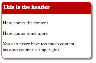
Now two notes for IE: first the shadow doesn’t have alpha so it’s not as nice and second, this filter may not play along with other filters in the same module. But the shadow is cast and that’s a check for IE too, even IE5.5!
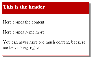
You may notice that in this case we basically need to more or less repeat the same declaration three times and the IE declaration two times. This is irksome, but hopefully keeping the strings close together should help gzip compression.
As for glowing, it’s the same thing in FF, Webkit, Opera, only without any offset. For IE, there’s a different filter called glow:
.glow {
  -webkit-box-shadow: 0 0 10px rgba(50, 50, 50, 0.8);
  -moz-box-shadow: 0 0 10px rgba(50, 50, 50, 0.8);
  box-shadow: 0 0 10px rgba(50, 50, 50, 0.5);
  filter:progid:DXImageTransform.Microsoft.glow(Strength=5, Color='gray');
  -ms-filter:"progid:DXImageTransform.Microsoft.glow(Strength=3, Color='gray')";
}
I added these declaration to a new class .glow so I can add the class name to modules that need to glow. The result:
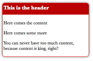
The result as it glows in IE:

Now you see why I added only 3 pixels glow in IE and whole 5 in the rest. The IE glow is a little .. interesting. Also in IE8 (could be my VM, in IE6 XP no VM all looks OK) the glow seems to move slightly when you hover over the module.
Verdict for shadows and glows:
- Full support: FF, Safari, Chrome, Opera, IE5.5 and up
More info:
Gradients
Ah, gradients. Sometimes so subtle that we, muggles and other mere mortals, don’t see them even when we try our hardest. But for the designer they could be life/death situation.
Let’s make the head (class .hd) of our module a gradient without any images:
.hd {background-image: -moz-linear-gradient(top, #641d1c, #f00);
  background-image: -webkit-gradient(linear, left top, left bottom, from(#641d1c), to(#f00));
  filter:progid:DXImageTransform.Microsoft.gradient(startColorstr=#ff641d1c,endColorstr=#ffff0000);
  -ms-filter: "progid:DXImageTransform.Microsoft.gradient(startColorstr=#ff641d1c,endColorstr=#ffff0000)";
}
The result:

What a beautiful (code-speaking, of course, not so sure about visually beautiful) module. It has rounded corners, drop shadows and a gradient and so far we haven’t used even a single image. Which means this reddish module can become blue, green or, god forbid, pink – with a single tweak in the code, the CMS or the user preferences (if you’re building a social network for example).
Gradients verdict:
- Full support: FF, Safari, Chrome, IE
- Fallbacks: Opera (solid color)
More info:
… and RGBA for all
Being able to set the transparency of the background without affecting the transparency of the foreground (the text) is quite handy. That’s why there’s rgba() in CSS (red, green, blue, alpha). IE is not yet supporting it, but we can use the gradient filter which does support transparency. In this case we don’t need the actual gradient so we set start and end color to the same thing. Also the background: transparent is needed for the whole thing to work in IE:
.rgba {
  background-color: transparent;
  background-color: rgba(200,200,200,0.8);
  filter:progid:DXImageTransform.Microsoft.gradient(startColorstr=#99dddddd,endColorstr=#99dddddd);
  -ms-filter: "progid:DXImageTransform.Microsoft.gradient(startColorstr=#99dddddd,endColorstr=#99dddddd)";
}
The result is pleasantly cross-browser:

RGBA verdict
- Full support: Firefox, Safari, Opera, Chrome, IE
Rotating images
It happens that sometimes you use the same image only flipped. For example open/close thingies, menus and such. How about reusing the same image and rotating it with CSS?
.arrow {background: url(arrow.png) no-repeat; display: block; float: left; width: 33px; height: 33px;}
.right{ /* this is the original image*/ }
.left {
  -moz-transform: rotate(180deg);-webkit-transform: rotate(180deg); -o-transform: rotate(180deg);
  filter: progid:DXImageTransform.Microsoft.BasicImage(rotation=2);
  -ms-filter:"progid:DXImageTransform.Microsoft.BasicImage(rotation=2)";}
.up {
  -moz-transform: rotate(270deg);-webkit-transform: rotate(270deg); -o-transform: rotate(270deg);
  filter: progid:DXImageTransform.Microsoft.BasicImage(rotation=3);
  -ms-filter:"progid:DXImageTransform.Microsoft.BasicImage(rotation=3)";}
.down {
  -moz-transform: rotate(90deg);-webkit-transform: rotate(90deg); -o-transform: rotate(90deg);
  filter: progid:DXImageTransform.Microsoft.BasicImage(rotation=1);
  -ms-filter:"progid:DXImageTransform.Microsoft.BasicImage(rotation=1)";
}
Here’s the result. Single image:

Result:
![]()
the HTML:
<span class="arrow right"></span>
<span class="arrow left"></span>
<span class="arrow up"></span>
<span class="arrow down"></span>
You may notice that the CSS could be quite verbose for saving such small images. It’s highly recommended you add the rotation code to a class and use the class name when necessary instead of repeating the same long declaration for every use case or image. Then pray to the gods of compression that this thing gzips well 😉
Verdict
- Full support: Firefox, IE, Safari, Opera, Chrome
Multiple UI elements with the same background image
The last few tricks have something in common – they each use one background image. The background images are very small – usually around 100 bytes. The tiny image has some transparency to it and is placed as a background-image which sits on top of a background-color. Because of the transparency, the background color shines through, but differently depending on the transparency level of the image above it.
The result is – different UI elements with different colors (and even different hover colors) which can be part of CMS or part of user’s skinning and they all reuse the same tiny background. So what can we do this way? A lot of interesting background effects, but here’s a few.
Glossy buttons
Here’s the end result:
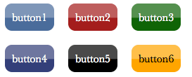
All these buttons share the same background image. The image is 1×1000 and repeated horizontally. The 1000 is just to be safe, very safe, because 50, 100 or 1000 doesn’t affect the file size which just a mere 100 bytes. The upper half of the image is a little less transparent. The lower half is 100% transparent. When placed on top of the solid color the whole thing looks shiny and glossy. And you can change the color any way you like.
The HTML:
<p class="button">button1<p>
<p class="button button2">button2<p>
<p class="button button3">button3<p>
<p class="button button4">button4<p>
<p class="button button5">button5<p>
<p class="button button6">button6<p>
And the CSS can’t be simpler:
.button {
  background-image:url(http://tools.w3clubs.com/mask/mask.php?x=1000&type=h);
  background-position: center;
}
.button:hover {background-color: #F29222;}
.button2 {background-color: #A41D1C;}
.button3 {background-color: #0F6406;}
.button4 {background-color: #333f79;}
.button5 {background-color: black;}
.button6 {background-color: orange; color: black;}
Actually in the test page I have inlined the image with data URI to save the whole HTTP request for such a teeny image.
As you can see in the URL of the background, I’ve done a little script to generate some background images:
http://tools.w3clubs.com/mask/mask.php?x=1000&type=h
The image generator’s source code is right here.
Stripes
Same technique – but used to generate striped background:

It’s basically the same code, only using a different call to the image generator to give us a different background image.
HTML:
  <div class="module stripe earth glow">
    <div class="bd">
      <p>striped background</p>
    </div>

  </div>

  <div class="module stripe tech glow">
    <div class="hd phony stripe"><h3>stripity-stripes</h3></div>
    <div class="bd">
      <p>striped background with the same background image</p>
    </div>
  </div>
CSS:
.stripe {background-image: url(http://tools.w3clubs.com/mask/mask.php?type=stripe);}
.earth  {background-color: olive;}
.tech   {background-color: #bbb;}
.phony  {background-color: #0F6406;}
Again, this image can be a data URI so we save the single HTTP request.
And another gradient
So if you don’t like the previously discussed way to do gradients, here’s another one. The same trick with the solid color background and a semi-transparent image on top.
Result:
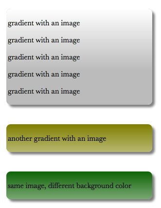
The background images as generated by the service are:
// lighter at the top
http://tools.w3clubs.com/mask/mask.php?type=gradient
// darker at the top
http://tools.w3clubs.com/mask/mask.php?type=gradient&flip=1
Again, you can see the test page here and the source for the image generation is here.
For yet another example of this technique check my post on this (abandoned) blog phonydev.com. There I take an image and a mask image generated by the same script and overlay to achieve an iPhone-like glossy button.
![]()
Thanks!
Kind of long post, but I hope you’re excited about removing a bunch of images from your future designs. If I’ve omitted some details, please let me know in the comments.
