

Lindsey Simon (@elsighmon) is a front-end developer for Google's User Experience group and project lead for the open source Browserscope.org project. Dude hails from Austin, TX where he toiled at a few startups, taught computing at the Griffin School, and worked as webmaster for the Austin Chronicle. He currently lives in San Francisco, writes acoustic guitar songs, and helps run a foodie website dishola.com.
This entry in the Performance Calendar 2010 series is going to take a slightly liberal interpretation of performance and apply it to task completion and UI design. Remember the JavaScript library speed wars happening a few years ago? For the most part there was a lot of focus on the speed of various implementations of selector matching engines. In early 2009 Peter Higgins published and brought attention to an interesting suite of tests and results he called TaskSpeed which instead tests the performance of groups of common operations; this post is inspired by that distinction.
Around the middle of this year we were working on a redesign for Google Translate and one of the main UI improvements we wanted to make was to the process of language selection. In the UI at the time, it would take a mouse or touchpad user four clicks to choose the correct language pair – one to open the “from” SELECT element, one to choose the correct language, one to open the “to” SELECT element, and one to choose the correct language. We had known for awhile that choosing the correct language name in an HTML SELECT dropdown with 51 languages(and growing!) is frustrating and slow. We had a prototype of a different design for the language picker that we agreed felt faster and better. We wanted more data to be sure.
At Google we have robust infrastructure to perform small percentage experiments but integrating a big UI change in the Translate frontend was going to take some time and we wanted a quicker way to gauge the speed of the new language picker. As project lead for Browserscope it occurred to me that we might be able to leverage a new feature we’d released this year for this purpose. Browserscope’s User Test feature provides a simple way, via a JavaScript include, to store data and correlate medians by user agent. So we built out a quick and kinda dirty A/B test, put it up at groupmenuselect.appspot.com and sent out the link to all our friends. The results look like this, grouped by browser.

What did we learn by testing?
The short version – average task completion time using the proposed new language picker(GroupMenuSelect) was faster. The average time for a desktop user to choose a language from the native SELECT was 3.7 seconds while the average time for choosing from the GroupMenuSelect was 2.5 seconds. Sure, this might only shave a couple of seconds out of somebody’s day, but if you use Translate repeatedly and change languages often (like a language learner might do) this would be a notable improvement. Also if you multiply this difference by the total number of language selections.. now you’re getting the idea.
It’s particularly interesting to look at the results for different user agents – most interesting to me was the fact that the difference on Safari was basically negligible. When you look at the screenshots of how different browsers render a native SELECT, it becomes clear that there’s a correlation between the number of visible options (without scrolling) and speed to choose the right one and this fully supports the design motivations of the new picker.
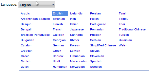
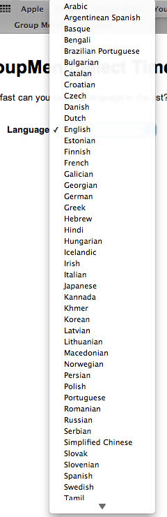
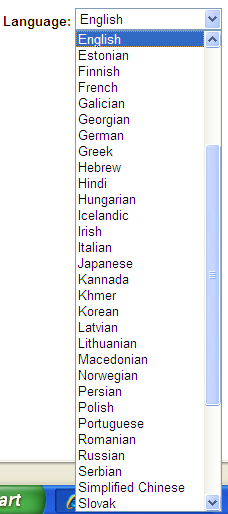
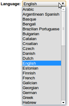
NATIVE SELECT
----------------------
Total:   51 language options
Mac:     45 visible at a time
Windows: 30 visible at a time
Ubuntu:  20 visible at a time
Android:  7 visible at a time
iPhone:   5 visible at a time, with an extra click needed for "Done"
Here are some screenshots of the native select in different systems
Mac
Windows
Chrome Linux

Android

iPhone
A broad conclusion from analyzing these results might be that once you have around 30 options in a SELECT list (like a language picker), you can likely do the majority of your desktop users a big usability favor by providing an alternative interface.
It’s worth noting too is that we could see from the data that the speed improvement wasn’t necessarily so obvious on mobile devices. The horizontal constraint and small text makes it hard to read all the languages at once, which essentially defeats some of the purpose. In Android the time to complete a language selection using the GroupMenuSelect was sometimes quite a bit higher than the native SELECT (the Android result row is incomplete as it refused to fire mousedown on the native SELECT) but that was due more to missed selections which our timer didn’t account very well for. On the iPhone, the layout, interactions and affordance all worked pretty well for the GroupMenuSelect and so we see a slight timing gain over the native control which requires many scroll events to navigate the list. In the end though, we went with a bitflip in Translate to disable the GroupMenuSelect for mobile devices before launch until we had more definitive results.
With data and edge cases in hand, we embraced the effort to integrate the new language picker in the Google Translate frontend. Since the launch in August, we’ve been able to track the time it takes our users to select a language with more granularity, precision, and less selection bias than we had in our initial experiment – and the results are by and large in line with what we saw there. This story speaks to the value of experimenting and gathering data when it comes to performance, and using those results as a bellwether to dig more deeply and make adjustments.