
 Estelle Weyl (@estellevw) started her professional life in architecture and then managed teen health programs. In 2000, Estelle took the natural step of becoming a web standardista. She currently writes for MDN Developer Network and organizes #PerfMatters Conference. She has consulted for Kodak Gallery, SurveyMonkey, Samsung, Yahoo, Visa, and Apple, among others. Estelle shares esoteric tidbits learned while programming in her blog. She is the author of Mobile HTML5 and co-authored CSS: The Definitive Guide, and HTML5 and CSS3 for the Real World. While not coding, Estelle works in construction, de-hippifying her 1960s throwback abode.
The mobile segment is the fastest growing segment of Internet users. If your site is accessible via the mobile browser, you’ll notice that your mobile OS stats has been increasing rapidly. Developing with mobile in mind will improve user experience on all devices, not just phones. Whether or not you design for mobile first, you definitely need to consider mobile performance when developing web applications.
Mobile devices may have browsers that are similar to, or even more featured, than the browsers on personal computers. Even with more advanced browsers, the devices themselves may have similar memory and bandwidth constraints to the Pentium III you were using back in 1999. While your users may be using similar applications to access your sites, the devices themselves create various constraints that you need to consider during development.
When it comes to mobile, you need to take battery life, latency, memory and UI responsiveness into consideration throughout the development process.
Battery Life
Mobile users are just that: mobile. Unlike desktop computers which are tethered to the wall at all times, and even laptop computers which are generally used by stationary users, mobile users do not recharge their devices throughout the day. Mobile users expect their devices to last at least 24 hours between recharging.
While most users realize that calls and GPS usage consume battery power, they don’t realize that different websites will drain their battery faster than other sites. You may have noticed that CPU usage drains the battery on your laptop when unplugged. CPU usage drains the battery on your mobile device just as effectively! Manage CPU usage. Avoid repaints. Minimize both size and activity of your JavaScript. Always use CSS, rather than JavaScript for animations. And, even when supported, never serve WebGL to a mobile device.
Anything that makes your laptop churn, warm up or turns your computer’s fan on also draining the battery if you’re not plugged in. Remember, your mobile device users are not plugged in!
Latency
Download and upload speeds are NOT equal to the bandwidth marketed by ISPs. The quoted MBps is actually the *fastest* connection one could possibly ever hope to get. The speed by which a website, including the markup, stylesheets, media, application scripts and third party scripts, makes it onto our devices are impacted almost as much by latency as by the bandwidth of the marketing terms of Edge or 3G.
We won’t dive into latency here. If you want a better understanding of latency and bandwidth in general, check out An Engineer’s Guide to Bandwidth by Tom Hughes-Croucher. (It also describes some tips on reducing packets.)
"Mobile users have terrible latency, so a site optimized for mobile should really reduce the number of HTTP requests it makes. Note that mobile users that surf the web over wifi experience far lower latency." — Phillip Tellis
What is important to know is that latency has a much larger impact on download speeds on mobile devices than on tethered devices or devices accessing the Internet via WiFi.. Actual speeds have more to do with packet loss and latency. Air — the stuff packets go thru to get from a mobile device to a cell tower — is the main cause of latency. In other words, your mobile users using 3/4G already have low bandwidth. Latency makes their web surfing experience that much more painful.
Because of latency issues, reducing DNS look ups and HTTP requests is vital in the mobile space. This leads us to the first web performance optimization anti-pattern: embedding stylesheets and scripts.
Embedding CSS and JS: a best practice?
Best practices for speeding up your web site recommend making your JavaScript and CSS files external and using a contend delivery network, or CDN. However, external files mean more http requests, and using CDNs for static content adds both more DNS look ups and more http requests. While embedding CSS and JS in your HTML goes against all best practices I’ve ever espoused, if done correctly, embedding your scripts on first load can help improve performance. Bing’s mobile web site is a perfect example.
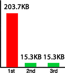

As pointed by Nicholas Zakas, when you access m.bing.com for the first time from your mobile device, the entire site loads as a single file. The CSS and JS are embedded. Images are included at data URIs. Bing for mobile put all their assets into a single file necessitating only a single http request. However, that single file is 200KB. That is huge. However, only the first visit to Bing returns such a large file. By taking advantage of localStorage and cookies, every subsequent request to m.bing.com returns a single file of manageable size. While the first request returns a huge file, every subsequent request produces a response of about 15KB.
Bing embeds all the files needed into the single HTML file. Using client side JavaScript, Bing extracts the CSS, JS and images from the original download, and saves the CSS, JS and image data URIs in local storage. Bing saves the names of the stored files in a cookie. With every subsequent page request, the cookie informs the server which files are already saved locally, allowing the server to determine which assets, if any, need to be included in the response. In this way, subsequent responses only include scripts, styles and images not saved in local storage, if any, along with the HTML.
The steps to reducing the negative effects of latency in a mobile site download by making a web app with a single HTTP request for all HTML, CSS, JS & images include the following steps:
- Embedding CSS & JS for 1st page load
- Extract & put the above embedded files in LocalStorage
- Set cookies with the names of the extracted embedded files
- On subsequent requests, check the cookies server side
- Only embed new and missing scripts based on cookie values
- Load files from localStorage resources on load
Note: If you’re wondering why this method may be more efficient than simply downloading and caching files: not only does this method improve performance by avoiding the latency of multiple DNS lookups and HTTP requests, but mobile devices have more limited cache, with iOS having no persistent memory.
Pulling data out of localStorage is a performance hit. When it comes to mobile, however, it is less of a hit than latency, especially latency with limited bandwidth.
Memory
Most performance recommendation focus on improving I/O speeds. It is not sufficient to only focus on how long it takes for responses to complete in the mobile space.When it comes to mobile and the limited memory on most mobile devices, we have to also manage what happens *ON* the device. As developers, we generally develop on our personal computers where memory is virtually unlimited. Mobile users, however, are running our sites on devices with very limited memory.
Memory on personal computers has increased almost exponentially over the past 2 decades. 256MB may have been more than enough to run all software on a Pentium II in 1997. In 2011, however, base model (i.e. ‘slow’) computers come with at least 2GB of RAM. An iPhone 3G has 128MB of memory. The original iPad has 256MB. The faster HTC Inspire has 768MB. The norm for new, high end smart phones is around 512MB of RAM with 1GHz processors. Mobile devices have software written in 2011, but run on devices that have the memory of a 1997 desktop.
While 512MB may seem large enough to run any web application, in managing memory it is important to remember that the browser (and web application) is not the only process consuming the limited RAM. The operating system, background processes and other open applications (operating system and user initiated) are all sharing the memory. Mobile devices are generally running many native applications as well as user installed apps, with or without the users knowledge. Running applications are many, including user initiated apps like Twitter, GPS, Facebook, apps that came with the device but may be running unbeknownst to the user, like Calendar and Media, and applications downloaded by the user, like Angry Birds. Native OS applications and all apps with user notifications turned on continue to run in the background. A device with 512MB of RAM likely has less than 200MB of available memory. In managing memory, remember that your web application’s most active users are likely also the ones using other mobile applications. When testing, test with real world devices. Run apps like Twitter, Facebook and Mail with notifications on all your testing devices.
The greater the number of applications running on a device, the less memory available for your web application. And, even if none of those applications are memory hogs, the sheer number of apps running in the background create high memory usage conditions. High memory usage causes a slow UI, and when the browser is out of memory, it is out of memory. The mobile browser will generally close or crash to free up memory. You need to manage the memory requirements of your web applications to ensure they don’t slow or crash the mobile browser.
Optimize Images
Other than avoid CSS expressions (YSlow) and Optimize images (PageSpeed), the performance optimization guidelines have to do with I/O and not what happens once the site is on the device. While gzipping files helps improve download speed it does not help with memory management. Once the asset is on the device, it is no longer compressed. Images use up memory. Images over 1024px cause greater memory issues. Reduce your image file sizes by serving up the image with the dimensions at which it will be displayed, and by compressing the image at that size. There are a few tools at your disposal. ImageAlpha can help convert your transparent pngs into 8-bit pngs with full transparency. The Sencha.io proxy determines what size image the user’s device requires and will shrink (not grow) images before sending them to the client.
While reducing image file size has always been important for web performance, when it comes to mobile we can’t just focus on the I/O file size. You have to consider how large the image file is uncompressed as memory is limited. All images use up memory. Composited images use GPU memory instead of CPU memory. So, while that may be a neat trick to free up some memory, composited images use up four times the memory of their non-composited counterparts, so use this trick sparingly.
I recommend keeping your web application files at use at any one time (JS, CSS, HTML and images currently displayed) to under 80MB.
Weigh the benefits of CSS
CSS can help reduce the number of HTTP requests and reduce the size of the requests that are made. With gradients, border-radius, box and text shadow and border images, you can greatly reduce the number of HTTP requests. The benefits of CSS is that effects are:
- require fewer HTTP Requests
- Updatable
- Scalable
- Transitionable
- Animatable
However, painting these effects to the screen has associated costs. Sometimes pngs, gifs and jpegs render faster and use less memory than CSS effects. Any CSS features that is transformable is generally evaluated at each reflow and repaint, using up memory. PNG, JPEG and GIF images, unlike CSS generated images, are rendered and transitioned as bitmaps, often using less memory (but more http requests). For example, shadows, especially inset shadows, kept in memory and are repainted even if obfuscated by another element with a higher z-index. And, while a radial gradient may take 140 characters of CSS, the browser will paint and keep in memory the entire gradient, not just the section of gradient that is displayed in the viewport. I recommend using linear gradients and native rounded corners over images, but weigh the performance of radial gradients and inset shadows against the cost of downloading image.
Weigh the benefits of CSS. While CSS images are generally the preferred solution over using PhotoShop and uploading exported pictures, some CSS features have hidden costs due to memory usage and rendering slowness.
GPU benefits and pitfalls
On some devices, by transitioning or transforming an element into a 3D space, the element is hardware accelerated. By transferring the rendering of the element from the CPU to the GPU, you can greatly improve performance, especially when animating. However, translate3D is not a panacea! Hardware accelerated elements are composited. Composited elements take up 4 times the amount of memory. Using GPU instead of CPU will improve performance up to a point. While hardware accelerated elements use up less RAM, they do use up video memory, so use the
div { transform: translateZ(0); }
trick sparingly.
Viewport: out of sight does not mean out of mind
The mobile phone viewport is the viewable screen area. Unlike your desktop browser where you scroll content, on mobile devices unless the viewport height and width are set, and scaling is disabled, the viewport is fixed and the user moves the content underneath. The viewport is a “port” through which your users view your content. Why is this a perfermance issue? Most don’t realize that the content that is drawn to the page, even if it is not visible in the current viewport, is still in memory.
Minimize the DOM
Every time there is a reflow, every DOM node is measured. The CPU on your desktop can handle a virtually endless number of nodes (it will eventually crash). The memory on mobile devices is limited and garbage collection differs so is not fully reliable. To improve performance, minimize the number of nodes. Instead of allocating DOM nodes and destroying them (or forgetting to destroy them), pool and reuse your nodes. For example, if your creating a card game, create no more than 52 nodes, reusing pooled nodes instead of creating a new node every time a card is added back into the game.
As you know from JavaScript best practices, touching the DOM with a read or write is expensive. Cache DOM lookups
and store them in variables.
Also, batch DOM queries and DOM manipulations separately, minimizing DOM manipulations by updating content fully outside of the DOM before updating the DOM.
When it comes to managing memory, image optimization, CSS rendering, and DOM node count are not the only points of concern. These are just points that are not necessarily considered in the desktop space when focusing on performance.
UI Responsiveness
Mobile browsers are single threaded. In that respect, mobile browsers are similar to desktop browsers. Mobile devices do are different though because of the limitations of the device. It is always important to manage your JavaScript. Bloated and inefficient JavaScript is even more problematic on mobile devices because of battery usage and memory.
There is more to UI responsiveness on mobile than just single-threaded-ness. Because of latency, the browser may appear to hang after selecting an action because it can take a while for the round trip. It is important to provide user feedback within 200ms after an action is taken. If you are showing or hiding an element, no need to provide feedback, since the app will be responsive. However, provide feedback to indicate that your site is responding if your user has to wait for a round trip for a UI update.
In addition, because the mobile device is a touch device, and "double tap" is a potential user action, mobile devices actually waits for potential double taps before responding to user action. On iOS devices there is a default 300ms wait after the touchend event before any action is taken. Because of this, you may want to co-opt default events like the tap with by adding an event listener to the touchend event to make your application more responsive.
Summary
The above is not an exhaustive list of topics to consider in ensuring good mobile UI performance, but should be a good start. Remember that mobile is the fastest increasing segment of our users. Don’t ignore them.
As developers, we’ve tested our websites to make sure we’ve followed the points and goals recommended by Yahoo’s YSlow and Google’s PageSpeed. We’ve tested and tested… using our desktop browsers. We’ve assumed the web performance optimization guidelines improves web application performance for all browsers, whether our users are accessing the site on their laptop, iPad, android phone or even their Wii. And, to a great extent, it does. But remember that the well known and heeded optimization guidelines aren’t our only concern when it comes to mobile.
Do continue testing your website, but make sure to test on mobile devices. Emulators are not simulators. The emulator does not simulate memory constraints and does not simulate the device with 100 apps open. Test on real devices in real scenarios (turn the wifi and test with many, many unclosed apps hanging in the background).