

Éric Daspet (@edasfr, @webperf_fr) is CTO in an open e-book distribution startup. He wrote about PHP, founded Paris-Web conferences to promote web quality, and is now pushing an open book about performance.
We used to focus on metrics but perceived performance is far more important than actual performance. In our pursuit of better metrics, we too often forget simple good old tricks. Here is a quick reminder of how you should deal with a user waiting:
First rule is: do not let your users wait more than 100ms. Ever.
Under 100ms, the user will generally not feel the delay. If you succeed in complying with this first rule, don’t ruin everything by adding a throbber or a progression bar. These would simply make the user realize he’s been waiting for something.
As you will see, each solution may result in a dramatic user experience if the wait is longer than the one expected. Here, never let the user wait too long with no indicator. The interface will appear sluggish, and slower than necessary.
The first rule is simple, but what if you have to make your user wait more?
From 100ms to 1 second, a simple animation may drastically reduce the perception of waiting time. The best way of achieving this is by anticipating the result of the user’s action. Did he just try to delete something? If so, start deleting it instead of waiting for the actual result. Did he try to post a comment? Then put his comment text at the end of the list and scroll to show it in place.
Again, don’t rely on a simple animation and let the user wait, should the delay exceed one or a few seconds. Your user may not wait for the final result, or may think something is broken.
From 1 second to 10 seconds you probably should display an animated throbber. You will find thousands of those by googling. Choose a simple one with a fast animation. I am not saying that the faster the better but if your throbber is slower than the one from your competitor’s, your site may be seen as slower than your competitor. Users won’t care if you are actually slower or not, they care that you may appear such. Oh, and choose any animation you want but avoid the old windows-like sandglass, please.

Old anecdote: In an old Mozilla Firefox wiki page about performance you can read “Make the throbber faster :p (we honestly do it every release)” under the title “Perception of how fast Firefox is working”. This page was from 2009 but they still accelerate the throbber in 2012. It seems like cheating but having a faster browser is not enough, it is important to let the user know and feel that the browser is actually faster. It is no different for your website.
Again, there a danger in relying on a throbber for very long times. The user can’t know on how long it will take and may think the action is stuck somewhere. The performance perception may be horrible.
Starting from 5 or 10 seconds, you should add a progress bar. Chris Harrison published two interesting research papers about progress bar perception. The first one tried to use easing functions to let the progress bar appear faster or slower at certain moments of the progress, and the results were statistically significant: Bars with many acceleration/deceleration phases or with step by step progression (slow and fast wavy in the illustration) produce the worst user experience, followed by progress bars that pause near the end (late pause). The optimal performance perception is achieved with bars accelerating progressively (power and fast power).
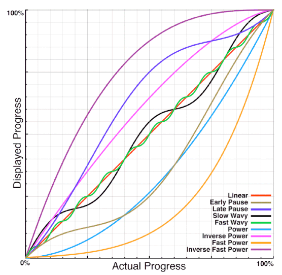
There are four consequences:
- If you are free to order your tasks in the process, begin with the slow ones and finish with the quick ones.
- Try to anticipate the progression so the progress appears fluid for the user and avoid a jagged step by step experience.
- If you are able to anticipate the total duration of the progress, apply a function so that your bar won’t use a linear progression but an accelerated one.
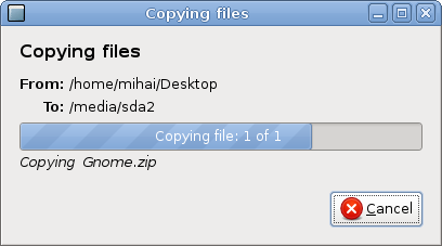
- Never ever finish your progress by “one additional step to synchronize, write, store, compute” so it may appears to pause at the end or near it. If you need to, either dismiss the progress bar in advance (the file copy dialog of Microsoft Windows XP did this), or take this last step into account in the total duration and progression of the bar.
Here again, Firefox considered this in its 2009 document: “Change all progress bars in Firefox to use an easing function that automatically biases progress to appear slower at the beginning and faster at the end”.
A second study tried to add visual pulsations or animated ribbing to the progress bar (video). By adding a pulsation (preferably a decelerating one) or animated ribbing (going backward, from right to left) you may reduce by 11% the duration of the wait time as perceived by the user.
You may see this simple trick used everywhere if you pay attention. For example, Mac OS X, Gnome and Gmail all have ribbed progress bars with backwards going animations.
Starting from 15 or 20 seconds the main rule is “don’t let the user wait”.
Preferably, ask the user to wait and don’t block or freeze the user interface: Let the user know that a long process is starting, let him continue his work and send him a message when the process is finished. Whether it be a popup within the application, a text message on his phone or an e-mail, both the process and the notification must be asynchronous. Most import/export processes, for example, use this procedure, but it probably could be extended to other actions.
If you have to work synchronously, in addition to the progress bar, distract your users from the wait time by proposing them something else to do. The GNU/Linux distributions Open Suse and Ubuntu chose a few years ago to display a slideshow explaining the new features during the installation.
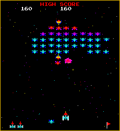
Ark Linux used to let the user play a game to avoid him feeling the wait. The “minigames game during loading” trick is an old one. Games themselves used mini-games during their own loading, from Commodore 64 to Playstation 2. With HTML 5 and new browser capabilities, it is becoming available in our webapps.
Perception is the key. All the above may seem like we are cheating. We didn’t improve our actual performance by even 1ms. However, if the user’s feeling is the one of a fast website, why even bother?
Don’t misread me however: Perception and actual metrics are complementary. Metrics without perception enhancements may be useless but you will soon hit the limit if you only apply perception tricks. You may even be counter-productive if the user ever feels he was abused.