

Rick Viscomi (@rick_viscomi) is a web performance engineer and developer advocate at Google working on web transparency and the HTTP Archive.
In a previous life he also helped make YouTube fast and coauthored the book Using WebPageTest.
There are many case studies documenting how web performance and business metrics like conversion rates and ad revenue are correlated. But when a website is slow, those lost conversions and ad dollars don’t just evaporate �” they go to a competitor.
To get a sense of this risk, competitive analysis is the practice of benchmarking how similar websites compare. Traditionally, we would load up a couple of WebPageTest runs for our site and a competitor and compare everything from time to interactive (TTI) to the number of bytes it loaded. This is useful data, but admittedly there are some blind spots. Synthetic testing is only as relevant as the accuracy of its configuration. Tuning tests for a website under our own control is easy; we can just look at our real user measurement (RUM) data and calibrate accordingly. But how do we calibrate a test of our competitor’s website without making blind assumptions about its users?

The Chrome User Experience Report (CrUX for short) addresses this gap by providing aggregate data from real users across the top sites on the web. With it, you can confidently perform a competitive analysis of sites knowing that the data is backed by real user experiences.
You may have heard about CrUX in October when it was unveiled at the Chrome Dev Summit. The initial dataset included 10,000 origins, but this week’s new release has expanded coverage of over 1 million origins. So how does it work? Per the Chromium Blog announcement:
All performance data included in the report is from real-world conditions, aggregated from Chrome users who have opted-in to syncing their browsing history and have usage statistic reporting enabled.
The report includes histogram data for the following paint and page load metrics: first paint, first contentful paint, DOM content loaded, and onload. These metrics are aggregated by origin and can be sliced by dimensions like form factor and effective connection type (4G, 3G, etc) to give you a more granular understanding of user demographics and how they affect the user experience. To top it all off, new data is added on a monthly basis so that you could analyze how user experiences evolve over time.
The entire dataset is fully queryable on Google BigQuery. For example, you could write a query to compare the distribution of first contentful paint (FCP) experiences of Hacker News and Reddit:
#standardSQL
SELECT
  origin,
  ROUND(SUM(IF(bin.start < 1000, bin.density, 0)) / SUM(bin.density), 4) AS fast_fcp,
  ROUND(SUM(IF(bin.start >= 1000 AND bin.start < 3000, bin.density, 0)) / SUM(bin.density), 4) AS avg_fcp,
  ROUND(SUM(IF(bin.start >= 3000, bin.density, 0)) / SUM(bin.density), 4) AS slow_fcp
FROM
  `chrome-ux-report.all.201711`,
  UNNEST(first_contentful_paint.histogram.bin) AS bin
WHERE
  origin IN ('https://news.ycombinator.com', 'https://www.reddit.com')
GROUP BY
  origin
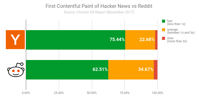
The results show that Hacker News has a sizeable competitive edge by serving pages with a greater proportion of fast FCP than Reddit. But how can we tell if Reddit’s website is truly slower or if the results are skewed by a greater proportion of Reddit users being on slow network connections? To answer that question, we can use the effective connection type data in CrUX to get a sense of users’ network conditions.
#standardSQL
SELECT
  origin,
  effective_connection_type.name AS ect,
  ROUND(SUM(bin.density), 4) AS density
FROM
  `chrome-ux-report.all.201711`,
  UNNEST(first_contentful_paint.histogram.bin) AS bin
WHERE
  origin IN ('https://news.ycombinator.com', 'https://www.reddit.com')
GROUP BY
  origin,
  ect
ORDER BY
  origin,
  ect
| Origin | ECT | Density |
|---|---|---|
| https://news.ycombinator.com | 3G | 0.0831 |
| https://news.ycombinator.com | 4G | 0.9171 |
| https://www.reddit.com | 3G | 0.034 |
| https://www.reddit.com | 4G | 0.9656 |
The results show that while both origins have a very high density of fast 4G speeds, Hacker News actually has a slightly smaller proportion of page loads over 4G speeds. Combined with the FCP data above, we can more confidently give Hacker News the competitive edge at least as far as FCP is concerned (the other metrics show similar results).
This demo only scratches the surface of CrUX. There’s so much more to explore like the breakdown of desktop and phone users, trends over time, and even mashing up RUM with synthetic data to get a better understanding of how the way a web page is built affects the user experience. Visit the CrUX docs to learn more about the methodology, data organization, and how to get started writing your first query. If you have any questions or feedback, visit the CrUX group.
Oh and one more thing… Have an awesome project idea that requires some serious number crunching? Click here to request 10 TB worth of BigQuery credits!