

Tim Vereecke (@TimVereecke) loves speeding up websites and likes to understand the technical and business aspects of WebPerf since 15+ years. He is a web performance architect at Akamai and also runs scalemates.com: the largest (and fastest) scale modeling website on the planet.
More and more people are making use of the data saver mode built into their browser (Opera Turbo, Yandex Turbo Mode, Chrome Data Saver). As website owners we should listen and serve a lightweight version when the data-saver request header is present.
I’ll share the approaches, trade-offs and results from my journey shaving off bytes on www.scalemates.com. With around twenty thousand daily visitors it is the largest scale modeling website in the world.
The light version consumes 50% less bandwidth on an iPhone
Visitors to my website opt in for this new slim version for various reasons: Some want to save on money (eg. standard data cost, roaming,…), stay under data limits (eg. free Wi-Fi at the airport) or they want to improve performance (eg. bad network conditions) or a combination.
Quoting a regular user from Australia:
“This is great for me living in the wilderness off a cell(phone)modem.”
I have been using performance budgets for many years, but the new light version unexpectedly broke this model. I will address how the use of a data budget matrix solved the issues I faced.
Here is the structure of my journey:
- Step 1: Understanding your users
- Step 2: The basics
- Step 3: Smart data-saver detection
- Step 4: Removing content
- Step 5: Serve low(er) quality content
- Step 6: Inform the user
- Step 7: Monitor
Step 1: Understanding your users
Is it worth the effort and do my visitors actually care? These were 2 questions I asked myself a few months ago. None of my analytics tools (Google Analytics/mPulse RUM) currently track data saver mode out of the box. Luckily adding a custom dimension is an easy task and the way forward to get the required insights. (see Google Analytics – Including non-standard data in your reports)
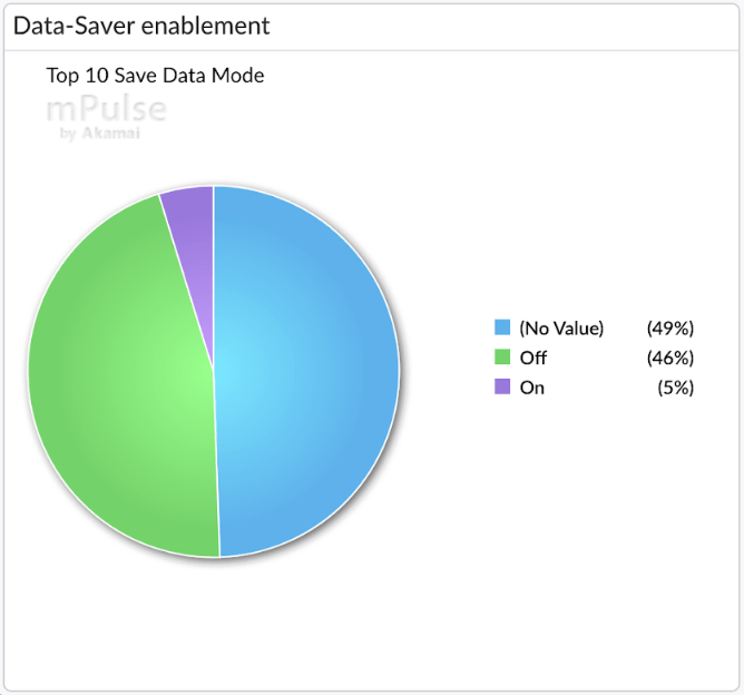
Real user data showed me that 51% of my visitors expose the save-data header (On+Off). Around 5% of my user base is hinting me to serve a lightweight version of the website.
The pie charts below drill down on those visitors requesting to save data.
The pie chart on the left hand side indicates that high pixel density screens are leading the pack. This makes sense, as websites serving high quality responsive images can consume a huge amount of traffic.

The second pie chart shows adoption by country. Looking at the top 5 countries in the list you see that it is certainly not limited to emerging countries only.
From my perspective the above data showed that demand was high enough to consider creating a lightweight version.
Step 2: The basics
The first step was to make sure I got the basics right: Get rid of any byte which doesn’t contribute to the user experience and quality of my app.
Ensure you apply all standard #WebPerf best practices focussing on saving bytes:
- Apply browser caching
- Minify CSS, JS, HTML, SVG
- Font subsetting
- Compress via Gzip and when applicable Brotli/Zopfli
- Dust and clean your unused CSS and JS
- Optimize images (WebP/JPEGXR/JPEG2000 – Optimal quality)
- Remove unwanted response headers (X-Powered-By, Server, Expires …)
- Get rid of 404 requests
- Get rid of duplicate content
- Enable HTTP/2 (Compressing headers)
- Reduce 3rd party content
An awesome online and free tool which helps me with detecting and optimizing many of the above is yellowlab.tools
Each byte saved in this phase makes makes the next steps easier. The other advantage is that what you do here impacts all your users independently of the data-saver mode.
Although performance and byte savings were always on top of my mind, doing this exercise recently saved some extra bytes. I had introduced some duplicate CSS selectors, I found 2 unused JS functions and the only reason I had jQuery UI was because of autocomplete. So I switched to the awesomplete library as a lightweight alternative.

The graph above shows the byte saving improvements after my JS optimisations. There is a nice drop off in the transfer size on October 10th where it goes from 41Kb to 33Kb, about 20%
Step 3: Smart data-saver detection
Only looking at the presence of the data-saver header and blindly shipping less bytes to the end user is unfortunately not always the best approach.
In my design I had these 3 use cases in mind:
- I want visitors sending “data-saver: on” to easily toggle this mode based on their own preferences (either session based or individual pages).
- I want to provide the same options to browsers not sending the client hint.
- I want to easily validate/test the impact (eg. Webpagetest, Browser Dev Tools, Yellow Labs, Pagespeed Insights…)
The solution to this was straight forward:
- Add 1 optional persistent cookie to store user preferences
- Add 1 optional query parameter for ad hoc enablement of the full version
Here is the backend function to check if I need to serve the Lite version (return true) or Full version (return false)
function isDataSaverEnabled(){
  if($_GET['save-data'] == 'on'){
     return true;
  }
  if($_GET['save-data'] == 'off'){
     return false;
  }
  else if($_COOKIE['save-data'] == 'on'){
     return true;
  }
  else if($_COOKIE['save-data'] == 'off'){
     return false;
  }
  else if (strtolower($_SERVER['HTTP_SAVE_DATA']) == 'on'){
     return true;
  }
  return false;
}
The GET parameter takes precedence over the COOKIE, the COOKIE takes precedence over the Header. The default is the full version.
Step 4: Removing content
Once the detection mechanism was implemented I started the fun work of saving bytes!
This section covers how to save data by simply removing content when the light version is requested.
The more bytes you save in this step the better. It allows you to be less drastic in the next step (Reducing quality)
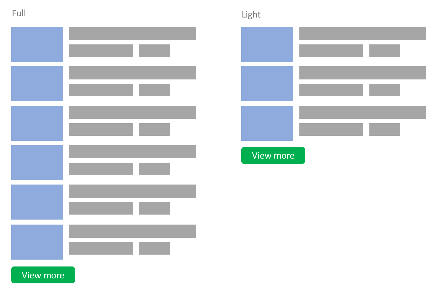
Reduced teaser content
In the full version there are up to 40 related articles with nice attractive thumbnails and a “View more” link. When a user has data saver enabled I show the “View more” link after 15 articles, saving 25 HTTP requests and a lot of bytes.
$maxRelatedArticles = 40;
if (isDataSaverEnabled()) {
  $maxRelatedArticles = 15;
}
Infinite scrolling
Infinite scrolling is used on some pages instead of pagination (eg. newsfeed, search results). When visitors scroll down a JS listener triggers an XHR request for additional content 200px before they reach the end of the page.
In the light version I ship less content on the initial page, and less content is requested when the XHR request is triggered.
The downside is that the user creates more requests for the same amount of content. But the chance that they download content which they do not need is drastically reduced.
$pagination = 40;
if (isDataSaverEnabled()) {
  $pagination = 20;
}
Still under consideration is to change the standard threshold (200px) and wait a bit longer before actually requesting the next page.
Remove non crucial content
In the sidebar every page shows a small widget with the amount of members currently online.

This includes 7 avatar images supporting various screen sizes and resolutions. This is non essential content and is therefore removed when data saver mode is turned on.
if (!isDataSaverEnabled()){
  displayWidgetOnlineusers(7);
}
Other content falling in this category included:
- logos to sister websites/brands
- logos of the 20 supported payment providers
- 75 country flags
Advertising slots
Advertising is key for many websites (and also for mine), but they can generate plenty of additional requests and bytes.
In the light version the number of ad slots per page is reduced.
I removed the ones generating the least amount of revenue so the business impact is low while the data savings are still relevant.
Small sidenote: With privacy and performance in mind I switched from 3rd party ad providers and went for a 1st party ad solution in May 2018 (this was related to GDPR). From a data saver perspective it means there is no risk that a chain of 3rd/4th party requests is triggered resulting in out of control bandwidth consumption. Also, all banner images are served on my own domain and are optimized by the CDN.
Video auto-play
Some of my help pages contain the HTML5 video element with autoplay enabled. When the lite version is delivered, the autoplay attribute is omitted as shown below:.
// Full
<video controls autoplay>
  <source src="howto-create-album.mp4" type="video/mp4">
</video>

// Light
<video controls>
  <source src="howto-create-album.mp4" type="video/mp4">
</video>
Remove preview thumbnails
This technique simply removes preview/teaser images.
This is a valid option to consider as it works well on many websites. A nice example is a news website where the headline of the link is enough to provide the context.
For my website this technique was however not suitable. The product images provide a lot of context which can not be replicated with words alone.
So for all my images I had to find another solution. This is discussed in the next step.
Step 5: Serve low(er) quality content
This step has a lot of potential in terms of byte savings, but this potential comes with a significant cost. There is impact on user/brand experience by lowering the quality of images.
My aim in the first iteration was to save significant bytes while maintaining good enough quality.
There are 2 main categories of images
- Teaser images: Thumbnails used in overview/search pages
- Hero images: Full width product images, album images etc.
The same process was applied to both types of image, but the detail below describes the approach taken for the teaser images only.
The main thumbnails are all 160x96px in CSS size. Depending on the DPR (1x,1.5x, 2x and 3x) I upgrade the image to a 240px, 320px or 480px wide variant via the srcset attribute.
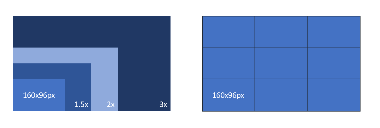
Above shows a small scale drawing comparing the 4 variants. The 3x version has 9 times more pixels than the 1x variant.
Here is the default HTML output for one of my product teaser images.
<img alt="1:112 X-Wing Fighter (Revell 03601)"
  src="/products/boxart-t160.jpg"
  srcset="/products/boxart-t240.jpg 1.5x,/products/boxart-t320.jpg 2x,/products/boxart-t480.jpg 3x"
>
It boils down to this little matrix:
|
DPR |
1x |
1.5x |
2x |
3x |
|
Full |
160px |
240px |
320px |
480px |
Approach 1: Downgrade quality
The first dimension I looked at was quality. Creating a lower quality image with higher lossy compression and serving it via another URI (added *-lq.jpg).
// HTML Output
<img alt="1:112 X-Wing Fighter (Revell 03601)"
  src="/products/boxart-t160-lq.jpg"
  srcset="/products/boxart-t240-lq.jpg 1.5x,/products/boxart-t320-lq.jpg 2x,/products/boxart-t480-lq.jpg 3x"
>
Although easy to implement, the disadvantage is that you would require 4 additional images per thumbnail. I have 500K products in the database, this would mean 2 million extra images.
I was also concerned that introducing more variants could impact my offload and CDN performance.
Approach 2: Always show the 1x version
The second approach is also easy to implement, just get rid of the srcset element in the backend and always serves the image corresponding to your CSS size (1x) when data saver mode is enabled.
// HTML Output
<img alt="1:112 X-Wing Fighter (Revell 03601)"
  src="/products/boxart-t160.jpg"
>
This offers the largest byte savings for non-1x screens. The downside however is that for smaller images falling back to 1x has a very large quality penalty. Another disadvantage is that for 1x screens nothing changed.
Compared to approach 1, we don’t have to create new images and on the CDN no new variants need to be served as we reuse the 1x version.
Approach 3: Downgrade DPR level
This option ships less bytes to visitors but it avoids over compressing images making the quality poor.
This is achieved by downgrading the DPR level by 1 level:
- For 3x screens serve the 2x image
- For 2x screens serve the 1.5x image
- For 1.5x screens serve the 1x image
The matrix version of the above logic:
|
DPR |
1x |
1.5x |
2x |
3x |
|
Default |
160px |
240px |
320px |
480px |
|
Light |
160px |
160px |
240px |
320px |
An alternative is to add a maximum cap and never serve larger than 240px for high resolution screens. In this example this would mean ignoring any screen that has a resolution higher than 2x.
// HTML Output
<img alt="1:112 X-Wing Fighter (Revell 03601)"
  src="/products/boxart-t160.jpg"
  srcset="/products/boxart-t160.jpg 1.5x, /products/boxart-t240.jpg 2x
>

The matrix version of the logic:
|
DPR |
1x |
1.5x |
2x |
3x |
|
Default |
160px |
240px |
320px |
480px |
|
Light |
160px |
160px |
240px |
240px |
This solution comes close to meeting all requirements including, good enough quality, good enough byte savings, no new files, no offload hit.
Approach 4: Serve alternate content based on same URL
All the previous approaches had one downside for users switching from light/full or vice versa.
The approaches above ignored potential content in the browser cache and would download light variants (extra bytes downloaded) rather than using the full variant in cache (0 bytes over the network).
Tackling this problem can be done either via a service worker or on your CDN/origin.
Service workers
Service workers are great and the site already has a service worker to support offline viewing and sending push notifications, therefore integrating some data improvements here too seemed like a natural choice.
- Intercept the fetch() request for the full image
- Check the cache for the high-res version.
- serve the image from cache or continue
- rewrite the request URL (e.g. replace “-320.” with “-160.”)
- find/serve the low-res version from cache
- fetch low res version from origin
- store low res version in cache
if (event.request.headers.get('save-data')){
  let saveDataUrl = event.request.url
    .replace("-240.", "-160.")
    .replace("-320.", "-160.")
    .replace("-480.","-160.");
  event.respondWith(fetch(saveDataUrl));
}
At first glance this looked perfect, but there are 2 major limitations:
- It requires the service worker to be installed: This means that for new visitors the full version images would still be shown on their first page view. I could get rid of that issue by presenting all users with a fast loading splash screen. But for my website (today) this is not an option.
- It results in mixed quality content (some images good, some images bad)
Moving it to the Backend (CDN or Origin)
If your CDN supports serving alternate content requested over the same URL than the below approach is an option to consider.
The trick is to modify the cache key based on the presence of the save-data header. Next do a regular expression replacement and rewrite the forward request to the alternate variant. Below is an easy example for the Akamai CDN where the 360px request is rewritten to the 240px request.

Alternatively, when you have image conversion capabilities in your CDN you can do some magic there as well.
This works on first page view unlike the service worker approach. It also offers the benefit of working without the use of JS. Making the site work and perform well without JS is something I am currently working on and may make a good subject for next year’s perf calendar!
Implemented strategy
Looking at the pros and cons of the differents approaches I decided to implement the below strategy.
Light version
When in light mode, I downgrade 1.5x to 1x. For higher resolution screens I always serve the 1.5x variant.
// HTML Output
<img alt="1:112 X-Wing Fighter (Revell 03601)"
  src="/products/boxart-t160.jpg"
  srcset="/products/boxart-t160.jpg 1.5x, /products/boxart-t240.jpg 2x
>
Full version
I looked at the additional bytes required for serving 3x images versus the 2x variants. The 3x images consume roughly 40% extra bytes. Looking at the quality difference on a 3x enabled phone was only marginal and disappointing. So I decided to remove 3x support for all versions.
|
DPR |
Image Decoded body size |
|
3 |
898Kb |
|
2 |
560Kb |
|
1.5 |
410Kb |
|
1 |
207Kb |
The above table shows the amount of bytes (Image decoded body size) per DPR for the full version. The 3x version is 338Kb extra compared to the 2x version.
Step 6: Inform the user
When data saver is enabled we compromise on quality and usability in favour of saving bytes. The risk here is that users might get the wrong impression about my brand.
To mitigate this risk I implemented the below:
- Let my visitors know you they are in data saver mode
- Educate my visitors what I changed
- The option to toggle individual images to high res variants.
- Indicate the extra bytes they will consume when toggling

Above screenshot shows how this was implemented on my website (see 2 red squares)
Step 7: Monitoring
This section looks at best practices when it comes to tracking data consumption on my own website.
Data Budget vs Performance budget
Since I first read Tim Kadlec’s article on setting a performance budget in 2013 I have been a big fan of this concept. It offers a simple way to talk about performance inside an organisation and an easy way to detect changes.
I personally distinguish and track both my Performance budget in milliseconds as well as my Data budget in bytes.
Although often related they are not the same:
- Saving bytes will not always improve performance, for example removing
X-Powered-By: php7.0-fpmon 50 resources will likely not show a millisecond of impact. - Sometimes adding bytes can improve perceived performance, for example adding Low quality image place holders improving SpeedIndex but negatively impacting data.
Data Budget Matrix
Monitoring performance budgets and data budgets is not easy in a responsive design world with different breakpoints and screen resolutions. Once you start serving a light and a full version this adds another dimension to consider.
One number is great to keep things simple, unfortunately the extra dimensions make monitoring data budgets more complex. This is true for both synthetic and RUM.
- The extra dimension reduces the chance a synthetic test corresponds to reality. Picking one device, one DPR and one version is not representative for all the other variants a websites serves to their users.
- While RUM gives you full insights in all the different permutations it is never easy to find one meaningful value. Adding the extra dimension doesn’t make the exercise easier.
I solved this by setting up a data budget matrix. An approach which I found to work very well for RUM and synthetic monitoring.
This matrix looks at the key dimensions which trigger a different version of the site. For my website I look at these main dimensions:
- Device type: Desktop, Tablet, Phone
- DPR: 1x, 1.5x, 2x, 3x
- Data-Saver mode: On, Off
Here is my Data Budget matrix populated with mPulse RUM data. You can clearly see the byte savings efforts when the Lite version (Data-saver: On) is served.

This reflects real user data. Although there are some fluctuations such as different ads being served to different users or a mobile advert could be heavier than a desktop advert, on the whole the data is consistent
You can simplify the matrix by removing 1.5x or extend this by adding 4x depending on your use case.
This also shows some gaps in the real world that synthetic testing may miss, such as no users have tablets with 3x displays and no mobile devices with 1x displays visit my site.
Summary
Your users are key! Listen to them when they request to save bytes. Save bytes by combining techniques focussing on quality reduction or removing non-crucial content. Use a data budget matrix to keep track of the different versions of your site. Bytes are key, but quality and usability are equally important. Try to find a good balance between saving enough bytes while maintaining good enough quality.
I hope this input was useful for your next projects!