

Gilles Dubuc (@MonsieurPerf) is the engineering manager of the Performance Team at the Wikimedia Foundation.
At the Wikimedia Foundation, we collect RUM data on Wikipedia and sister sites on a sampled pageview basis. This data, collected from various browser APIs like NavigationTiming is then stored on our self-hosted Hadoop cluster. At a smaller scale, a single database instance could be more than enough to achieve the same thing. You might even afford the luxury of collecting RUM metrics for every pageview, even though in most cases that is probably overkill.
Having all this data in a queryable database makes for a very convenient tool that has become my go-to resource when it comes to answering questions about our real world performance. While you can get similar data in Google CrUX (Chrome-only, though), or with commercial RUM data collection and processing providers, I find that in a lot of situations nothing can beat having access to the raw data for all browsers in a database.
Here are some examples of big questions I was able to answer in recent weeks by leveraging our raw RUM data.
Is traffic dropping in Japan as the month goes by?
In November this slide based on Chrome RUM data made by Kenji Baheux made the rounds:
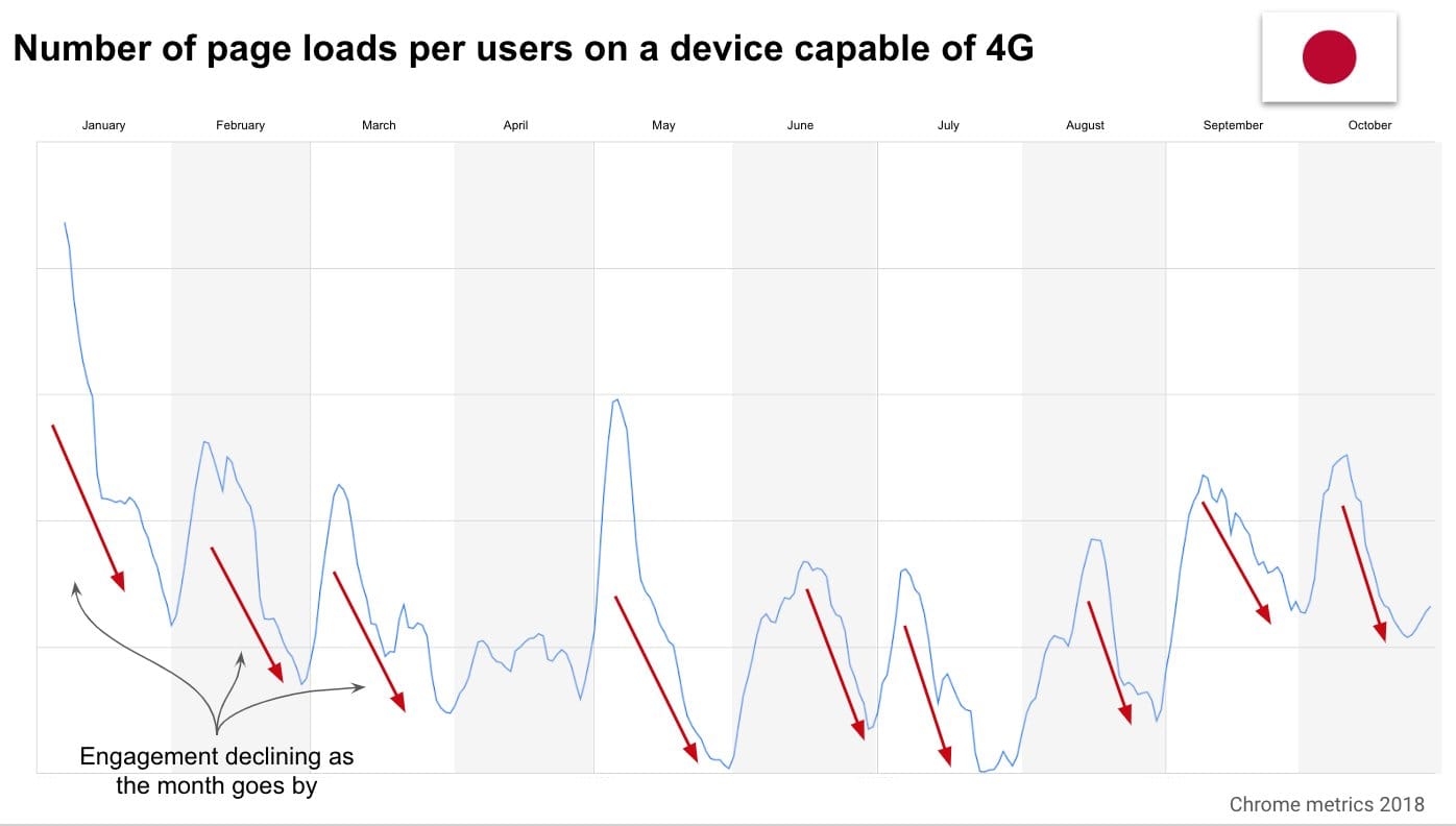
It shows that in Japan the combination of contract renewal being on the 1st of the month for everyone and users being throttled to 2G speeds after a certain amount of data usage results in a drop of bandwidth and pageviews observed towards the end of the month. With the effect worsening every day.
When I see big performance discoveries like this without the underlying data being shared, I start from a very skeptical standpoint. Having dealt with RUM a lot myself, I know that it can be easy to make mistakes in how the data is filtered and interpreted. Since Japan is the 3rd largest country visiting Wikipedia in terms of pageviews, that gives us plenty of data to verify the existence of such a phenomenon. Also, while the effect may be real on the web as a whole, I want to know if it affects Wikipedia more or less than others.
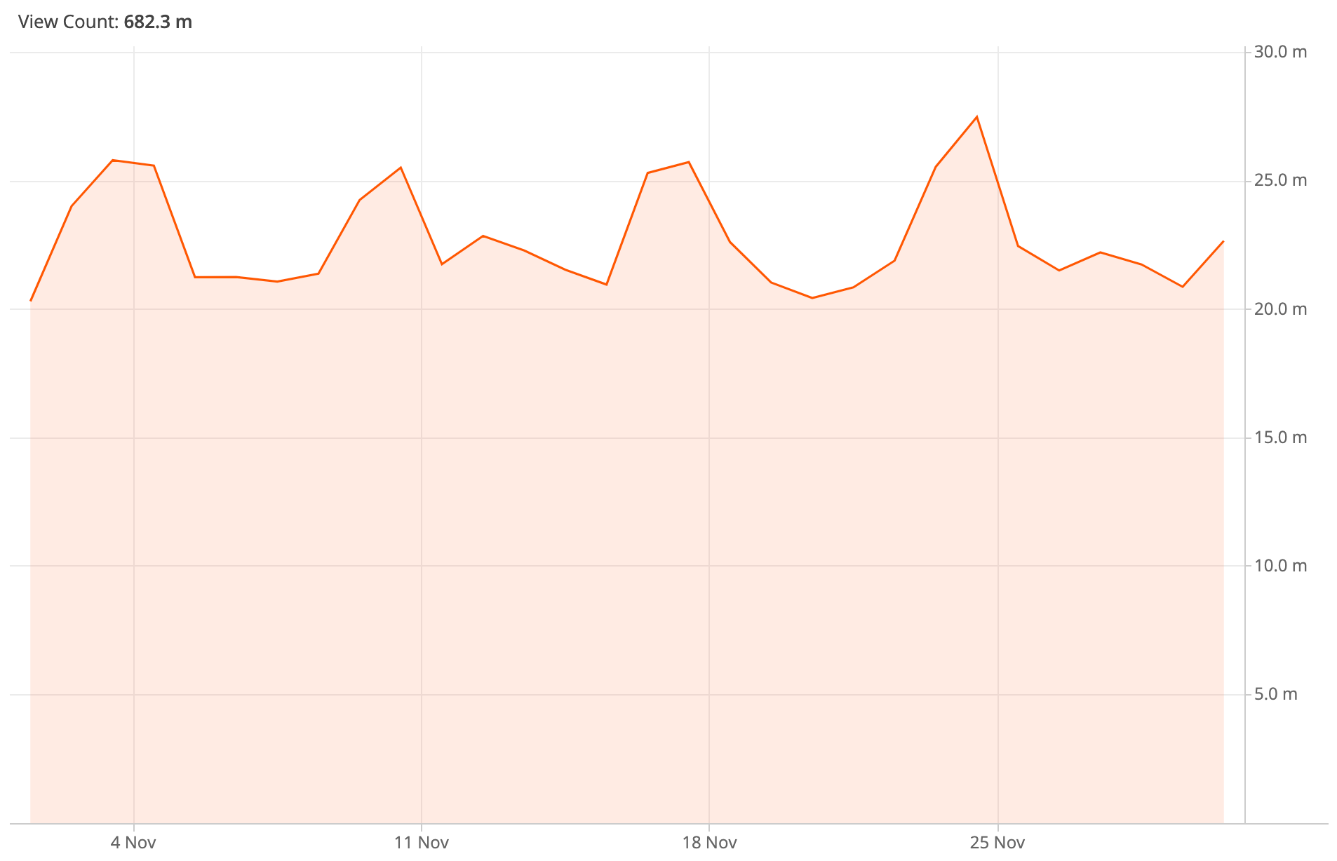
Looking at total pageviews coming to the mobile web variant of Wikimedia projects from Japan over the course of a single month (November 2019), there is definitely no downward slope observed. The spikes seen are regular weekly usage patterns (Kenji’s graph is over 10 months, the graph below zooms in on a particular month).
Using the NetworkInformation API, we measure the effective connectivity of our visitors (more details about this later in the post). One would think that if the throttling is as harsh as 2G speed, it should be visible in our median connectivity for visitors connecting from Japan over a cellular network (this is also information the API gives us). But that isn’t the case:

Following Rick Byers‘ advice, I finally looked at what it was like at the p5 (the threshold for the 5% of our visitors with the worst effective downlink speed):
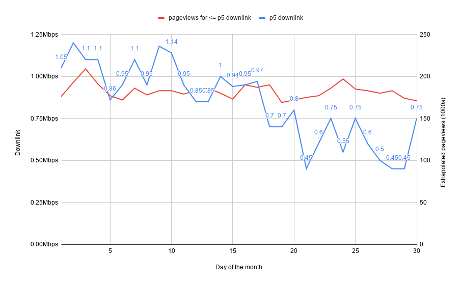
Here we see that pageviews for this cohort of slow connectivity users is also stable. Finally we do see that the connectivity is indeed getting worse as the month goes by for these visitors with the worst connectivity. The spike back up on the 30th of the month is explained by the fact that we look at our data with UTC dates, and midnight on the night of the 30th of the month in Japan happens at 15:00 UTC. This spike is particularly interesting, as it confirms the contract renewal effect.
This brings up a very interesting fact, which is that some visitors to Wikipedia and sister projects do get their connection throttled towards the end of the month, yet they don’t view less pages as a result. Maybe it’s because our visitors know that Wikipedia still remains usable even at low bandwidth? At any rate, it’s interesting to see how the results diverge for our sites compared to the rest of the web. And that’s something that makes diving into your own RUM data worthwhile, as patterns observed on other websites might apply differently to your specific situation.
Which phone represents the p25 experience the best in a given country?
Our team is currently looking into the possibility ot building up a device lab for performance testing. In the meantime we have started experimenting with low-end devices for our exploratory performance testing. In that context, when deciding which lower end phones to buy, I decided that instead of doing the typical “buy the cheapest phone” or “buy the most popular phone on Amazon”, I would instead turn to our RUM data to find out which phones represent a specific percentile of our userbase the best.
I set out to establish what is the p25 phone in terms of processing power and what is the p25 connectivity in India and in the US right now, for Wikipedia visitors. Every website has a different audience, which is very clear for us when we slice it per country or per language. As such, what is our p25 won’t be your p25, but by looking at your own RUM data you could find out what it is for your own audience. Of course p25 is just an example here, you might want to rather focus on the median, the p5, etc.
Connectivity
For connectivity, it’s quite straightforward. All you need to do is to collect downlink and rtt from the NetworkInformation API. According to caniuse.com only about 30% of visitors support these specific properties, so there is a bit of browser bias, but at the moment it’s the best RUM can give us. It’s also possible to do these sorts of latency and bandwidth measurements with Boomerang or equivalent, but that will be limited to the specific origins you test against. Whereas the NetworkInformation API has the advatange of looking at the effective connectivity across all recently accessed origins.
Turning to Hadoop, I can easily get the percentiles for connectivity of clients accessing our mobile site from specific countries. Country of origin for the pageview was established using IP addresses and a MaxMind GeoIP database.
| origincountry | rtt_p25 | downlink_p25 | sample_size |
|---|---|---|---|
| IN | 300 | 0.95 | 447306 |
| US | 150 | 1.6 | 604699 |
We now know that across the month of November 2019 in India 25% of visitors had a roundtrip time approximately greater or equal to 300ms and 25% of visitors had a download bandwidth that was 0.95Mbps or slower. Note that they are not necessarily the same users, but that gives us an idea of what the p25 experience is along those 2 dimensions. For the US, we get 150ms and 1.6Mbps respectively. So latency is twice a good and bandwidth almost twice as good at the p25 mark in the US compared to India.
These figures can directly inform what you would pass to a network shaper that would simulate this experience either for you as a developer locally on in your synthethic performance tests.
The reason rtt values are so “round” is that they are rounded to the nearest 25ms. The downlink value is subject to rounding as well, in addition to a current cap at 10Mbps in the Chrome implementation. If you are looking at slow experiences like I am with the p25, the cap shouldn’t matter yet.
Processing power
There is currently no browser API that tells you how powerful a device is in terms of processing. You might infer a theoretical score based on the specifications of a device according to its user agent string, but that has a few big problems:
- The UA string is unreliable
- iOS devices don’t advertise the device generation in their UA string
- Battery level, device app bloat, can all greatly influence the effective processing capability of the device
In order to measure this, we started collecting the score of a (very naive) microbenchmark running inside a Web Worker some time ago:
function onMessage() {
  var i, startTime, amount = 100000000;

  // Global `performance` was originally window-only, and later added to workers.
  // Support: Edge, IE 11, Safari < 11, Mobile Safari < 10.
  if ( !self.performance ) {
    postMessage( false );
    return;
  }

  startTime = performance.now();

  for ( i = amount; i > 0; i-- ) {
    // empty
  }

  postMessage( Math.round( performance.now() - startTime ) );
}

work = 'onmessage = ' + String( onMessage );

blob = new Blob( [ work ], { type: 'application/javascript' } );
worker = new Worker( URL.createObjectURL( blob ) );
Workers run on a separate thread, which means that they are not blocking the main thread. And with most mobile devices nowadays being multi-core, the amount of processing competition between a single Worker and the main thread should be limited. It’s not perfect, but it’s certainly a decent approximation of how powerful the processing of a given device is at a specific point in time.
The higher the score, the slower the device:
| origincountry | score_p25 | sample_size |
|---|---|---|
| IN | 398 | 289061 |
| US | 165 | 1144953 |
Next, I can take those scores and look for User Agent values for which the median score is close to those targets. This will tell me which devices our visitors frequently use to visit Wikipedia, whose score tends to be similar to the scores I want. The goal here is to make a well-educated guess for me to procure an actual phone that will get microbenchmark scores that are as close as possible to 398 for India and 165 for the US.
In India, for example I get these candidate devices:
| device_family | median_score | count |
|---|---|---|
| XiaoMi Redmi 4 | 412 | 3347 |
| Samsung SM-J701F | 389 | 2621 |
| XiaoMi Redmi 4A | 420 | 1726 |
| vivo 1606 | 385 | 1568 |
| XiaoMi Redmi Y1 | 408.5 | 1250 |
The Samsung SM-J701F, known commercially as the Samsung Galaxy J7 seems like a good compromise of having its median close to the target as well as being frequently used by Wikipedia visitors from India.
Using the same methodology, the most “p25 mobile device” for US-based Wikipedia visitors is the Motorola Moto Z Droid.
Fast-forward to having actually purchased two of these phones second-hand:

And now I can run the microbenchmark once again on these real devices.
On the Samsung Galaxy J7 with a full battery, for 5 runs I’m seeing a median score of 334. The target was 398. I might be able to slow down that device by installing a bunch of apps doing background work on it to get it closer to the target. It might be interesting to see how it performs on low battery as well.
On the Motorola Moto Z Droid with a full battery, the median is 171, when the target was 165. So no adjustment needed on that one.
Not bad at all, these devices are definitely in the same ballpark as the p25 I was aiming for. This gives me a very interesting baseline for exploratory and synthetic testing using real devices.
Which percentile does my own phone correspond to?
It’s very common for software engineers building the web to have the latest and greatest devices, which tends to make them blind to performance issues that might be more obvious on less luxurious devices. I personally have an iPhone 7 plus. While it’s definitely not state-of-the-art anymore, given that it’s now 3 years old, it still was one of the most expensive and powerful phones on the market when it came out.
I live in France, let’s go to our trusty Hadoop cluster and find out in which percentile my phone lands today compared to my fellow countrymen, based on the microbenchmark score I get on it.
Based on 5 runs of the microbenchmark with a full battery, my phone gets a median score of 63 (the lower the score, the more powerful the device).
Now let’s see in our RUM data if we can find which percentile is the closest to a score of 63 for mobile visitors based in France:
| percentile | median | p83 | p99 |
|---|---|---|---|
| microbenchmark score | 189 | 63 | 42 |
This means that in my home country, I’m at the p83 experience when it comes to processing power, with the microbenchmark completing 3 times faster on my phone than it does for users with a median experience phone.
This means that despite being 3 years old, my phone still represents a biased high-end experience that few people can afford. Good thing I purchased these lower-end phones for a much more realistic experience of what it’s like for most people to browse the web 🙂