

Duncan Mackenzie, (@Duncanma), is the engineering manager for several Microsoft websites including docs.microsoft.com, azure.microsoft.com, and channel9.msdn.com. Over the years he has written extensively on programming topics at Microsoft and in a series of books. These days, his writing can be found on his own blog at duncanmackenzie.net, where he likes to focus on his passion for web performance. Outside of tech, he enjoys spending time with his family, traveling when they can and exploring the Pacific Northwest when staying closer to home.
In my work, I like to group reliability, efficiency, accessibility and performance into a category I call “Quality”. All this type of work has a clear benefit to the user and to the business, but it is not always possible to draw a direct line between this work and whatever indicator your team or company uses to determine success. One of the reasons why engineering teams can end up as ‘feature factories’, is that a new feature, or a list of new features, is a concrete and easily understood output to all levels of management. Improving the ‘quality’ of your experience is important, but in many companies, it is difficult to ensure that sufficient time is allocated to focus on this aspect.
I have worked on many sites and projects over the years, and I have found the single best way to ensure that quality is a core area of focus, is to make that work visible and easily understood. We must do more than just make things faster; we must be able to explain what we did and what impact it had.
Many times, I have had a team come to me and explain that they shipped a change that ‘really improved performance’. If I want that type of work to be valued, one way is to make sure it is celebrated, just like a new feature. Either internally or externally, I need to share this performance improvement, leading me to almost always ask “how much of an improvement is it?”. Unfortunately, many times the answer is vague, as no one knows exactly what the result is. It is quite easy to write up an email or a post when we can say we increased performance of a site by 20% and very hard to write something when all we can say is “it’s faster”.
As we continue with this pattern, features, design updates, or other clearly visible projects will get more visibility, and we will have to fight to allocate resources to doing work on site performance. Leadership cares about performance, but we have not made the benefit clear and understandable.
Establishing a baseline is critical
Just like reproducing a bug before fixing it, we must establish a baseline before doing performance work. Generally, we have an observed issue, someone has found the experience to be too slow, and part of our initial investigation is to document that issue with real data. Web performance is often impacted by a combination of factors, picking a metric gives us an indicator of both the issue and the fix. It is common that we already have an idea of what will fix our issue but taking the time to accurately describe the state of the system before making any changes will improve our confidence in our fix and allow us to communicate the change more clearly.
Let us take an example from one of my teams. Back in March, we shipped a major update to a complex page on the docs site (Azure documentation | Microsoft Docs), and we made the performance of the page worse. The team decided to make some changes, but first we gathered a baseline using a mix of techniques. We started with a few WebPageTest.org runs to capture a synthetic result that was consistent and more trustworthy than our local performance numbers, and we have SpeedCurve running so we would have real user data for this page as well. At that point, we decided that ‘Visually Complete’ was a good indicator of the drop in performance between the earlier version and what was now live. SpeedCurve gave us a value of 3.7s for Visually Complete before we attempted to improve this experience.
The updates are not that relevant here, but the major change was to make the 100s of icons on that page lazy loaded, while also adding in image dimensions to avoid reflow. Local testing and testing on review was done to determine if these changes were having the desired impact, but the real data was obtained once our updates were in production.
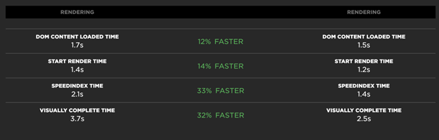
Since we had our baseline, and the ability to get consistent tests before and after, we could see our target metric had improved from 3.7s to 2.5s. Given that clear improvement, I was able to send out some emails celebrating the awesome work and I even wrote an external blog post about it.
If we had just noticed the page seemed slow, made these same changes and then deployed them, the result for our users would be the same. The difference is not in the result, it is in the clarity of communication that was possible around this work. I understand the impulse to just care about doing the work, but in any large team or company, visibility is essential. To get the best results, we must encourage a focus on quality, and we need space in our schedules to have that focus. By making this work visible and celebrating it, we have a track record showing value and it will be easier to justify more focus on performance in the future.
A/B tests are cool, but A and then B tests are great too
One thought you may have had, reading through that example above, is that we should have rolled out this change with an A/B test. That is a good comment, and it can be a good way to test a change where we are unclear of the benefit. In the context of this discussion, an A/B test allows you to collect your baseline under a more accurate set of matching conditions and can increase confidence in your results. If that is not possible though, doing a ‘before and after’ test with proper data is the next best thing. In this specific case, we had released an experience that needed fixing, and we felt the changes were a guaranteed improvement. All we were unsure of was the exact degree of improvement, and our production data before and after the deployment provided that information.
Careful phrasing is not “Spin”
Given a set of data, illustrating the value of a set of performance work, it is important to consider how you report on that information. Percentages are great to give context, but actual time measurements help people to picture the change in terms of real experience. A reduction of 1.2 seconds and a reduction of 32% may both be accurate, but one may be more impactful than the other. In most cases, I will provide both the specific change and the percentage. Percentages can be calculated many ways though and can seem wildly different in significance.
In one of our systems, we had an issue where a large number of users were receiving a time-out error trying to complete a task. Approximately 8% were hitting a failure. Through a set of great work, this # was reduced to 1%, and there was much rejoicing. The email that went out to share this improvement with leadership expressed the improvement like this “Successful transactions increased by 7%”. I suggested that it would be better to say “the # of users hitting an error was reduced by over 80%” or that “We went from a 92 to 99% success rate”. The response from our engineering team was that all those numbers mean the same thing and we should not be trying to “spin” the data. This is not “spin”, this is attempting to phrase our data in the way that correctly indicates the magnitude of improvement. Especially if you are dealing with a relatively well-performing experience, how you describe your improvement will radically change how it is perceived. Always represent your data accurately, and give the raw numbers where you can, but there is often more than one way to express a change in performance.
Make sure you think in terms your audience will understand and care about
You and your team of developers are likely not the target audience for any communication about a set of performance improvements. Even if your management is highly technical, it is important to focus on data points that they will understand without too much explanation. I have found, for example, that ‘page load’ is a number that is well understood, even though I may prefer to look at Largest Contenful Paint or Visually Complete as a better metric for the user experience. If I can express an issue with a page or site using page load, I will often do so, because it is easier than trying to run through an explanation of new performance metrics. I am lucky to work with management that understands the web well, but if that is not the case, then you may want to use a different metric.
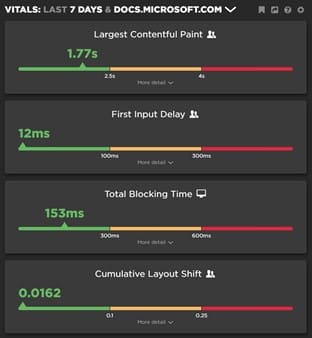
One example is the idea of Apdex (Application Performance Index, The Apdex Users Group), a methodology in which you set thresholds on various performance metrics to group user sessions into ‘satisfied’, ‘tolerating’, and ‘frustrated’. Apdex provides a formula to produce a single value out of this data, giving an easy way to represent the overall quality of experience. Using this type of calculation, you can communicate about web performance by talking about the percentage of users who fall into these categories. This concept is illustrated in the scale between Good, Needs Improvement, and Poor with Web Vitals (Web Vitals), allowing you to set goals based on # of page views classified as “Good” instead of speaking in terms of relative or absolute performance metrics.
Setting a goal of “75% of our user sessions will be a good experience” is easily understood. You can provide a description of what exactly that means in terms of metrics and how you will track that data as a deeper dive for those who are interested. In our case, both Google’s Search Console and SpeedCurve report on these Web Vitals results for us, making it easy to use as a performance goal.
Documenting the impact of your work can lead to a cultural change
So far, I have been focused on how clearly documented results enable us to communicate the value of performance work with others but is not the only benefit. A culture of using data to evaluate impact must spread across the entire team. Even if we are not going to talk about the impact of a change, we should understand it accurately, so we can determine the right amount of effort to focus on different areas. If we have determined that optimizing images on our site can produce a large impact, we can justify building automated or manual processes into our publishing pipeline. If this would only produce a 1% improvement, while better use of our CDN could produce a 10% improvement, we should focus on the CDN work first. If we have time to do both, that is great, but by thinking in terms of effort vs impact we can determine what should be done first.
Putting all of this into practice
Improving the quality of our web experiences needs to be equally important to the business as it is to the engineering team. Getting to that state can be a journey, but the key is through clear communication of results; we should talk about a performance improvement as much as any other user-facing change. If performance tuning is something we do ‘only when we have time’, it will be hidden work and the ones doing it will feel unappreciated. Good teams can manage to get far without visibility, as they have pride in their work and a strong belief that performance is important. Imagine what would be possible if that belief were shared and their work was celebrated equally to a design update or a new feature.