

Neil Gunther, M.Sc., Ph.D. (@DrQz), is a researcher and teacher at Performance Dynamics where, amongst other things, he developed the both the Universal Scalability Law (USL) scalability model and the PDQ: Pretty Damn Quick open-source performance analyzer, and wrote some books based on them. Prior to that, Dr. Gunther was the Performance Manager at Pyramid Technology and also spent a decade at the Xerox Palo Alto Research Center. Dr. Gunther received the A.A. Michelson Award in 2008 and is a Senior member of ACM and IEEE. He sporadically blogs at The Pith of Performance but much prefers tweeting as @DrQz.
Most Web Performance Calendar posts are about improving client-side web performance. That’s a good thing because I don’t know much about the web–it’s very complicated, naming all those bits and bytes in the browser. Instead, I’m going to talk about something much more transparent: CLOUD performance.
In that vein, my parody channeling of the Ray Charles hit title should be extended to read: it ain’t about performance no more … in the cloud.
Moreover, I’m going to discuss cloud performance using just two performance metrics: throughput and latency. Everybody loves those two metrics so, that should keep things nice and simple.
Tomcat on AWS
The cloud environment presented here is Amazon Web Services (AWS). A mobile-user application runs on top of a Tomcat thread-server that also communicates with third-party web services, such as hotel and rental-car reservation systems. The number of AWS cluster instances varies throughout each 24 hour business cycle, depending on the incoming mobile-user traffic. The elastic capacity requirements are handled automatically by the AWS cloud services.
This particular AWS cloud configuration and operation can be summarized as:
- Elastic load balancer (ELB)
- AWS Elastic Cluster (EC2) instance type
m4.10xlargewith 20 CPUs or 40 VPUs - Auto Scaling group (A/S)
- Mobile users make requests to Apache HTTP server (versions 2.2 and 2.4) via ELB on EC2
- Tomcat thread server (versions 7 and 8) on EC2 makes calls to 3rd-party web services
- A/S controls the number of active EC2 instances based on incoming ELB traffic and configured A/S policies
- ELB balances incoming traffic across all active EC2 nodes in the AWS cluster
All the subsequent performance data discussed here are taken from this application running in a production environment, rather than a load-testing environment.
Performance Profiles
Performance data was collected from the AWS production system and analyzed using a combination of the following FOSS tools:
- JMX (Java Management Extensions) data from JVM
- jmxterm
- VisualVM
- Java Mission Control Datadog dd-agent
- Datadog — also integrates with AWS CloudWatch metrics
- Collectd — Linux performance data collection
- Graphite and statsd — application metrics collection and storage
- Grafana — time-series data plotting
- Custom scripts for particular metric combinations
- R statistical libraries with
RStudio IDE - PDQ queueing analyzer tool
More details about the data collection procedures can be found in references [1,2].
The last tool on that list, PDQ (Pretty Damn Quick), is a software tool, written in C by the author [3]. It comprises a library of functions for solving queue-theoretic performance models. An example of how it is used will be presented momentarily.
Throughput profile
First, let’s consider the application throughput profile shown in Figure 1. The most important thing to note about this plot of throughput is that it is not a time series–like every performance monitoring tool spits out.
As a general matter, time series plots are rather useless for doing deeper performance analysis. Just because a monitoring tool produces time-series plots, doesn’t automatically make them particularly useful. It’s just a straightforward thing for them to do: render metrics in time.
Instead, Figure 1 shows the steady-state view of the throughput, denoted by X(N), as a nonlinear function of the load, N, created by mobile-user requests. In other words, N is the independent variable and X(N) is the dependent variable. Most importantly, all steady-state throughput profiles are concave functions. Since each user-request is assigned to a Tomcat thread, we can optionally refer to N as “users” or “requests” or “threads”. They’re all logically equivalent.
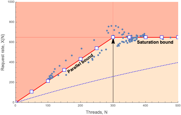
Figure 1: Throughput profile of Tomcat application on AWS
Figure 1 is quite busy so, let’s step through it. The dots are the measured throughput, X, at the corresponding number of measured threads, N, i.e., an X-N pair. Each blue dot in Figure 1 represents an X-N sample that was collected every 5 minutes over 24 hours. A dot therefore corresponds to a particular timestamp when the data was sampled but, that information is implicit in Figure 1. Rest assured that I can find the time when any dot was sampled, if I need to. The blue curve seen in the bottom portion of the figure represents a more typical throughput profile that will be explained later.
The data points range approximately between N = 100 and N = 500 threads. On reflection, it should be clear that the smaller values of N correspond to the quiescent period during the 24 hour window and conversely, the larger values of N correspond to the heaviest daily traffic.
What would not be apparent, if we just showed a simple scatterplot of the AWS-Tomcat data, is that all the data points tend to be scattered around two lines:
- the diagonal red line (up to N < 300)
- the horizontal red line (for N >= 300)
This is made clear in Figure 1. The knee in the data at N = 300 is indicated by the vertical arrow. The red lines represent the statistical mean of the measured data–in the sense of linear regression analysis. The variation in the data corresponds to statistical fluctuations (or “noise”) about the mean.
Moreover, these red lines have a particular meaning in queueing theory. You do know your queueing theory don’t you? The diagonal line represents the ideal parallel performance bound. In other words, you cannot have a throughput better than that as you increase the request load; on average. Similarly, the horizontal line represents the saturation performance bound. You cannot have a throughput that exceeds that bound; on average. A more typical throughput profile is represented by the blue dotted curve in Figure 1. In that case:
- execution is serialized
- a lot more queueing occurs
- throughput rapidly falls away from the parallel bound
All in all, the blue dotted curve ends up lying well below both redline limits.
To be clear, you can see instantaneous values that do exceed these redlines but, they are only transient values. The redline is the statistical mean of those transient values.
And, in case you’re wondering, yes, Figure 1 only shows measurements on a single EC2 instance in the AWS cluster. From the standpoint of PDQ (discussed in the next section), that’s the correct approach. All the instances are supposed to scale identically. That’s the job of the ELB load balancer and that’s the assumption PDQ also uses. If instances are not scaling identically, that’s not the fault of queueing theory. That’s the fault of the load balancer configuration or some other aspect of the cloud infrastructure.
Latency profile
Next, let’s look at the corresponding response time profile. Response time here refers to the elapsed wall-clock time from the issuance of a mobile-user request to receiving the completed response from the Tomcat application (including all business-logic processing). Roughly speaking, it is the inverse function of the throughput: a convex function.

Figure 2: Latency profile or “hockey stick” characteristic of Tomcat application on AWS
Figure 2 shows the steady-state view of the response time, R(N), as a nonlinear function of the mobile-user request load, N. Here, R(N) is the dependent variable. All steady-state response time profiles are convex functions.
In the parallel throughput region of Figure 1, all the threads are executing independently of one another and therefore the latency is independent of the number of threads. The average latency of the system therefore remains constant as the load increases. Beyond the knee point, however, no more parallel threads are available and queueing sets in as requests have to wait for threads that are now shared. Thus, the latency begins to increase: linearly. Performance analysts often refer to Figure 2 affectionately as the “hockey stick” profile. The foot of the hockey stick is flat because from a queueing point of view, there isn’t any queueing.
Conversely, the horizontal saturation limit in Figure 1, means the system can’t do any more work than it was doing at N = 300 threads. Any additional threads do not contribute to the throughput. On the other hand, the additional requests do get to wait in queues. That those queues grow is reflected in the diagonal line of Figure 2–the hockey stick handle. Note further that that “handle” is LINEAR, not exponential. If more than 500 users were added, the growth would remain linear.
PDQ Model
The white squares in Figures 1 and 2 come from the queueing representation shown schematically in Figure 3.
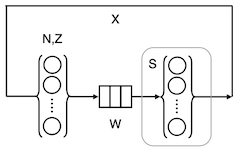
Figure 3: Queueing representation of AWS-Tomcat
Reading from left to right, the little bubbles in curly braces represent N user-threads and their associated think time, Z. For technical reasons, we set Z = 0 in this Tomcat model. User requests flow rightward to a waiting line (the little boxes) labelled, W. There, the requests wait to have their work performed by active Tomcat threads, shown as the bubbles in the second set of curly braces. The average service time of an active thread is S = 444 milliseconds (derived from the data collected from the EC2 instance). It turns out that there can only be up to 300 active threads in the AWS set up. More on this, later.
Figure 3 can be expressed in PDQ, using the R language, as follows. To start with, we assign some global vector objects, such as the number of user requests, the number of active threads, their service time, and so on.
requests <- seq(50, 500, 50) # from mobile users
threads  <- 300   # max threads under AWS auto scale policy
stime    <- 0.444 # measured service time in seconds
ztime    <- 0.0   # measured think time in seconds
xx       <- NULL  # x-axis load points for plot
yx       <- NULL  # corresponding throughput
Then, we define the AWS-Tomcat instance model, aws.model, as a function object in R that incorporates calls to the PDQ library.
library(pdq)

aws.model <- function(nindex) {
pdq::Init("")
pdq::CreateClosed("Requests", BATCH, requests[nindex], ztime) # LHS bubbles in Fig. 2
  pdq::CreateMultiNode(threads, "Threads", MSC, FCFS)           # RHS bubbles in Fig. 2
  pdq::SetDemand("Threads", "Requests", stime)                  # Tomcat service demand
  pdq::SetWUnit("Reqs")
  pdq::Solve(EXACT)
  xx[nindex] <<- requests[nindex]                               # update global vector
  yx[nindex] <<- pdq::GetThruput(BATCH, "Requests")             # y-axis plot values
}
The throughput, for example, is then calculated for each load point, N, of interest. This part of the PDQ model can simply be written as a loop over the aws.model object.
for (i in 1:length(requests)) {
  aws.model(i)
}
Finally, we use the base plot function in R to render the throughput values, X(N), as the white squares in Figure 1.
plot(xx, yx, type="p", pch=0,
     xlim=c(0,500), ylim=c(0,800),
     xlab="Threads, N", ylab="Request rate, X(N)"
)
That’s all it takes. A slight variation in the PDQ code can be used to calculate the corresponding response times in Figure 2. This PDQ model, and others, are explained in greater detail in [1[ and [2], as well as in my PDQW workshop [5].
The reasons for constructing the PDQ model include:
- validating the current performance measurements by comparing them with a model of expected values
- explaining the observed profile of the current measurements
- looking for opportunities to make performance improvements
- projecting scalability beyond the current measurements
The hint from Figures 1 and 2 is that the measured X(N) and R(N) corroborate very well with PDQ. On the other hand, the PDQ model makes clear that there is not much room for performance improvement. The initial throughput increases linearly with load and runs along the parallel bound. You can’t beat that. It might be possible to lift the saturation bound in some way but, it turns out there isn’t. I’ll return to that point, shorty. The only other improvement might be to reduce the variability in the data.
I should note in passing that I’ve seen throughput data for a completely different Tomcat application that was not running in the cloud and it did not appear to scale as well as Figure 1. Its profile was closer to the dotted curve in Figure 1. Since I wasn’t involved with that system in any way, I don’t know if the difference was due to bad measurements, bad configuration, or something else.
Punchline
Hopefully, you can now see the meaning of my title. It’s not about performance in most cases because scaling is taken care of automagically by the AWS cloud. Nobody was more surprised by this result than me. This Tomcat application is scaling maximally. The throttling at N = 300 threads is a consequence of the Auto Scaling policy whereby CPU utilization is not to exceed 75% on any EC2 instance.
So, if it’s not about performance, what is it about? It’s about cost to the user or, more formally, capacity planning. It’s about hard-core ROI. Standard performance tuning exploits on AWS are not generally likely to garner much ROI. From a completely different perspective, this is nothing new. Decades ago, expensive monolithic mainframe computers literally charged your departmental budget when you ran an application, e.g., a billing application. Back then, mainframe MIPS cost big bucks. Although the incentives are presented quite differently today, from the standpoint of user-cost, the cloud is the new mainframe [6].

Figure 4: AWS infrastructure capacity lines
When it comes to the cloud, one really needs to thoroughly understand how Amazon charges for capacity. That involves understanding the cost differentials for reserved instances, demand instances, spot instances and more recently, AWS lambda serverless microservices, and how all that relates to the cost of capacity consumption. See Figure 4. The same observation applies to Google GCP and Microsoft Azure cloud services.
As any MBA will attest, it’s not really possible to do a proper cost-benefit analysis without combining measurements with models. In this case, capacity models like the PDQ model described above.
Returning to the “knee” in Figure 1 or the “ankle” in Figure 2, it should be noted that they are a consequence of the A/S policy: if the EC2 instance CPU busy exceeds 75%, spin up additional VMs and rebalance the incoming mobile request load. There’s no way Linux understands how to do such a thing. The Linux scheduler will simply shovel more threads onto CPU until it approaches 100% busy, i.e., until the CPU cores saturate. (I’m ignoring cgroups, which are not applicable here) So, the discontinuous knee in X(N) is actually a pseudo-saturation effect due to the A/S policy being invoked. The concomitant load at which the pseudo-saturation knee occurs happens to be N = 300 threads.
It’s left as an exercise for the reader to ponder who or what is acting on the A/S policy assertion. Let me narrow it down for you. It’s not the EC2 hardware. It’s not Linux.It’s not Tomcat.It’s not the JVM. And, it’s not the Java application code. To be quite honest, I’m not 100% certain myself although, I do have a pretty solid hypothesis. If you can identify it, I would be interested to hear from you but, you should also bring supporting performance measurements.
Anyway, it’s mysteries such as these that help to make the cloud simple. 😉
Acknowledgements
Thanks to Guerrilla grads Mohit Chawla (coauthor [1,2]) and Catalin Enache for reviewing an earlier draft of this post.
References
- Tomcat-Applikationsperformance in der Amazon-Cloud unter Linux modelliert (Linux Magazin 2019 in German)
- Linux-Tomcat Application Performance on Amazon AWS (2019 in English)
- PDQ Version 7 Download
- Analyzing Computer System Performance with Perl::PDQ (Springer 2011)
- PDQW Tutorial Workshop
- How to Scale in the Cloud: Chargeback is Back, Baby! (2019 Rocky Mountain CMG slides)