

Gilles Dubuc (@MonsieurPerf) is the engineering manager of the Performance Team at the Wikimedia Foundation.
The web performance community has many industry stories about performance perception. But they almost never publish the underlying data and can’t be peer reviewed. As readers, we have to assume that experiments were set up correctly and that the data was interpreted appropriately to reach the conclusions claimed by our industry peers.
I’ve always been skeptical of these stories. Having studied Wikipedia’s performance field data for years, I know how easy it is to make mistakes when setting up A/B tests or processing large amounts of data. Those mistakes can lead to misleading conclusions. Additionally, there is an incentive to not share methodological mistakes that might be discovered after publishing the initial conclusions, as it might reflect badly on the organization the author represents.
Which is why in 2018 I turned my attention to academic research on the subject of performance perception and did a broad literature review of it. I discovered that study quality varies greatly, and that several studies whose conclusions kept being quoted in the web performance community were merely essays, and often didn’t include underlying data. While doing this literature review I noticed that one name kept showing up as an author on high quality papers on the subject: Dario Rossi.
Studying performance perception at scale
The next logical step for me was to contribute to this body of academic research on the subject of perceived performance and I contacted Dr Rossi, presenting various ideas I had in mind. He agreed to collaborate and invited Flavia Salutari and Diego Da Hora to join us. Together we set out to research web performance perception at scale on Wikipedia. This resulted in a paper published in 2019 and 2020 as well as an open dataset.
The core of this large-scale study was a micro survey displayed on a small ratio of Wikipedia articles page views in a few languages, on the top-right corner of the page:
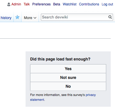
The order of the possible answers is shuffled every time the survey is displayed, to avoid bias in users picking the top options more frequently.
We decided to use a ternary option (with one as a way to bail out) rather than mean opinion score because we wanted to know the threshold at which bad performance should be actionable for us, as maintainers of the website. If users think that a page load isn’t fast enough, it means that we should do something about it if we can.
The study went into great length to look at whether the survey suffered from different forms of bias, like self-selection, and those were disproved. Disgruntled users experiencing bad performance aren’t more likely to respond to the survey, as the distribution of page load time is the same for users who decided to respond to the survey and those who decided not to.
I encourage you to read the full paper, as it analyses the data in great detail and a blog post summary wouldn’t do it justice.
Human performance metrics
Having gone through the efforts to set up this micro survey correctly for the study and ensuring that it wasn’t biased, I figured that this was a signal we should keep collecting, as long as the Wikipedia communities where the survey was running were fine with it. Especially since we saw in the study that the correlation between RUM and human perception wasn’t great – 0.59 precision and 0.62 recall for our best machine learning attempt to predict human response) – we knew that the human signal brings novel information about performance.
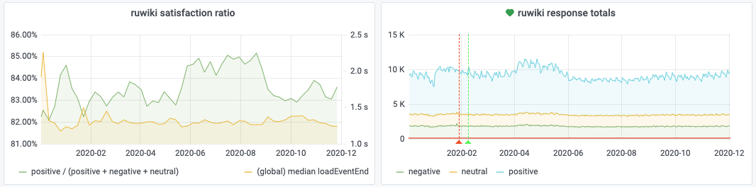
We expanded the survey to more languages and increased the sampling rate, collecting orders of magnitude more samples than we did in the original study. This micro survey still runs to this day and collects around 20,000 survey responses per day. The original study only had a total of 62,000 survey responses.
This has given us a very valuable signal, a new category of performance metrics. In addition to synthetic and RUM monitoring, we now have direct human opinion about our current performance. And each survey response comes with all the RUM metrics we normally collect.
Perceived web performance in 2020
I recently looked at this data for the whole of 2020. Wikipedia’s frontend performance is quite stable over long periods of time, and we often see variations in our RUM metrics that are due to environmental changes. Such as users upgrading to faster devices over time, internet connectivity degrading in a particular country due to increased traffic caused by a pandemic lockdown, ISPs upgrading their physical infrastructure, etc. These are events outside of our control, beyond the limits of our infrastructure, that affect our RUM performance metrics over long periods of time.
The very eventful year of 2020 has given us a few global movements of RUM metrics for the Wikipedia languages where our performance perception survey runs. These bigger swings than in previous years have allowed us to see for the first time this very interesting correlation on the scale of a whole year between user survey responses and RUM page load time:
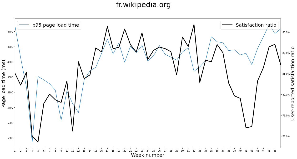
Note that page load time is displayed “flipped” on this graph, with low PLT values at the top and high PLT values at the bottom. This is to make it easier to see the inverse correlation at play.
The user-reported satisfaction ratio is expressed as the amount of users who replied “yes” to the question “did this page load fast enough?”, divided by the amount of users who replied with any of the available options (“yes”, “no”, “not sure”).
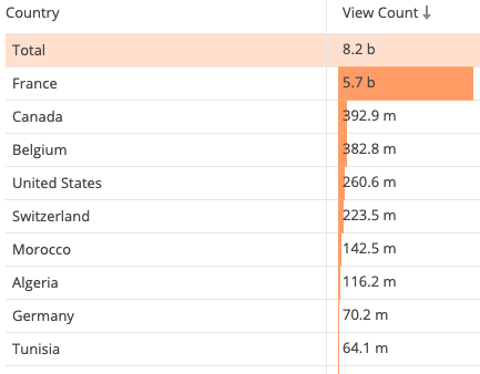
Over the course of 2020 so far, 69.5% of the traffic to French Wikipedia came from France:
The first pandemic lockdown in France was between weeks 12 and 19. The second lockdown started just before week 45. One could think that starting a nationwide lockdown could affect the population’s mood negatively as a whole and the end of it could affect it positively, to the point that the survey would be affected.
But no such thing happened. In fact, during the period of the first lockdown RUM page load time improved on French Wikipedia and users were proportionally more satisfied. This rules out these nationwide events as external factors that could have impacted the survey because of the mood change of a whole country’s population. The survey satisfaction ratio has been following page load time over the course of the year, not nationwide events.
While the movements of page load time and user satisfaction ratio correlate, the magnitude can be different sometimes, as exemplified in the second half of the year for Spanish Wikipedia:

One possible explanation is that, as we discovered in our original study, RUM page load time, like any other RUM metric, is only a partial proxy for user satisfaction. A change of page load time is an isolated symptom, the source of which can be very different underlying performance changes. Delayed initial latency or delayed display of images would both result in an elevated page load time, but are very different user experience changes.
Nevertheless, this shows that even a small change of trend in page load time can result in a 1 to 3% change in user satisfaction ratio. The graphs above tracked the p95, but the same is true for other percentiles. As seen below on Russian Wikipedia where a 120ms increase of median page load time correlated with a 2% drop in user satisfaction:

These graphs were generated with this jupyter notebook pointed at these datasets. It’s worth noting that page load time displayed on these graphs is measured at a much higher sampling rate than survey responses. For instance, over the course of 2020 Russian Wikipedia has had 62,106,530 RUM page load time measurements made and 615,457 survey responses recorded.
Beyond Wikipedia
I strongly encourage members of the web performance community to start collecting human performance metrics. It can be challenging to gather user-reported performance signals while avoiding bias, but the rewards are worth it.
If we had that kind of data for multiple websites, this would give us ways to assess RUM metrics (and particularly new ones) better. We would be able to see which metrics get us closer or further from the human signal. We would start getting answers about whether or not users care about the same performance aspects on every website or not.
This data can also help prioritize where optimisation efforts should be concentrated for your website. When you’re designing custom RUM metrics, a human signal can help figure out what matters the most for your audience.
Prioritisation of performance regression response could also be adapted based on this signal. If one of the RUM metrics you track worsens, but humans responses don’t change, maybe it’s not worth stopping everything you’re doing to handle that particular metric regression as an emergency.
It’s not a silver bullet by any means, but asking users about performance provides a completely new performance insight that could lead to interesting advances in our understanding of web performance perception. After all, it might not be such a bad idea to ask users if they’re satisfied, instead of only guessing whether they are.