

Aaron Hans is a web development enthusiast and tech lead at California's Office of Data & Innovation
You can deliver the same data story with dozens of different tools. Some have a lot more client-side weight than others. This is a case study of a couple different data visualization tools we used for the State of California’s COVID-19 site. Switching from Tableau to D3 let us radically improve performance.
How big was the difference?
When we rewrote the COVID-19 state dashboard, the time to interactive delay went from 70 seconds to 4 seconds. We did this while preserving all functionality and keeping the same user interface.

This performance audit shows the Tableau version of the state dashboard. It ran using default settings at web.dev/measure.
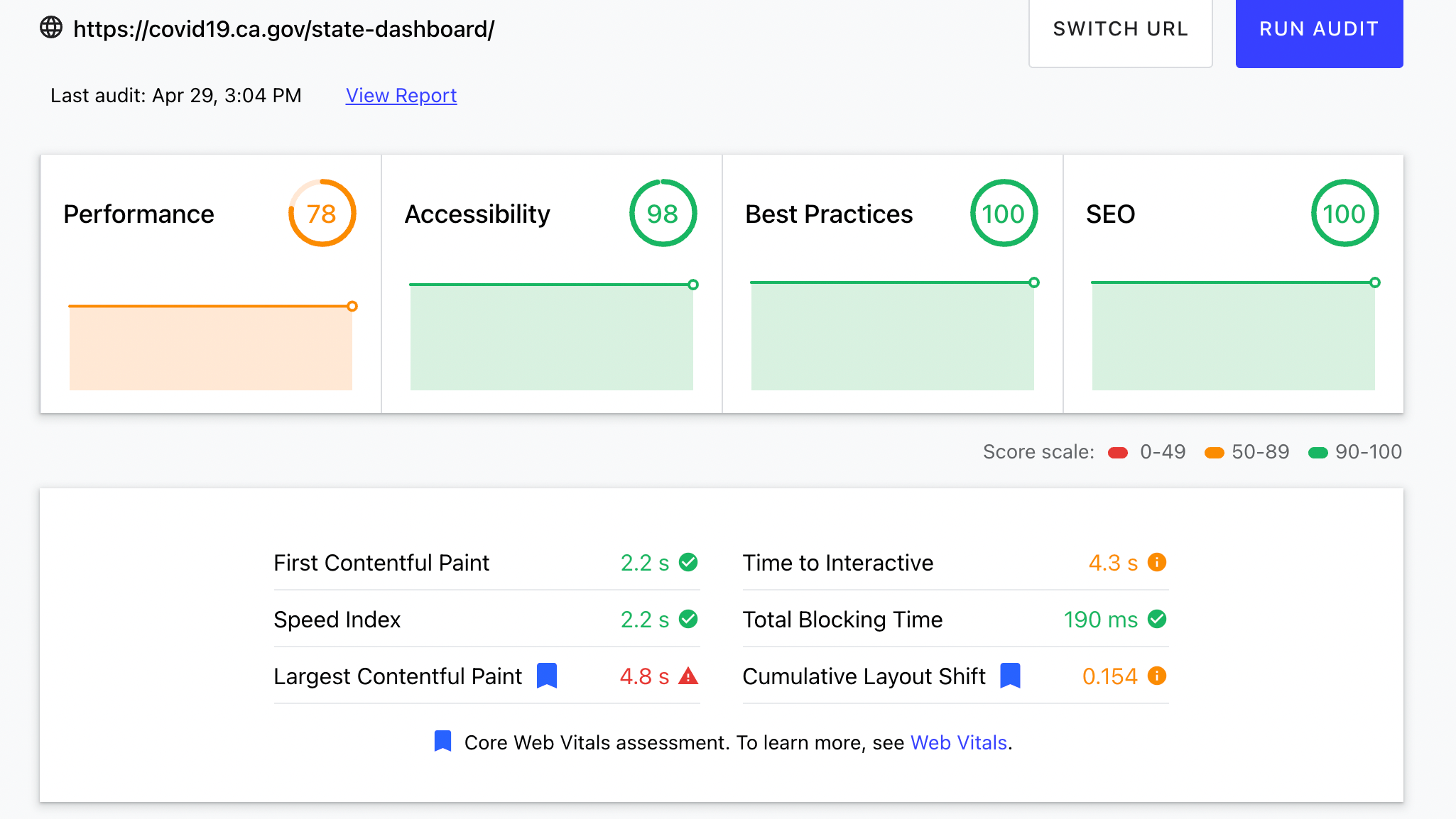
The new D3 version of the state dashboard launched April 29, 2021. This shows an improvement in the performance score. Most importantly, the time to interactive measurement is 4.3 seconds instead of 70.
Where we started
There are definitely some advantages to using Tableau. It was built for data scientists and doesn’t need (as much) JavaScript development. You can make charts in Tableau relatively fast. At the beginning of the pandemic, the state had contractors with Tableau expertise. They were able to quickly create data viz required for the public response.
Using a JavaScript library like D3 requires some JavaScript expertise. It brings a lot of benefits:
- Significantly faster performance
- Easier support for translated & localized chart content
- Improved accessibility with screen readers
- Removal of dependency on Tableau infrastructure in production sites
All these factors lead to a better experience for the end user, and we believe the development cost is worth it. This is especially true for dashboard-style pages that contain lots of charts.
We built a lot of dashboards for the site. As California’s pandemic response continued, we showed the benefits of alternate approaches on new projects. Our work led to the greenlight to rebuild an existing dashboard to make it faster without changing the user interface. This gave us a controlled experiment that compared two different data viz tools fairly.
Equity dashboard
We started using D3 instead of Tableau when we built the equity dashboard. We had enough lead time on this project to prototype using different tools.
There is a ton of collaboration that goes into building these pages. Britt Allen led the initial programming work prototyping different data viz options in Python. She used real data to figure out how to clearly communicate about equity.
Once we had our desired designs, we shared D3 versions with data scientists closest to the data like Dr. Jason Vargo on observable. Adam Little, our lead designer for our COVID-19 dashboards, guided the visual look and feel. His excellent work on the state dashboard was recognized by the COVID Tracking Project’s analysis of state response. Developers Chach Sikes, Jim Bumgardner and I developed the page, APIs and charts.
The magnitude of the user experience between our first D3 powered dashboard on the equity page and the previously created Tableau powered dashboards was so great we wanted to replace the data viz on the state dashboard. Before duplicating so much effort we worked with engineers from Tableau to find performance fixes. There are some tricks to delay interactivity with Tableau that can help in some cases but don’t work well when you want other elements on the page to control embedded chart states. We also noticed a few brief outages due to Tableau centralized infrastructure around this time. This gave us further reason to switch to D3 which didn’t require additional servers for chart support. Jim took charge and rewrote the entire state dashboard in D3, preserving every aspect of the original Tableau functionality.
Other benefits
Deeper translations
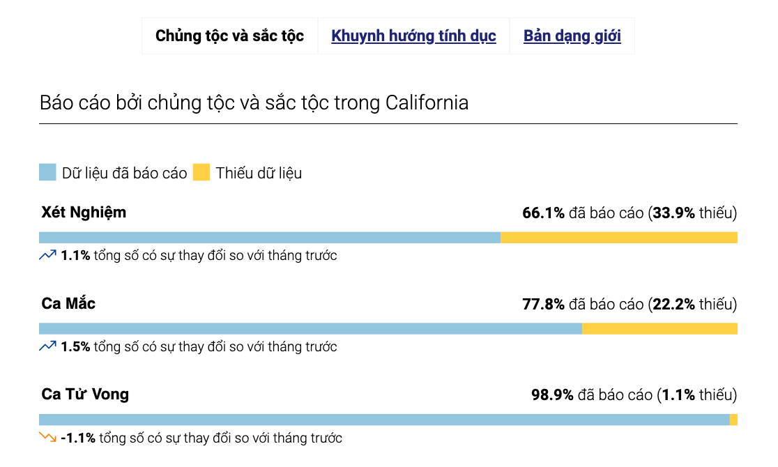
Chart of race and ethnicity data reporting percentages translated into Vietnamese. The translations are baked all the way in to the labels
It was extremely hard to provide translated content in Tableau. Browser-based translation tools couldn’t reach inside it. In comparison, D3 supports translation in the strings inside the charts along with the containing page. This let us reach more people in the language of their choice.
Better accessibility
Konstantin Koryaka added deep screen reader support to D3 charts. In this video he describes how he provided an equivalent experience to users of assistive technology browsing a basic chart.
Faster data dashboards help everybody. We all get in bandwidth constrained situations sometimes. Making things quicker helps us all, especially for people trying to execute tons of JavaScript on less powerful devices.
The team at the Office of Data & Innovation is building a performance-aware culture at the state. Covid19.ca.gov uses a WordPress backend with 11ty build generating the frontend. The flexibility of 11ty combined with our own lightweight web components helps us ship performant sites like:
We’ve done some analysis on the speed of sites in the state using speedlify. The sites ODI built recently are at the top of the leaderboard and we are evangelizing performance awareness across the state.