

Keerthana Krishnan (@keerthanak17) is a software engineer based in Munich, Germany. She has 6+ years of experience, mainly as a front-end web developer. She's also an experienced technical speaker who has previously presented at events like JS Conf Asia 2019 and Performance.now() 2023
CLS is a Core Web Vital that measures the visual stability of a website. But in practice, there are a ton of scenarios that we simply do not consider during the development process that could affect the CLS score down the line. In this article, let us take a quick look at some common cases –
1) Test images
Test images are often already in the developer’s or tester’s browser cache and the delay it takes to load them from an API call could be negligible.
Try 1: Disable the cache in the dev tools during the development/ testing process
Try 2: Try loading a new, larger image with a throttled network to see how the application handles the delay in loading the image.
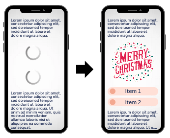
Fix 1: Always add width and height size attributes to your images and video elements or its containers. This sets the intrinsic size of the element, allowing it to take up space before it loads, to mitigate content layout shifts. Read more about setting height and width
Fix 2: If it’s not possible to give a fixed size an element, the aspect-ratio CSS property lets you define a custom width-to-height ratio for an element. This means that even if the parent container or viewport size changes, the browser will adjust the element’s dimensions to maintain the specified width-to-height ratio. The specified aspect ratio is used in the calculation of auto sizes and some other layout functions.
However, for this to work, at least one of the element’s dimensions should be automatic. ie, you need to have height: auto (or for width) in the styling of the element’s box. If neither the width nor height is an automatic size, then the provided aspect ratio has no effect on the box’s preferred dimensions. Read more about aspect-ratio
2) Third party plugins, ads and iframe embeds
Have you ever started reading an interesting article and then a Cookie Banner just popped up at an awkward position? Similar to the videos and images I mentioned above, iframes, embeds and ads which appear only on the production version of a website can unexpectedly trip up the CLS score of an otherwise well-designed website. Not to mention, depending on how large the shift is, it could give an incredibly unpleasant user experience, Ex: ads blocking the main content or navigation.
Try: Test the third party plugins and embeds with different screen sizes during development and of course with a throttled network to see how the application handles the delay in loading the plugin and how it can appear in different screen sizes
Fix: Statically reserve space in the page for late loading content.

Similar to the first case, using the min-height or aspect-ratio for the responsive content to reserve the space for these elements avoids a layout shift down the line when they are loaded.
3) Animations without transform
An animation that moves an element using something other than transform is likely to be slow. Ex: Animations which change the top or left positions, need calculations which impact the rendering pipeline
Avoid any property that triggers layout or paint unless absolutely necessary. For example, when properties such as width or height change, they push content around on the rest of the page. This forces the browser to recalculate new positions for every affected element for each frame of the transition.
For JS animations, use requestAnimationFrame() and avoid setTimeout(), setInterval(). Avoid animations which needs calculations on each frame (Ex: using jQuery.animate())
Don’t use
.box {
  position: absolute;
  top: 10px;
  left: 10px;
  animation: move 3s ease infinite;
}

@keyframes move {
  50% {
    top: calc(90vh - 160px);
    left: calc(90vw - 200px);
  }
}
Do use
.box {
  position: absolute;
  top: 10px;
  left: 10px;
  animation: move 3s ease infinite;
}

@keyframes move {
  50% {
    transform: translate(calc(90vw - 200px), calc(90vh - 160px));
  }
}
Fix: CSS can be used to make high performance animations which do not trigger layout shifts using properties like transform and opacity.
4) Managing data
If you’re managing a data set in smaller chunks with techniques like virtualization, lazy loading or infinite scrolling make sure that the newer chunks do not disrupt the visual items when they load.
When the newer chunks of data load in between or above already loaded content, not only does this create a layout shift but it also gives a bad user experience
Even for smaller sites, when using client side rendering, different dynamic content can load in at different times.
Fix: Adding an animation or space for further items on initial render which takes up the space where next data is about to be loaded in helps to avoid the layout shift as newer items are added to the list or table.
5) Web fonts
Fonts are typically important resources, as without them the user might be unable to view page content. Thus, best practices for font loading generally focus on making sure that fonts get loaded as early as possible. Particular care should be given to fonts loaded from third-party sites as downloading these font files requires separate connection setups.
Before a font is loaded, the browser uses a fallback font to display the content. If the fallback font is visible, then it’s replaced with the loaded web font (FOUT–flash of unstyled text) Else, “Invisible” text is displayed using the fallback font until a web font is available and the text is made visible (FOIT–flash of invisible text). Both of these can cause layout shifts. Read more about avoiding invisible text here
Fix 1: Minimising the differences in the web fonts with similar size, the space taken and appropriate fallback. Ex: using sans-serif fallback for a web font like “Google Sans” while Google Chrome’s default fallback font is “Times” which is a serif font. Here’s a nifty tool you can use – Font Style Matcher
Fix 2: font-display: optional can avoid a re-layout as the web font is only used if it is available by the time of initial layout
Read more about best practises for Web Fonts
6) User Interaction Delay
A layout shift is only bad if the user isn’t expecting it. However, if a user interaction triggers a network request that may take a while to complete, the ensuing shift, even though the user is expecting it, might still be counted to the CLS score if there’s a delay in the completion of the request.
There is a window of 500ms after a user interaction where a layout shift is not considered unexpected for the user. Any further delay due factors like network load or server processing speed can cause a layout shift which is counted in the CLS score
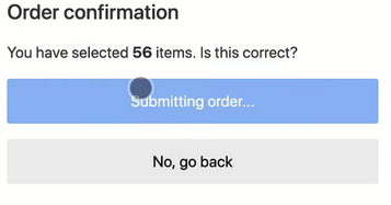
Fix 1: Adding an animation or creating some space right away to show a loading indicator could ease transition.
Fix 2: There is no one-size-fits-all solution here. Depending on the user interaction, you could design other ways to keep the user engaged while the request is being process. Ex: Having the user fill out a feedback form while showing a loading animation to denote their order being processed in the above example.
Conclusion
This is not an exhaustive list of CLS scenarios. Even if it looks the CLS of your page is 0, in production, be sure to do a basic load of the page and scroll down to the end and wait a beat. It can be that simple to find layout shifts because of funky static headers and improper lazy loading of content because of lack of space reserved (or using Lighthouse which also does this)
At the end of the day, it is always better if you can spot the CLS issues early and fix them promptly to give the best performance and user experience for your website.