Rick Viscomi (@rick_viscomi) is a Senior Developer Programs Engineer at Google working on web transparency initiatives like the Chrome UX Report and HTTP Archive. Rick is also the host of the video series The State of the Web and a coauthor of Using WebPageTest.
Last year I wrote about how to leverage the Chrome UX Report (CrUX) to find your competitive edge. Since then, there have been several important developments: CrUX has grown to over 4 million websites, the dataset has accumulated over a year’s worth of performance trends, and most importantly, the HTTP Archive has begun analyzing how over a million of these CrUX websites are built. In this post we’ll look at how we can combine the strengths of these tools to learn something new about performance on the web.
Overview of CrUX and HTTP Archive
As a refresher, CrUX collects performance data from real Chrome users and aggregates that data up at the origin-level. There are millions of these origins in the dataset. Performance metrics representing the interactivity, paint, and page load times are included in a queryable database on BigQuery. The metric we’ll be using for this post is First Contentful Paint (FCP), or the time at which the page shows something useful to the user. The FCP data for each origin is organized as a histogram representing the distribution of user experiences with the percent of experiences grouped by 100ms intervals.
The HTTP Archive on the other hand is not a collection of real user data. It is a synthetic tool built on WebPageTest that collects information about how each web page is built. Curated stats and trends are available on httparchive.org while the raw data is also queryable on BigQuery.
We will merge these datasets using BigQuery to analyze the performance of specific origins in CrUX as determined by HTTP Archive.
Understanding how the web is built
According to BuiltWith, 60% of the top 1 million websites use some kind of content management system (CMS) with WordPress being the most popular at about one third of the web. The prevalence of CMSs make them a great research topic to demonstrate the power of web transparency data.
To understand which CMS a given website is built with, we can leverage the technology detections included in the Wappalyzer project. HTTP Archive and WebPageTest use this tool to identify about 1,000 different technologies, the results of which are then queryable in the technologies dataset. So here’s a quick example of counting the number of WordPress websites:
SELECT
  COUNT(DISTINCT url) AS num_wordpress
FROM
  `httparchive.technologies.2018_12_01_desktop`
WHERE
  app = 'WordPress'
The result is 200,384 pages detected as using WordPress. We can write similar queries to identify websites built with many other popular CMSs like Drupal, Joomla, TYPO3, etc.
Understanding the performance of the web
To understand how fast the FCP experiences are for a given origin, we can query CrUX for a simplified distribution having only 3 buckets: fast (less than 1 second), average (between 1 and 2.5 seconds), or slow (greater than 2.5 seconds).
SELECT
  ROUND(SUM(IF(fcp.start < 1000, fcp.density, 0)) / SUM(fcp.density), 4) AS fast,
  ROUND(SUM(IF(fcp.start >= 1000 AND fcp.start < 2500, fcp.density, 0)) / SUM(fcp.density), 4) AS avg,
  ROUND(SUM(IF(fcp.start >= 2500, fcp.density, 0)) / SUM(fcp.density), 4) AS slow
FROM
  `chrome-ux-report.all.201811`,
  UNNEST(first_contentful_paint.histogram.bin) AS fcp
WHERE
  origin = 'https://web.dev'
The results show that during November 2018, the origin https://web.dev had a fast FCP about 50% of the time, followed by 40% average, and 10% slow.
| fast | avg | slow |
|---|---|---|
| 0.5094 | 0.4053 | 0.0853 |
Putting the two together
So now that we’ve established how to identify the CMS used to build a website and a way to determine how fast it is, we can combine the queries to understand how fast a particular CMS is:
SELECT
  ROUND(SUM(IF(fcp.start < 1000, fcp.density, 0)) / SUM(fcp.density), 4) AS fast,
  ROUND(SUM(IF(fcp.start >= 1000 AND fcp.start < 2500, fcp.density, 0)) / SUM(fcp.density), 4) AS avg,
  ROUND(SUM(IF(fcp.start >= 2500, fcp.density, 0)) / SUM(fcp.density), 4) AS slow
FROM
  `chrome-ux-report.all.201811`,
  UNNEST(first_contentful_paint.histogram.bin) AS fcp
JOIN (
  SELECT
    url
  FROM
    `httparchive.technologies.2018_12_01_desktop`
  WHERE
    app = 'WordPress'
  GROUP BY
    url)
ON
  CONCAT(origin, '/') = url
The results show that the average distribution of FCP performance on WordPress sites is 25% fast, 42% average, and 33% slow.
| fast | avg | slow |
|---|---|---|
| 0.2528 | 0.4192 | 0.3280 |
Performance analysis of the CMS ecosystem
It’s nice to know how fast WordPress websites are, but how do they compare to Drupal or TYPO3 websites? Let’s modify the query to factor in all CMS platforms:
SELECT
  app,
  COUNT(DISTINCT origin) AS freq,
  ROUND(SUM(IF(fcp.start < 1000, fcp.density, 0)) / SUM(fcp.density), 4) AS fast,
  ROUND(SUM(IF(fcp.start >= 1000 AND fcp.start < 2500, fcp.density, 0)) / SUM(fcp.density), 4) AS avg,
  ROUND(SUM(IF(fcp.start >= 2500, fcp.density, 0)) / SUM(fcp.density), 4) AS slow
FROM
  `chrome-ux-report.all.201811`,
  UNNEST(first_contentful_paint.histogram.bin) AS fcp
JOIN (
  SELECT
    url,
    app
  FROM
    `httparchive.technologies.2018_12_01_desktop`
  WHERE
    category = 'CMS'
  GROUP BY
    url,
    app)
ON
  CONCAT(origin, '/') = url
GROUP BY
  app
ORDER BY
  freq DESC
This results give us performance data for 156 CMSs. Let’s just look at the top 25:
| app | freq | fast | avg | slow |
|---|---|---|---|---|
| WordPress | 160835 | 25.28% | 41.92% | 32.80% |
| Drupal | 33806 | 39.47% | 37.46% | 23.07% |
| Joomla | 12625 | 24.96% | 43.14% | 31.91% |
| 1C-Bitrix | 5844 | 34.21% | 44.77% | 21.02% |
| Adobe Experience Manager | 5573 | 41.33% | 36.51% | 22.16% |
| TYPO3 CMS | 5338 | 47.40% | 36.35% | 16.25% |
| Weebly | 3976 | 34.91% | 48.13% | 16.95% |
| Microsoft SharePoint | 3455 | 38.94% | 34.81% | 26.25% |
| DataLife Engine | 2646 | 44.26% | 41.13% | 14.61% |
| Liferay | 2568 | 35.08% | 37.48% | 27.44% |
| DNN | 2197 | 42.73% | 35.10% | 22.18% |
| Squarespace | 1534 | 24.33% | 43.35% | 32.32% |
| Sitefinity | 1401 | 38.02% | 35.36% | 26.61% |
| Plone | 931 | 40.88% | 35.97% | 23.16% |
| SPIP | 811 | 38.29% | 38.32% | 23.39% |
| Contentful | 804 | 37.61% | 39.94% | 22.46% |
| Jimdo | 705 | 31.45% | 40.90% | 27.64% |
| Concrete5 | 684 | 31.55% | 41.39% | 27.05% |
| Craft CMS | 611 | 34.22% | 43.16% | 22.62% |
| Sitecore | 598 | 40.07% | 37.30% | 22.63% |
| IBM WebSphere Portal | 517 | 40.51% | 35.46% | 24.03% |
| eZ Publish | 448 | 40.02% | 38.85% | 21.13% |
| SilverStripe | 426 | 33.08% | 43.07% | 23.84% |
| Wix | 406 | 9.47% | 40.24% | 50.29% |
| SDL Tridion | 330 | 36.99% | 39.65% | 23.36% |
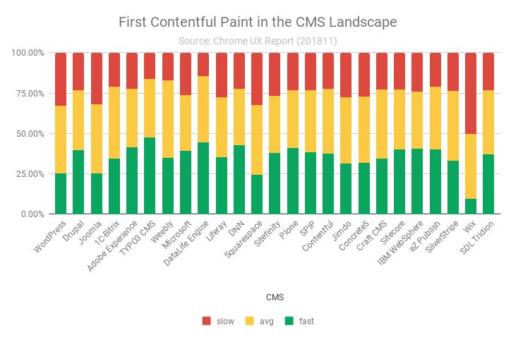
Visualizing the data in Sheets produces this chart:

So what can we learn about the CMS landscape using CrUX and HTTP Archive data? For one thing, the chart shows that it’s a diverse landscape. The range of fast FCP densities is from 9.47% to 47.40%. Many CMSs are in the 30-40% neighborhood, but there are several that fall short: WordPress, Joomla, Squarespace, and Wix. TYPO3, DataLife Engine, and DNN stand out above the rest.
Digging deeper for performance opportunities
Now that we have an idea of how users experience each CMS, let’s try to understand if the amount of JS or images correlates with performance. We can join with the summary_pages table in HTTP Archive to measure the number of bytes loaded by each page and aggregate the medians for each CMS.
SELECT
  app,
  COUNT(DISTINCT origin) AS freq,
  ROUND(SUM(IF(fcp.start < 1000, fcp.density, 0)) / SUM(fcp.density), 4) AS fast_fcp,
  APPROX_QUANTILES(bytesJS, 1000)[OFFSET(500)] AS median_js,
  APPROX_QUANTILES(bytesImg, 1000)[OFFSET(500)] AS median_img
FROM
  `chrome-ux-report.all.201811`,
  UNNEST(first_contentful_paint.histogram.bin) AS fcp
JOIN (
  SELECT
    url,
    app
  FROM
    `httparchive.technologies.2018_12_01_desktop`
  WHERE
    category = 'CMS'
  GROUP BY
    url,
    app)
ON
  CONCAT(origin, '/') = url
JOIN
  `httparchive.summary_pages.2018_12_01_desktop`
USING
  (url)
GROUP BY
  app
ORDER BY
  freq DESC
| app | freq | fast_fcp | median_js | median_img |
|---|---|---|---|---|
| WordPress | 160835 | 25.28% | 576.0 KB | 1.1 MB |
| Drupal | 33806 | 39.47% | 427.7 KB | 1.2 MB |
| Joomla | 12625 | 24.96% | 549.0 KB | 1.4 MB |
| 1C-Bitrix | 5844 | 34.21% | 696.0 KB | 1.9 MB |
| Adobe Experience Manager | 5573 | 41.33% | 686.0 KB | 1.1 MB |
| TYPO3 CMS | 5338 | 47.40% | 334.3 KB | 1.2 MB |
| Weebly | 3976 | 34.91% | 482.8 KB | 549.9 KB |
| Microsoft SharePoint | 3455 | 38.94% | 647.6 KB | 1.1 MB |
| DataLife Engine | 2646 | 44.26% | 406.5 KB | 1.2 MB |
| Liferay | 2568 | 35.08% | 566.5 KB | 984.7 KB |
| DNN | 2197 | 42.73% | 595.4 KB | 1.2 MB |
| Squarespace | 1534 | 24.33% | 1.2 MB | 1.6 MB |
| Sitefinity | 1401 | 38.02% | 789.8 KB | 1.3 MB |
| Plone | 931 | 40.88% | 437.6 KB | 566.6 KB |
| SPIP | 811 | 38.29% | 434.2 KB | 734.2 KB |
| Contentful | 804 | 37.61% | 882.4 KB | 973.9 KB |
| Jimdo | 705 | 31.45% | 418.5 KB | 616.6 KB |
| Concrete5 | 684 | 31.55% | 467.0 KB | 1.6 MB |
| Craft CMS | 611 | 34.22% | 455.6 KB | 1.6 MB |
| Sitecore | 598 | 40.07% | 555.8 KB | 1.1 MB |
| IBM WebSphere Portal | 517 | 40.51% | 414.1 KB | 879.5 KB |
| eZ Publish | 448 | 40.02% | 383.7 KB | 1.0 MB |
| SilverStripe | 426 | 33.08% | 408.1 KB | 1.4 MB |
| Wix | 406 | 9.47% | 1.9 MB | 576.9 KB |
| SDL Tridion | 330 | 36.99% | 677.0 KB | 1.3 MB |
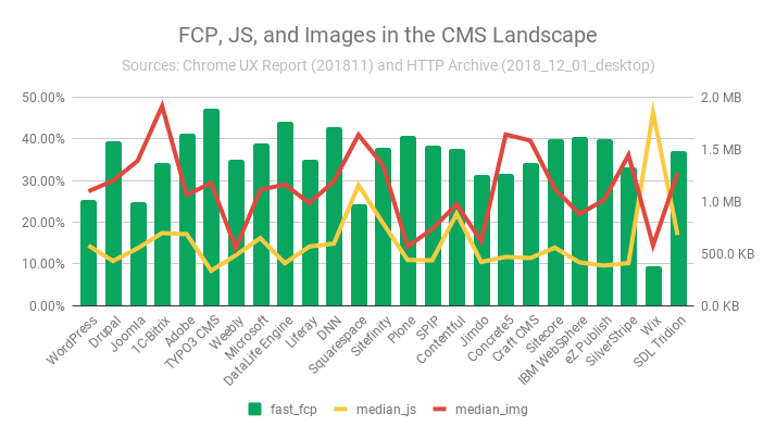
Ok so now we’re dealing with two types of values: percentages and bytes. Let’s try to visualize this using two y-axes and hope it doesn’t get overwhelming.

The green bars represent the percent of fast FCP experiences on the left axis and the streaks of mustard and ketchup represent the median number of bytes for JS and images respectively on the right axis.
The thing that jumps out that you probably noticed first is that Wix, which has the smallest density of fast FCP, also has the most median bytes of JS (1.9 MB). Coincidentally, Wix also has one of the fewest median bytes of images. If Wix is bootstrapping all of their pages with ~2 MB of JS, that could certainly have an adverse affect on performance.
Addy Osmani wrote an amazing article called The Cost of JavaScript in 2018 which states that JS is “the most expensive part of your site” because it has to download, parse, compile, and execute. So users with limited network and/or CPU speeds are especially harmed by wasteful JS usage.
Squarespace has 1.2 MB of median JS and 1.6 MB of median images. These are not small values and may be contributing factors to its low fast FCP.
TYPO3, the CMS with the biggest density of fast FCP, also happens to have the fewest median bytes of JS (334.3 KB). Coincidence? This analysis doesn’t tell us if there is a causal relationship but the correlations are too compelling to ignore.
Wrap up
This is a great example of the power of web transparency. Using the CrUX and HTTP Archive datasets, we have a sort of x-ray vision into the web, giving us the ability to see how websites are built and how users are experiencing them. Ultimately, our goal is to improve the user experience and we can do that by leveraging these datasets to understand where the opportunities are and monitor progress over time.
There are 48 other technology categories in Wappalyzer, so you can imagine the wealth of insights waiting to be discovered in the data. Take the queries in this post and substitute the values for things you care about and be sure to share your findings with the community.
Additional resources:
- Getting started with HTTP Archive
- Contributing to HTTP Archive
- Using CrUX to look at performance in the field
- State of the Web: Leveraging web transparency with Paul Calvano
- CMS Performance on the HTTP Archive forum
Thank you to Ilya Grigorik, Paul Calvano, Alberto Medina, and Addy Osmani for reviewing an earlier draft of this post.
