

Tsvetan Stoychev (@ceckoslab) is a Web Performance enthusiast, creator of the open source Real User Monitoring tool Basic RUM, street artist and a Senior Software Engineer at Akamai.
When I blog I always write something that has practical value for readers but I also like to share a short story that relates to it. This is my intention in this article as well. This post will be a bit of story-telling and will give examples of how I do things on a lower level in Basic RUM. I’ve spent weeks/months for some of the ideas I write about here and I strongly believe that sharing my findings will help other people at least find the right direction in case they would like to build their own RUM system or just analyze performance data. At the end of the article, I touch upon the question “What’s next?”.
The last 12 months
It’s been a year since I officially declared my commitment to work on Basic RUM. Many interesting things have happened since December 2018 when I blogged about Open source backend RUM tool. Wait! What?. I completed an alpha version and created online demo of Basic RUM. I believe that my work on Basic RUM has connected me with like-minded people from the Real User Monitoring space. Last year I left my job and dedicated some 9 months of active work on Basic RUM. This September I started a full-time job at Akamai, in the team that develops Boomerang JS and touches parts of very professional and mature RUM system called mPulse. Being busy in my full-time job doesn’t mean that I will stop working on Basic RUM but I will have to change the way I develop it. I will do more conceptual and software design work but I will work with freelancers who will do the actual programming/implementation.
Performance-First approach
I adopted an interesting development approach with Basic RUM. In the beginning of this year I had a chance to buy a high-end work station and develop Basic RUM on it. In reality I intentionally bought a 3-year-old laptop for developing Basic RUM and I also used a budget cloud-hosting provider. The idea was that I could spot performance issues that would otherwise be invisible for me if I was running Basic RUM on more powerful hardware.
Concepts we will discuss in this article:
- Beacon relay with Edge Worker
- Calculating percentiles
- Generating histograms
- Generating Bounce Rate vs. (metric) diagram
- Data Flavors and Diagram configuration format
1. Beacons relay with Edge Worker
A couple of months ago I visited a local software meetup. A fellow developer asked me how Basic RUM was going, so I was really excited to share my latest experiments with CloudFlare Edge Workers. After I explained how it works, he was “Hmm, seems that your focus is really keeping visitors satisfied.” There were 2 ideas I shared that evening with him regarding Edge Worker:
- Do not disturb the customer if Basic RUM Beacon Catcher service is under maintenance. In case the catcher service was down, then the Edge Worker would still return response 200 to the visitor’s browser and pretend everything is fine.
- For performance reasons, Edge Worker returns a response as soon as possible to the visitor’s browser and relays the beacon to my infrastructure where a beacon is persisted by Beacon Catcher service.
How it works:
![]()
Having this functionality is not mandatory but it’s nice to have. The example provided is also domain-dependent and requires knowledge about how CloudFlare Edge Workers work and of course you should be a CloudFlare client but feel free to implement this idea with your favorite CDN.
The Edge Worker code:
https://gist.github.com/ceckoslab/8bc5ded0267aa5de57805f874bc9d70a
2. Calculating percentiles
For many months, my approach of generating percentiles was to fetch all the records I had for a specific metric, iterate over all of them on application level and calculate a percentile. This approach came at a cost:
- Overhead for hydrating all the records and generating objects from them. The cost was higher memory consumption and more time spent iterating over the data set.
- Calculating a percentile is not a complex operation but having a class that does this made the project a bit more complex so I was happy if I could remove all percentile-related logic.
Problems with this approach began to be noticed once I added more diagrams and the data set for Basic RUM online demo grew, which resulted in over 10 seconds for diagram generation. I did some profiling and was surprised by the results. My expectation was that the database/MySQL is the bottleneck but in reality it was the application. This was so obvious for the cases when I already had results in the application cache and I had 0 requests to the database server.
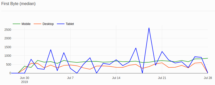
I did some research and found out that it was possible to construct a query that returns a percentile in MySQL 8.
The query below calculates media because we have p <= 0.50:
SELECT DISTINCT First_value(first_byte)
OVER (ORDER BY CASE WHEN p <= 0.50 THEN p END DESC) percentile
FROM (
    SELECT
    navigation_timings.first_byte,
    Percent_rank() OVER (ORDER BY navigation_timings.first_byte) p
    FROM navigation_timings
) t
* The query was tested on MySql8
Result:
| percentile |
|---|
| 431 |
With the help of this query I calculated medians for mobile, tablet and desktop devices for each day:
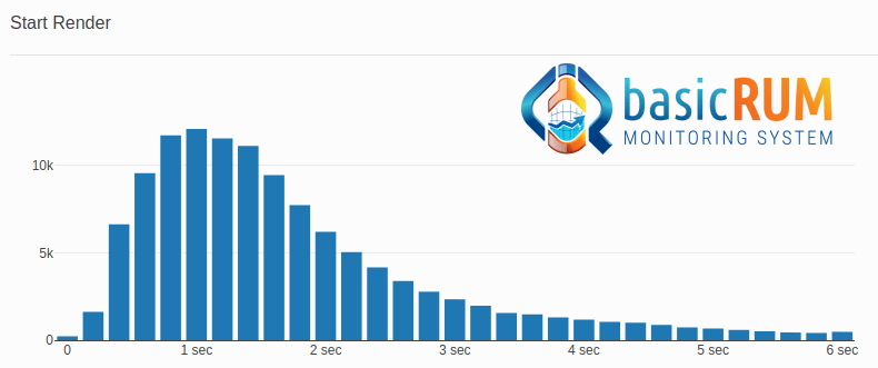
3. Generating histograms
In terms of generating histograms I had very similar problems as for percentiles. My application code was also a bit more complex because while iterating over all the records, I had to group the values in bins. Not a big deal but I was happy to remove this code and transfer the solution to another part of my application.
After some research and help from StackOverflow I ended up with the following query:
SELECT floor(first_byte/200)*200 AS bin_floor, COUNT(*)
FROM navigation_timings
GROUP BY 1
ORDER BY 1
* The query was tested on MySql8
Result:
| bin_floor | COUNT(*) |
|---|---|
| 0 | 228 |
| 200 | 1619 |
| 400 | 6625 |
| 600 | 9558 |
| 800 | 1173 |
| … | … |
Diagram:
4. Generating Bounce Rate vs. (metric) diagram
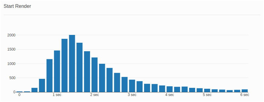
I’ve spoken with many people and it seems that most people have a good understanding what Bounce Rate is. It’s a KPI that is well-understood among businesses (talking from personal experience) which made my life easier while explaining how making a website faster potentially leads to lower bounce rates. As a matter of fact, having a diagram correlating performance metrics and bounce rates was my initial goal when I started collecting performance metrics about 2 years ago. I still find this very important and that’s why the first diagram that can be seen when Basic RUM dashboard is opened is “Bounce Rate vs. Start Render”
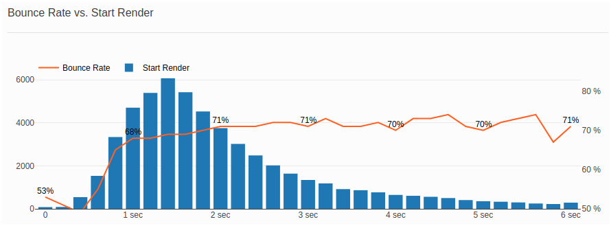
But how do we get the data in order to generate this diagram?
First we have to start with the definition of “Bounce Rate”. For a trivial non-single-page application “bounce rate” is the percentage of visitors who view exactly one page and do not navigate to another page within a specified time period. This period is 30 minutes for many popular tracking systems.
Great! This means that if we want to relate Bounce Rate with a performance metric, we should look at performance metrics we collect on visitors’ first page views.
In the example above, we look at “Bounce Rate vs. Start Render” where blue bars show the number of visitors grouped in different bins depending on Start Render (First Paint) time of their first page view. The orange line indicates the Bounce Rate we have in each “Start Render” bin.
- How do we generate “Start Render” bins?
- How do we generate “Bounce Rate” for each “Start Render” bin?
In order to accomplish those two tasks, we will need to query/match data from two tables in our database:
navigation_timings– a table where we keep mainly performance metrics from visitors’ page views.visits_overview– a table where we keep information about visitor sessions first visited page, last visited page, visit duration, number of visited pages, etc.
Generating “Start Render” bins for sessions that have exactly one-page view/bounced sessions:
Query:
SELECT floor(first_paint/200)*200 AS bin_floor, COUNT(*)
FROM navigation_timings
WHERE page_view_id IN (
  SELECT visits_overview.first_page_view_id
  FROM visits_overview
  WHERE visits_overview.page_views_count = 1
    AND visits_overview.first_page_view_id IN (
      SELECT page_view_id from navigation_timings
      WHERE navigation_timings.first_paint > 0
  )
)
GROUP BY 1
ORDER BY 1
* The query was tested on MySql8
Result:
| bin_floor | COUNT(*) |
|---|---|
| 0 | 78 |
| 200 | 89 |
| 400 | 540 |
| 600 | 1533 |
| 800 | 3343 |
| … | … |
Generating “Bounce Rate” for each “Start Render” bin:
In order to generate bounce rates for each bin we need to fetch 2 result sets: the 1st – count of all sessions clustered in bins of 200ms for start render time and the 2nd – count of bounced sessions clustered in bins of 200ms for start render time. We already have information about the bounced sessions from our previous example and it’s pretty easy to generate “Start Render” bins for all sessions – we just need to remove “visits_overview.page_views_count = 1” from our where clause.
SELECT floor(first_paint/200)*200 AS bin_floor, COUNT(*)
FROM navigation_timings
WHERE
  page_view_id IN (
    SELECT visits_overview.first_page_view_id
    FROM visits_overview
    WHERE visits_overview.first_page_view_id IN (
      SELECT page_view_id from navigation_timings
      WHERE navigation_timings.first_paint > 0
    )
  )
GROUP BY 1
ORDER BY 1
Result:
| bin_floor | COUNT(*) |
|---|---|
| 0 | 146 |
| 200 | 173 |
| 400 | 1107 |
| 600 | 2774 |
| 800 | 5138 |
| … | … |
Great! We now have enough data to construct a diagram displaying the distribution of start render time on first page view and calculate bounce rate for each bin of 200ms.
We still have to calculate the percentage on an application level but we could summarize bounce rate results in the following table:
| Start Render | All Sessions | Bounced Sessions | Bounce Rate |
|---|---|---|---|
| 0 – 200 ms | 146 | 78 | 53.42 % |
| 200 – 400 ms | 173 | 89 | 51.42 % |
| 400 – 600 ms | 1107 | 540 | 48.78 % |
| 600 – 800 ms | 2774 | 1544 | 55.26 % |
| 800 – 1000 ms | 5138 | 3343 | 65.06 % |
| … | … | … | … |
Ultimately, we can generate a diagram from this table that shows the relation between the start render time on first website visit and the bounce rate:
5. Diagram configuration format and Data Flavors
About 4 months ago I reached a point where I had a working logic for calculating percentiles, generating histograms and other statistical operations that I could run against a data set. I realized that too much effort was required when I wanted to create a new diagram. Basically I had to program and repeat a lot of code in order to display a new diagram in Basic RUM. You may not believe me but realizing that I have this problem was actually a moment of happiness because I found a new key system requirement for Basic RUM which was: “How can I generate new diagrams with minimum effort?”.
Diagram configuration format
Around the same time I stumbled upon a YouTube video about a data science software called Vega Lite. The video touched on a concept that was new and interesting for me, called “Grammar of interactive graphics“. I will not delve into great detail but the idea is to “ask Basic RUM a question” through a specifically crafted JSON configuration. This JSON mostly contains information about how a data set should be visualized. I didn’t spend much time studying the topic of “Grammar of interactive graphics” and I am not sure that I completely follow the rules because, as I understood, “Grammar of interactive graphics” is meant only for describing diagram rendering but in my implementation I have extra elements describing how the data for a diagram is being retrieved. Please keep in mind that the example below is inspired by “Grammar of interactive graphics” concept but it’s probably not exactly “Grammar of interactive graphics”.
Let’s look at a very simple example of the “Start Render – First Page View” diagram and talk about how this diagram is requested from the frontend via a diagram config JSON:
| JSON | Description |
|---|---|
{
title: 'Start Render',
  global: {
    presentation: {
      render_type: 'plane'
    },
    data_requirements: {
      period: {
        type: 'moving',
        start: '30',
        end: 'now',
      }
    }
  },
|
Global diagram settings where we can specify presentation and data related settings. This section is identified because it starts with a key global and contains presentation and data related configuration where only presentation key is mandatory.
presentation key: Here we can specify global settings that will be used later for all diagram segments. The render_type key is mandatory because it’s required by the rendering engine to identify the type of canvas on which the diagram will be drawn. Currently we have 3 options for render_type: plane, time_series and distribution. data_requirements key: Here we can specify global filters for how the data should be retrieved. In this example we tell Basic RUM to get data for a period of 30 days in the past where the end of the period is today’s date. |
segments: { 1: { presentation: { name: 'Start Render', color: '#1F77B4', type: 'bar' }, data_requirements: { technical_metrics: { first_paint: { data_flavor: { histogram_first_page_view: { bucket: '200' } } } } } } } |
The segments role is to help define what will be drawn in our diagram. In this example we will draw a histogram for the Start Render metric.
presentation key: Here we can specify rendering related information. We can define what name will be displayed in the diagram legend box, what color we will have for each metric. We also can define how a metric will be rendered. In this case we will render the metric values using bars. data_requirements key: Here we can specify what data should be fetched from our database. In this case we will fetch data for the first paint metric only for first page views of a customer’s visit. The data will be clustered in buckets of 200 ms. |
Result:
Some thoughts about why I like the diagram JSON configuration:
- Makes development easy and makes it possible for people to “exchange” diagrams with each other. Also, it would be easy to reproduce issues that open source contributors have because it will be enough if they just send their JSON configurations.
- A JSON schema could be used and this will make it easy to apply frontend and backend validation and auto complete for online text editors.
- JSON is a popular and understandable format for most developers.
Data Flavors
If you’ve reached this point of the article, I believe that you’ve noticed a key named data_flavor in our JSON configuration. I would like to talk a bit more about data flavors because they are key elements in Basic RUM and helped me solve performance and software design problems.
While still working at my previous job, while investigating backend performance issues, many times it was the database that was the performance bottleneck. Often the solution was to rewrite an SQL query or add an index to a table field. I mentioned in the beginning of the article that in early versions of Basic RUM I was fetching large numbers of database rows and iterating over them and performing different computations on the code/application level. This approach was good for a proof of concept but it was inefficient because of object hydration, memory consumption and code complexity. I was really surprised that Basic RUM actually had performance issues on the application level and when I noticed that, I decided to check if my database could offer a much efficient solution. This is where I came with the idea of something called Data Flavors for lack of a better naming convention.
From a Basic-RUM-user point of view a Data Flavor is just a JSON configuration key, a way to express how a metric should be presented, e.g. percentile, histogram, etc. From a developer’s point of view Data Flavors are helper classes, part of the SQL query builder, that know how to query the database in order to perform statistical operations.
In the latest version of Basic RUM we have the following data flavors:
- Bounce Rate in Metric
- Count
- Data Rows
- Histogram
- Histogram First Page View
- Percentile
Count and Data Rows
I didn’t talk about Count and Data Rows but I will briefly explain them now.
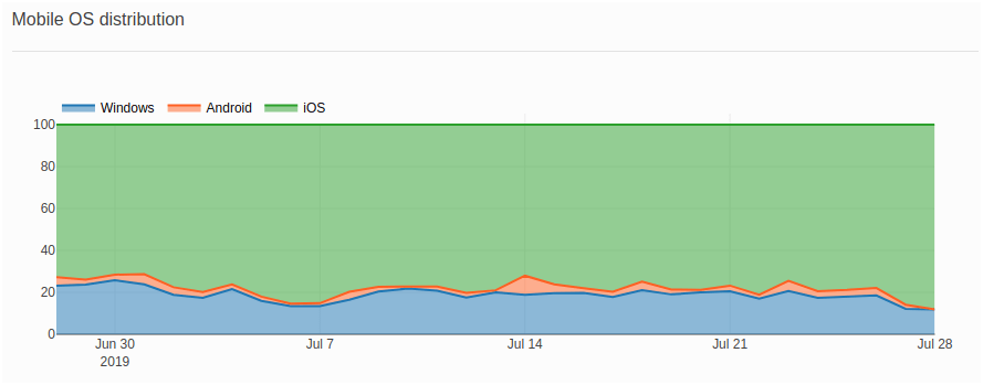
The Count data flavor is used for the cases where I show the daily distribution for visits by devices and operating systems:
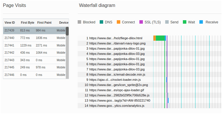
Data Rows is used for the cases where I show waterfall diagrams. In this case I need to pass page view ids to the frontend and later use those ids to tell Basic RUM to render a waterfall diagram for a chosen page view:
What’s next?
- In 2020, I will try to make a clearer software architecture for Basic RUM because many parts of the project still look like a construction yard.
- I am also planning to do more work on better documentation and to start a tech blog where I explain some software concepts of Basic RUM.
- And finally, the DevOps guru Evegeny Liskovets and I are working on Terraform recipes that should make the deployment of Basic RUM in the Cloud trivial!
Thanks
My team for inspiring me and challenging my ideas: Nigel Heron, Nic Jansma, Andreas Marschke, Avinash Shenoy. Philip Tellis for creating Boomerang JS. Evegeny Liskovets for helping me solve DevOps challenges. Cliff Crocker for working on the early concepts for business vs. performance metric diagrams. Stefan Stefanov for being my editor for this article. Ksenia Iakovleva for giving me feedback about this article. All folks who contributed in various ways.