

Erwin Hofman (@blue2blond) started building his own CMS in 2004, which is now used by several Dutch web agencies. The CMS also became his playground to eventually helping e-commerce agencies adopting and improving (perceived) performance, Core Web Vitals and accessibility.
Those who have run into the motherfuckingwebsite-series already know how to build the fastest website. And even if you don’t, it speaks for itself: just use HTML only. Because even CSS is render blocking, and always have been (2012).
But such websites aren’t the reality today. To achieve some sort of perceived performance, even when using large JS and CSS bundles (don’t do this though), critical CSS can be used. This will benefit the First Contentful Paint metric (FCP) as shown below.
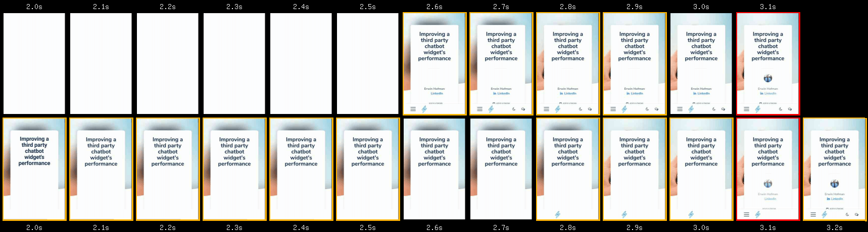
For this, I ran a WebPageTest for a blogpost of mine, without and with critical CSS. Test was conducted from Dulles, using a Moto G6 on a 4G connection. Starting at a 2.0 second mark, the user can already start reading in the optimized version using critical CSS. Depending on the layout, a user could even start reading the body text when scrolling. Without critical CSS, a user has to wait until the 2.6 seconds mark. In this comparison, it would mean an improvement of 23% when it comes to FCP and perceived performance in general.
The trick? By fixing other (early) render blocking resources, you allow the browser to render anything as soon as possible.
Accelerated Mobile Pages
I won’t be talking about new ideas for achieving optimal perceived performance, and also won’t really elaborate on critical CSS itself. Neither about frameworks or build tools one could use. This is just going to be a personal journey on critical CSS.
Alright, I lied, just a little bit about frameworks then: I baked AMP support into our CMS about a year after its launch. This resulted in the following though:
- it’s like going back to the non-responsive webdesign era, in which you had to maintain two website versions (or obviously just build in AMP only);
- you don’t own your code as much and have coding restrictions at the same time.
I stopped maintaining and even removed AMP support from the CMS I use. The reason? Depending on your platform and knowledge it can be time-consuming -which was one of the reasons why AMP gained traction amongst publishers I guess-. The irony I run into is that amp.dev isn’t passing the Core Web Vitals assessment, as:
- The homepage has a Largest Contentful Paint of 3.0 seconds at the 75th percentile at time of writing;
- It has an overall First Input Delay bottleneck.
However, every aspect that makes AMP fast can be implemented in any website, but with more control instead. One of them: inlining CSS. And preferably limited to the critical CSS, meaning CSS responsible for meaningful elements or elements above the fold. But we then have to lazyload non-critical CSS.
No polyfills please
As developers, we can use the async or defer attribute for script elements (don’t use both on the same script element though). But there is no browser native equivalent for link elements pointing to a stylesheet.
Luckily, others were missing this feature as well and started experimenting. One of the possible strategies involved a CSS preload polyfill to work in non-supportive browsers. This felt like adding extra weight to loose some weight for older browsers. I jumped on the train, but was reluctant to use the polyfill.
Polyfill trade-off
Don’t get me wrong. I sometimes do use polyfills. For example, I use a polyfill for emulating IntersectionObserver to be able to support lazyloading via lazysizes when there was no native lazyloading support.
Yes, two times an additional JavaScript library for Internet Explorer (and one for Safari). I often already have JS on a budget though, and more important: timing of onload-event would just massively improve by lazyloading images. I considered such polyfill a very acceptabele trade-off.
But normally, I choose to go with the progressive enhancement solution. No FontFace API or woff2 support in Internet Explorer? Let’s not overengineer our CMS as it is likely we have to remove such browser compatibility fixes again over time. Just no custom fonts for IE then.
Load CSS simpler
A new finding, Load CSS simpler as filament group called it, was exactly what the world was waiting for. I started using it right away. The idea? Pretend the stylesheet to be for printing purposes only, so that browsers won’t make it render blocking, while it will still be downloaded. Once downloaded, transform it into a stylesheet for all media, or just screen-only purposes. Their latest code-snippet is as following:
<link rel="stylesheet" href="/path/to/my.css" media="print" onload="this.media='all'">
No priority for stylesheets
Obviously, this simpler version of asynchronous CSS isn’t using any preloading anymore. However, if you choose to lazyload some CSS, then apparently it isn’t important enough in the first place, right. By not preloading the external CSS, you also reduce the chance of resource congestion and basically let the browser decide how to handle things in an optimal way (it might not seem like this though as not even 25% of CrUX origins are passing Core Web Vitals, but that often the platform or developers are to blame).
For example, when you have some JavaScript in your footer, you allow the browser to attach event listeners to your add to cart or favorite button, even before it would become visible once external and thus lazyloaded CSS was applied. This:
- prevents users from clicking on not yet functioning buttons as they’re initially invisible anyway;
- prevents the idea of a broken webpage;
- and thus limits user frustration.
Critical CSS challenges
Yes, there are some challenges, which might even turn out to be reasons why not to implement a critical CSS strategy. I only found an article covering a handful of reasons later. And truth to be told: it was very relatable.
HTML size and caching
A webshop, who’s name I am no longer allowed to publish within my talks and writings (whole other story) is a good example how things can go wrong with inline CSS. After reading a marketing-article in July 2018 about how a webshop was optimized, I dug into their source code. I came across inlining CSS, but not just the critical parts.
As a result, the content size of their homepage grew by 633%, from 54 kilobytes to 342 kilobytes by adding 288 kilobytes of CSS.
Obviously, content download time increased as well. Latency would increase first before ever being able to let users benefit from inlined CSS at all. Moreover, users aren’t benefitting from client side caching anymore when CSS is inlined on each page-view.
Let’s get critical, but just once
But what they at least should’ve done, is inlining CSS only once and then start serving pages with render blocking CSS once it was stored in the cache after the first pagehit. This would already have been an improvement, and this is what I chose to implement as well by using a cookie (or server session).
However, as the last article points out, cookies could last for too long. Longer than the caching-duration of your assets. Or cached assets might have been cleared before re-visiting your site again. This could lead to a browser having to re-download the assets at an unknown point in time. Be sure to consider this when implementing a one-time-only critical CSS strategy, maybe even by looking at session duration and returning visitor data in your site analytics.
As my very own CMS also does server side caching of requested HTML pages, the task of inlining critical CSS is done in a stand-alone PHP file which is at the very end for each incoming page request:
- Stylesheets are made render blocking during page build within the CMS;
- When it is the user’s first pagehit, the stylesheet is being lazyloaded and critical CSS is being inlined.
This means I just have one cached version per page, and also one version of critical CSS per page(type). This way, I don’t need to store two cached versions per page and the cache hit ratio will still be high. If you happen to use a CDN, this might require another strategy and filamentgroup might have you covered once again.
By the way: I use a prefetching library on top of the above strategy to also have quick responses on subsequent pagehits within a session. On top of the improved perceived performance during someone’s first pagehit, this can give a website an SPA or PWA-like feeling while navigating to other pages.
Server push
As each page request would go through a tiny PHP script, even when a server side cached version of the page was found, the path to the stylesheet bundle would’ve been extracted and pushed ahead of time using server push. Obviously, only on first pageview within a session (which was being checked using the same cookie), as browsers can’t know if a pushed resource is in the browser cache already, and thus has no way of determining if it should accept or reject a pushed resource.
This was just one of the challenges. HTTP/2 push turned out to be hard to implement, by developers/platforms, browsers and servers. As Chromium recently decided to remove HTTP2 Server Push support, I already removed this from our CMS.
To be honest: pagespeed gains were quite marginal anyway on top of other optimizations and I sometimes had malfunctioning websites when I had a regular expression syntax error for detecting resources to be pushed, ending up having too much resources being pushed and throwing a server error.
Show meaningful content only
As described by web.dev page within their article covering extracting critical CSS, you could use build tools to come up with the right amount of CSS. However, it is still the developer who is able to determine with contents really are important to show right away.
Even on first pagehit of a user, I try to keep the impact of inlined CSS on the HTML size as small as possible. For example, you might not need CSS for the following elements:
- rotating unique selling points in your header;
- CSS for contents in dropdowns, as they will be hidden by default anyway;
- add-to-cart or favorite buttons which won’t work yet as event listeners might not have been added yet anyway;
- icons, please don’t inline the full fontawesome library;
- vendor files, no need to have a datepicker or fancybox opened right away.
But then, we need a way to hide non-critical elements.
Hide non-critical
We made this very easy for ourselves. We just introduced a non-critical class, called no-critical. All elements containing this class will initially be invisible using the CSS property opacity. By also applying a little transition, non-critical elements will fade in over a period of 100 milliseconds once the external stylesheets has been downloaded.
inlined CSS as part of critical CSS:
.no-critical {
  opacity: 0;
  transition: opacity 0.1s ease-in;
}
CSS in the external stylesheet:
.no-critical {
  opacity: 1;
}
Obviously, users on slow connections might not be able to read the contents of the footer. We choose to not provide any maximum timeout for this though as at least main contents will always be visible.
Fix document flow
Obviously, invisible elements are still part of the document flow. In our case, when we know elements will be positioned absolute or fixed anyway, we just apply that one extra CSS property on top of opacity in our critical CSS already. This will prevent elements from being pushed around once the external CSS is applied by the browser.
For relative elements, we at least try to set the right dimensions to keep visible lay-out shifts to a minimum. Height and border-width are examples of CSS properties which might be needed in advance.
CSS specificity
By omitting any color properties, we also prevent any CSS specificity conflicts. Inlined CSS will have a higher specificity than external CSS, and otherwise we have to use the !important operator way too often.
The same applies to hover and active states. Chances are a visitor is just consuming the text without interacting right away anyway (this obviously also depends on their connectivity). So besides keeping our critical CSS size smaller, not declaring hover and active states in our critical CSS also prevents specificity issues for changing properties during for example mouseover, where inlined CSS would normally get precedence over external CSS.
Next to using !important, one could use more specific selectors within your external stylesheet, but this would only make your CSS larger than necessary. I already see stuff like this happening in Magento 2:
:root body .page-wrapper header.page-header .header.content .header-right-main .header.links
Another advantage of only applying the actual critical CSS and making the bundled CSS render blocking on subsequent page visits, is that any layout shifts or specificity issues due to maintenance won’t be experienced by users on subsequent page visits. But a build-tool could just prevent conflicts between bundled CSS and critical CSS in the first place, obviously.
Magento or SaaS
Magento was actually late to the critical CSS party: as of version 2.3.3 (November 2019), Magento is supporting critical CSS. I haven’t seen it in the wild yet though, although I am currently supporting an agency implementing critical CSS in their Magento 2 shop, where I am just doing the CSS part.
For Magento 1, I created and recently published a Magento 1 PHP snippet to achieve the same, per page-type. I did the same for Shopware 6 in collaboration with a Symfony developer, but the extension unfortunately isn’t published yet.
But in such circumstances it might be cumbersome to test for a cookie, to determine if you should inline CSS. For example because you can’t do any additional tasks in PHP when the platform itself is serving a server side cache. And within SaaS solutions, you only get to change HTML source.
Nevertheless, I am now in the process of doing this within a SaaS webshop. But obviously with the same mindset as mentioned above: keep the inlined CSS as small as possible to at least trigger early user engagement, but at the same time not impacting the HTML size too much.
<link rel="stylesheet" media="print" onload="this.media='all';cssLoaded();this.onload=null" href="general.css" />
<link rel="stylesheet" media="print" onload="this.media='all';cssLoaded();this.onload=null" href="home.css" />
<noscript>
  <!-- noscript fallback as above lines depend on JavaScript being turned on -->
</noscript>

<script>
  var asyncCssFiles = document.querySelectorAll('link[media=print][onload]').length;
  <-- late declaration of cssLoaded(), but seems to be working due to stylesheets being lazyloaded -->
  <-- Edge-cases/race conditions may happen though, so don't forget to test -->
  function cssLoaded() {
    if (--asyncCssFiles <= 0) {
      setTimeout(function() {
        document.body.classList.add('async-css-loaded');
      }, 0);
    }
  }
  if ( sessionStorage.getItem('cssCached') ) {
    var blockingCss = document.querySelector('style#critical-css ~ noscript');
    if ( blockingCss ) {
      document.write( blockingCss.innerHTML );
      var criticalCss = document.querySelector('style#critical-css');
      criticalCss.parentNode.removeChild(criticalCss);
    }
  }
  sessionStorage.setItem('cssCached', 1);
</script>
What we are doing here, is checking the amount of lazyloaded stylesheets. If all are loaded (this is when asyncCssFiles equals zero), a class is added to the html-element. In all situations (with JavaScript enabled) sessionStorage is used to check if the user visited the site before in the current
Although this has the disadvantage of increased HTML document size, this is what I use to get started on a new project. Also because it allows me to get started on improving without too much communication overhead. A backend developer can just implement this snippet and go back to focusing on backend performance again, for example.
The better approach, once everybody involved in speeding up sees the benefits of critical CSS, is to eventually remove the duplicate CSS from the external stylesheets together with this JavaScript snippet.
Still a CLS bottleneck
Didn’t we cover layout shifts already? Yes, that’s what I though as well. Despite our efforts in reducing layout shifts while implementing critical CSS, there still seemed to be layout shifts. But it was just one case where this could be seen in the CrUX data.
Real use cases
In all of my direct webdevelopment cases, we use a font loading strategy where we adjust the letter-spacing and other properties of the fallback font until the custom font kicks in, determined using FontFace API. Obviously, this is still likely to have a bit of a CLS impact, but the sum of layout shifts always was in the green area. Although Lighthouse would tell you what other elements shifted, I never really bothered to look into CLS with a more forensic eye as lab data was different from field data and often relied on common sense.
Moreover, in most cases we cater for at least any elements above the fold when it comes to applying critical CSS. So any layout shifts would not be tracked due to happening below the fold, and elements were already rendered once the user starts scrolling down.
Then WP came around
I did a WP case, didn’t feel like setting up to much critical CSS as the grid setup per page differed quite a lot. So, to minimize the size of the inlined CSS as well as my efforts, I basically only extracted the critical CSS for the header and page-header, hiding the rest.
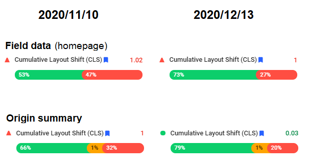
As we came from a render blocking CSS situation, I expected the CLS not to be zero anymore. There often are some layout shifts when implementing critical CSS. However, on desktop, things totally turned around in a negative way, looking at the CrUX data via Pagespeed Insights. At first I thought this was due to a Google Font being loaded using Google Fonts CDN. Despite this server being on HTTP/1 (ouch), I choose to self-host the fonts, combined with a loading strategy to reduce layout shifts. Result: none. We had no day-to-day Core Web Vitals tracking. But even within PageSpeed Insights, distributions didn’t even change a single percentage in a week time.
For the homepage, we can see how people just have good or bad experiences, no experiences in between. We got this fixed, and as seen in the data on the right, this did fix our CLS issues for other pages than just the homepage. Chances are the homepage is messing up our origin summary distribution, as most likely the homepage still has (another) major CLS issue to fix.
My first thought was that this was a CLS tracking bug, maybe even caused by specific devices. Using Twitter, I presented this specific scenario to Phil Walton, to only come to a conclusion myself later on. Obviously, I should’ve looked into it in a more forensic way beforehand. However, it appeared we were still looking at an undesired outcome as shifts really were invisible by the naked eye.
What really was happening
The reason this layout shift didn’t go unnoticed by Chromium and thus CrUX was because I did not bother to style all above-the-fold elements within my critical CSS. Layout shifts were actually happening within the viewport. Despite being invisible to the user. And the fact that it was only happening on the first pagehit, also cause a weird CLS distribution on first sight. Another learning right there: there can be different stories to the field data as shown in PageSpeed Insights.
Phil got back to me with an explanation and a code snippet. It appeared that any layout shifts that happen within the same frame, even when being invisible for users, really are tracked as CLS. Basically, content-visibility: auto; is suffering from this heuristic as well. While this was reported as a bug to Chromium, I started testing with the provided solution. By using setTimeout, you enforce the lazyloaded CSS to be applied in a new frame, preventing lay-out shifts from being tracked:
<link rel="stylesheet" media="print"  href="style.css"
  onload="this.media='all';setTimeout(function(){ document.body.classList.add('async-css-loaded') }, 0);this.onload=null" />
I was happy to see that he agreed with me that applying such a best practice towards improved FCP shouldn’t be so devious. Nevertheless, regardless of a fix being pushed in an upcoming Chromium, I chose to implement the solution right away within our CMS. Moreover, by looking at other CLS Chromium bugs, I got track of a JavaScript snippet you could paste into your JS console to track all CLS for yourself whereas until this point, I was using a combination of other methods to detect CLS.
new PerformanceObserver(l => {
  l.getEntries().forEach(e => {
    console.log(e);
  })
}).observe({type: 'layout-shift', buffered:true});
Using the :not operator
The provided strategy would force me to use one extra CSS property in both my critical as well as lazyloaded CSS, being visibility next to opacity. But this could conflict with elements which actually needed the visibility-property for other purposes. And I did not want to run into potential specificity issues.
This led to some contemplation and using the :not() operator was a logical step. By using this operator, I could even completely omit any critical related CSS from the lazyloaded stylesheet and keep the non-critical related styling limited to only be included in the critical CSS:
.no-critical, footer {
  transition: opacity 0.1s ease-in;
}
body:not(.async-css-loaded) footer,
body:not(.async-css-loaded) .no-critical {
  visibility: hidden;
  opacity: 0;
}
The first line without a not() operator is still needed to at least have the transition applied, even when the opacity is lifted once the async-css-loaded CSS class is being added.
Due to the possibility of having multiple lazyloaded stylesheets in your source and reducing layout shifts between downloaded stylesheets, I now use the code-snippet where a function called cssLoaded() is used, as shown in the Magento and SaaS code snippet which was mentioned earlier.
Conclusion
There really isn’t any conclusion as there are different ways to implement critical CSS, maybe depending on your platform and build tools. Over the years, this has been my critical CSS journey, where I changed mindsets and strategies over the years based on browser changes and mostly reading the findings and thoughts of others as well.
Maybe that’s even the conclusion: most of the above really aren’t new findings, but sometimes I just get pushed in another direction just by reading learnings and thoughts of others. It got me where I am today and sharing my own journey might help others.